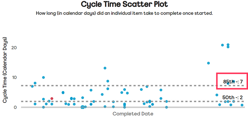
Improving flow is a key goal for nearly all organisations. More often than not, the primary driver for this is speed, commonly referred to as Cycle Time. As organisations try to reduce this and improve their time to (potential) value, what factors correlate with speed? This blog, inspired by the tool DoubleLoop, looks at the correlations Cycle Time has with other flow-based data…
The correlation of metrics
A few months ago I came across a tool called DoubleLoop. It is unique in that it allows you to plot your strategy in terms of your bets, the work breakdown and key metrics, all onto one page. The beauty of it is that you can see the linkage to the work you do with the metrics that matter, as well as how well (or not so well) different measures correlate with each other.

For product-led organisations, this opens up a whole heap of different options around visualising bets and their impact. The ability to see causal relationships between measures is a fantastic invitation to a conversation around measuring outcomes.
Looking at the tool with a flow lens, it also got me curious, what might these correlations look like from a flow perspective? We’re all familiar with things such as Little’s Law but what about the other practices we can adopt or the experiences we have as work flows through our system?
As speed (cycle time) is so often what people care about, what if we could see which measures/practices have the strongest relationship with this? If we want to improve our time to (potential) value, what should we be focusing on?
Speed ≠ value and correlation ≠ causation
Before looking at the data, an acknowledgement about what some of you reading may well be pointing out.
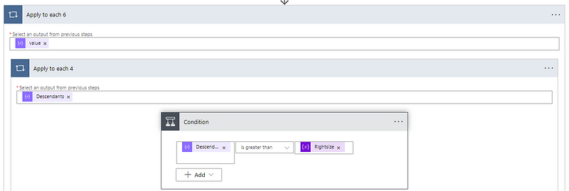
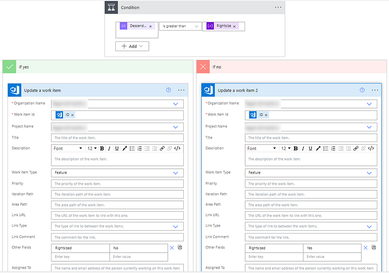
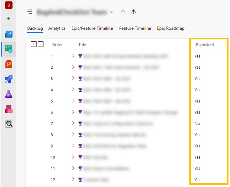
The first is that speed does not equate to value, which is a fair point, albeit one I don’t believe to be completely true. We know from the work of others that right-sizing trumps prioritisation frameworks (specifically Cost of Delay Divided by Duration — CD3) when it comes to value delivery.

Given right-sizing is part influenced by duration (in terms of calendar days), and the research above, you could easily argue that speed does impact value. That being said, the data analysed in this blog looked at work items at User Story/Product Backlog Item level, which is difficult to quantify the ‘value’ that brings.
A harder to disagree with point is the notion that correlation does not equal causation. Just like the biomass power generated in the Philippines correlates with Google searches for ‘avocado toast’, there probably isn’t a link between the two.

However, we often infer in working with our teams about things they should be doing when using visual management of work. For some, these are undoubtedly linked, for example how long an item has been in-progress is obviously going to have a strong relationship with how long it took to complete. Others are more for up for debate such as, do we need to regularly be updating work items? Or should we be going granular with our board design/workflows? The aim of this blog is to try challenge some of that thinking, backed by data.
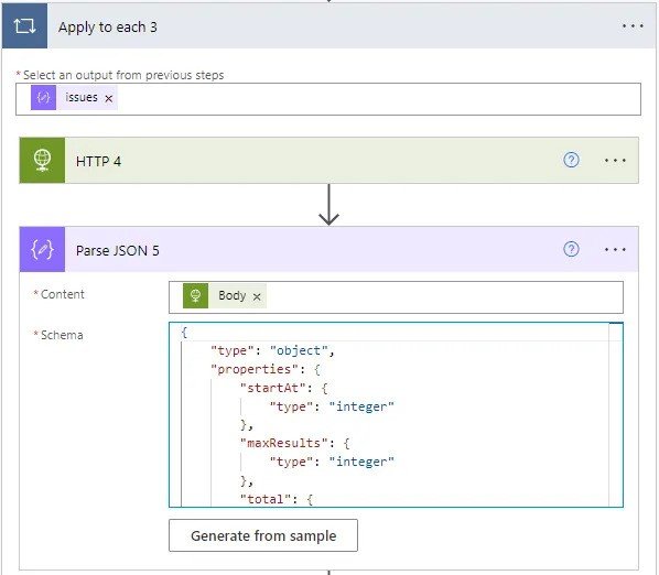
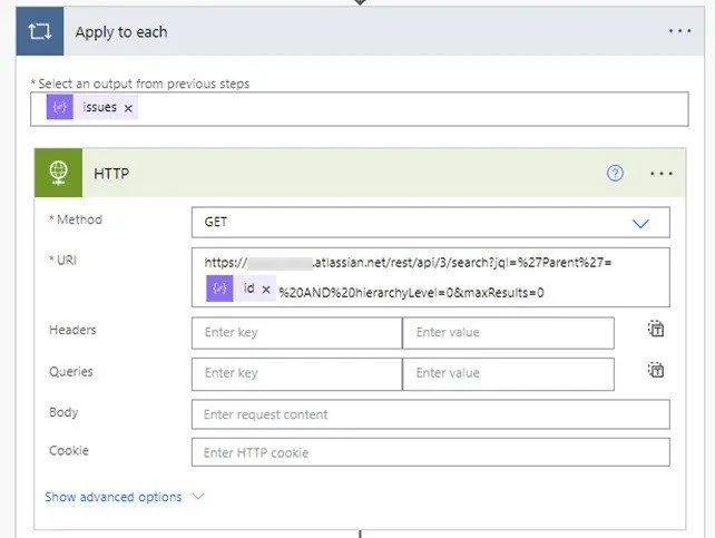
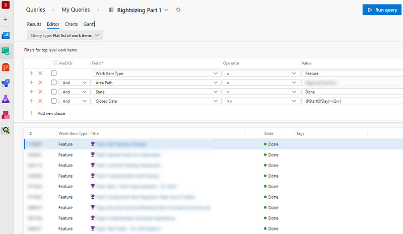
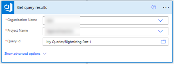
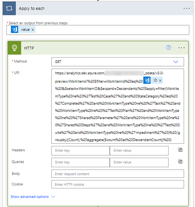
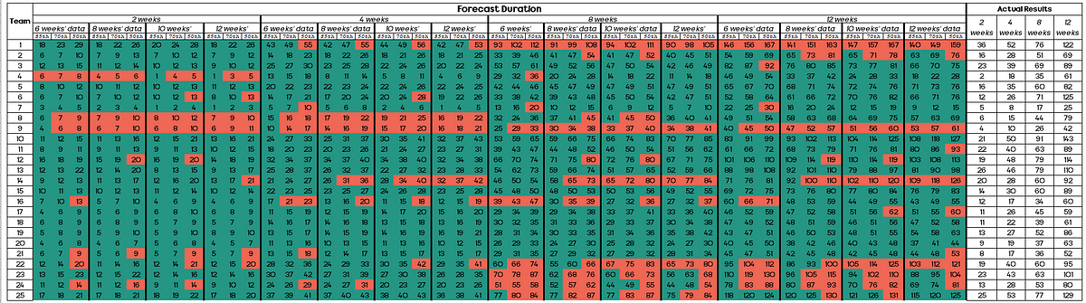
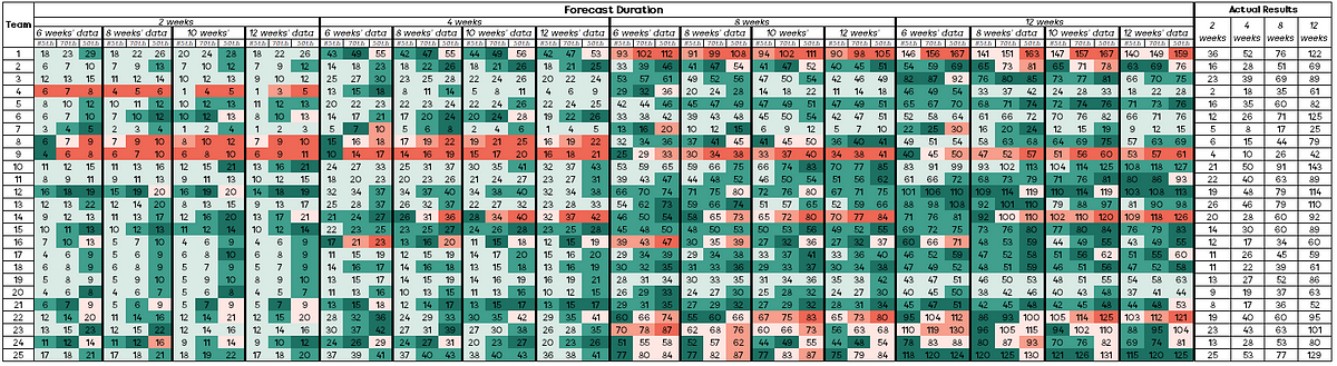
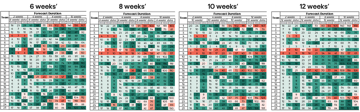
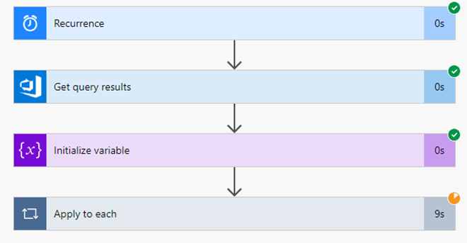
For those curious, a total of 15,421 work items completed by 70 teams over the since June 1st 2024 were used as input to this research. Given this size, there may be other causal relationships at play (team size, length of time together, etc.) that are not included in this analysis.
Without further delay, let’s start looking at the different factors that may influence Cycle Time…
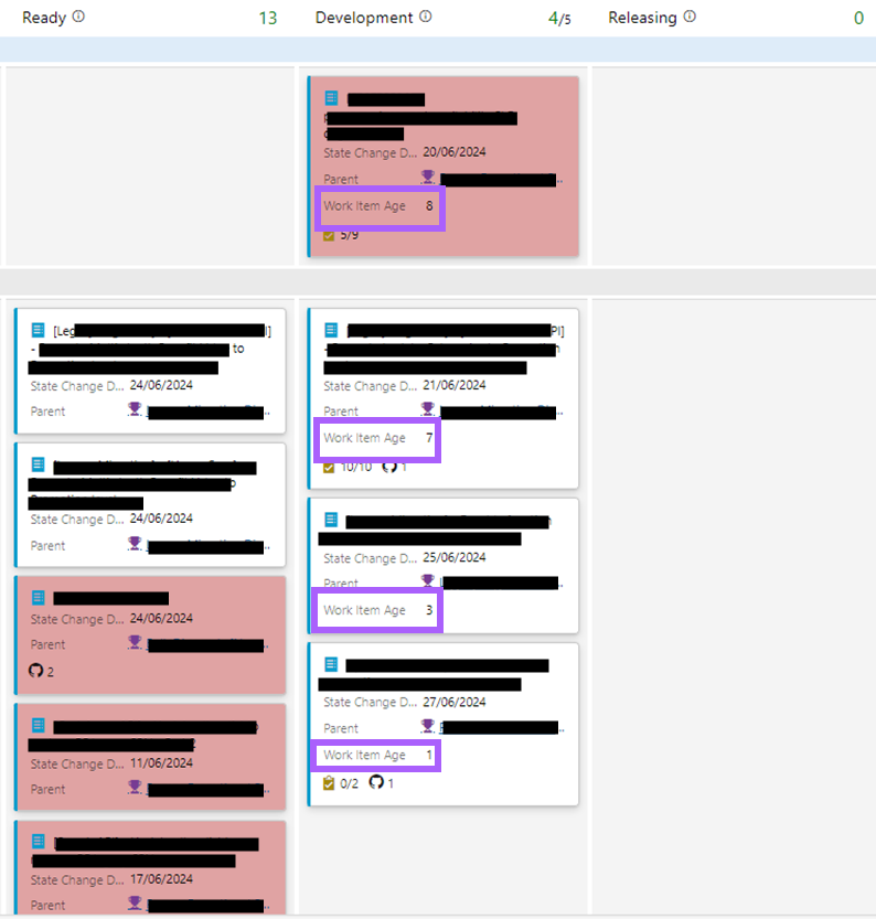
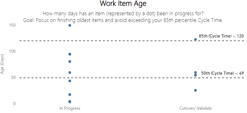
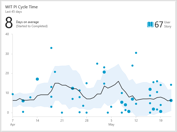
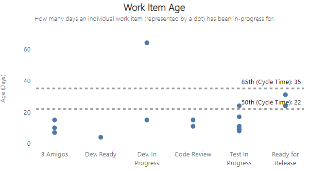
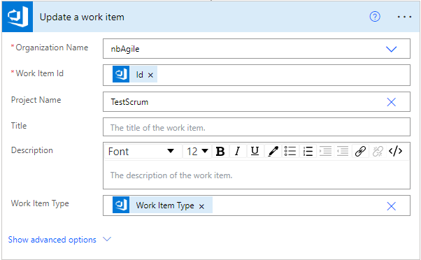
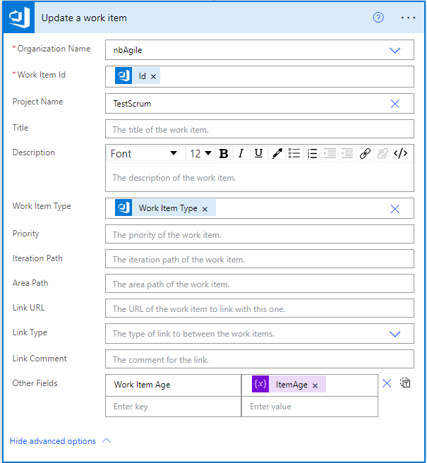
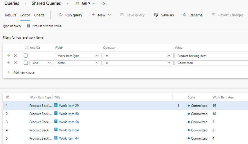
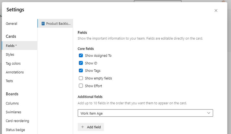
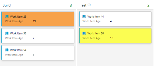
Days since an item was started (Work Item Age)
One of the most obvious factors that plays into Cycle Time is how long an item has been in-progress, otherwise known as Work Item Age.

Clearly this has the strongest correlation with Cycle Time as, when your item is in-progress, it will have been in that state for a number of days and then once it moves to ‘done’ there should never be a difference in those two values.

The results reflect that with a correlation coefficient of 1.000, and about as strong a positive correlation as you will ever see. This means that above everything else, we should always be focusing on Work Item Age if we’re trying to improve speed.
Elapsed time since a work item was created (Lead Time)
The next thing to consider is how long it’s been since an item was created. Often referred to as ‘Lead Time’, this will often be different to Cycle Time as there may be queues before work actually starts on an item.

This is useful to validate our own biases. For example, I have often made the case to teams that anything older than three months on the backlog probably should just be deleted, as YAGNI.
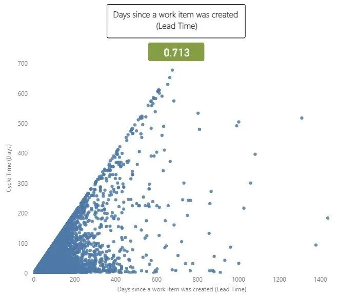
This had a correlation coefficient with of 0.713, which is a very strong correlation. This is to be largely expected, as longer cycle times invariably will mean longer lead times, given it (more often than not) makes up a large proportion of that metric.
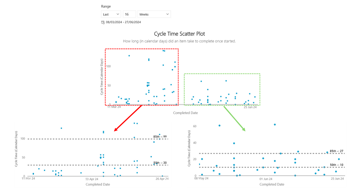
Time taken to start an item
A closely related metric to this is the time (in days) it took us to start work on an item. There are two schools of thought to challenge here. One is the view of “we just need to get started” and the other being that potentially the longer you leave it, the less likely you’re going to have that item complete quickly (as you may have forgotten what it is about).

This one surprised me. I expected somewhat a stronger relationship than the 0.166 correlation. This shows there is some relationship but it is weak and therefore not going to impact your cycle time how quickly you do (or don’t!) start work on an item.
The number of comments on a work item
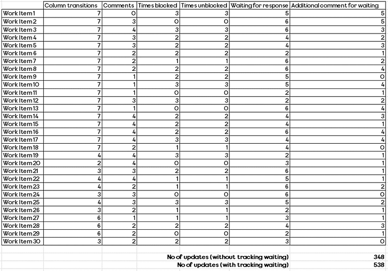
The number of comments made on a work item is the next measure to look at. The idea with this measure would be that more comments likely mean items take longer, due to their being ambiguity around the work item, blockers/delays, feedback etc.
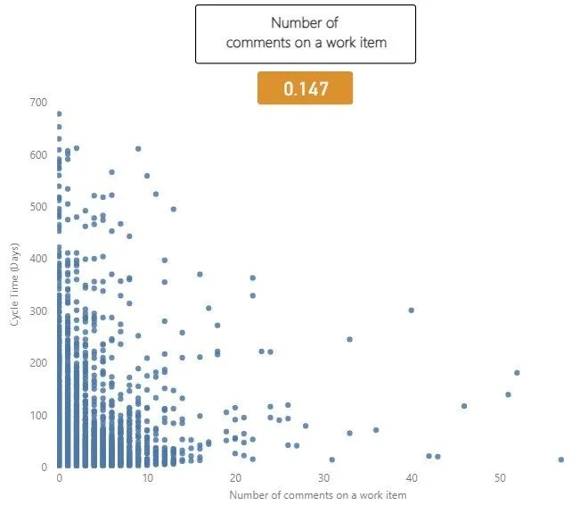
Interestingly in this dataset there was minimal correlation, with a correlation coefficient of 0.147. This suggests there is a slight tendency for work items with more comments to have a longer cycle time, but we can see that after 12 or so comments this doesn’t seem to be true. This could be that by this point, clarification is reached/issues are resolved. Of course, once we go past this value there are far less items that have that amount of comments.
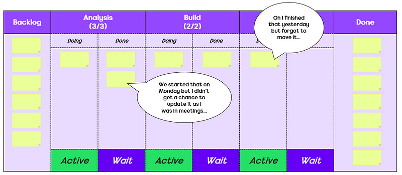
The number of updates made to a work item
How often a work item is updated is the next measure to consider. The rationale for this being teams are often focused on ensuring work items are ‘up to date’ and trying to avoid them going stale on the board:

An update is any change made to an item which, of course means that automations could be in place to skew the results. With the data used, it was very hard to determine those which were automated updates vs. genuine ones, which means there is a shortcoming in using this. There were some extreme outliers with more than 120 updates, which were easy to filter out. However once I started going past this point there was no way to easily determine which were automated vs. genuine (and I was not going to do this for all 15,421 work items!).

Interestingly here we see a somewhat stronger correlation than before, of 0.261. This is on the weak to moderate scale correlation wise. Of course this does not mean just automating updates to work items will improve flow!
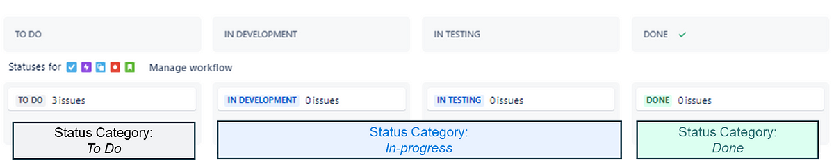
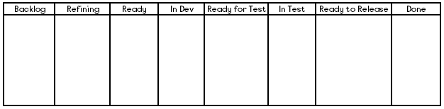
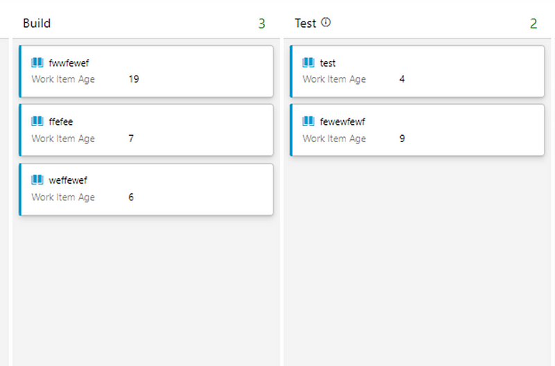
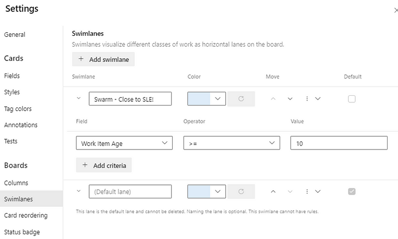
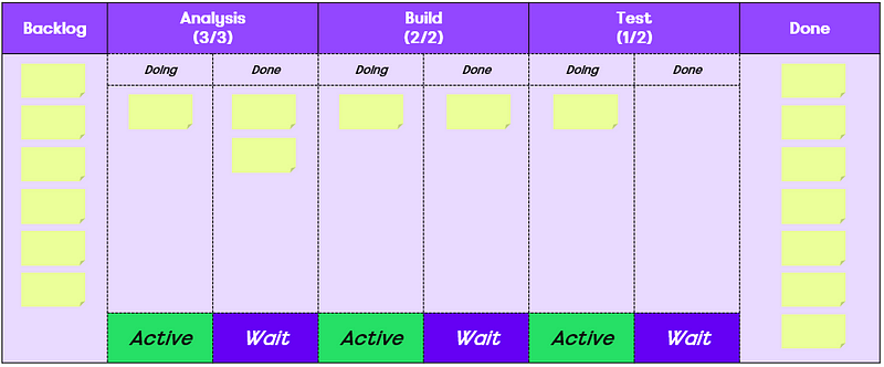
The number of board columns a team has
The next measure to consider is the number of board columns a team has. The reason for looking at this is that there are different schools of thought around how ‘granular’ you should go with your board design. Some argue that To Do | Doing | Done is all that is needed. Others would say viewing by specialism helps see bottlenecks and some would even say more high-level views (e.g. Options | Identifying the problem | Solving the problem | Learning) encourages greater collaboration.

The results show that really, it doesn’t matter what you do. The weak correlation of 0.046 shows that really, board columns don’t have any part to play in relation to speed.
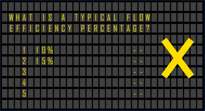
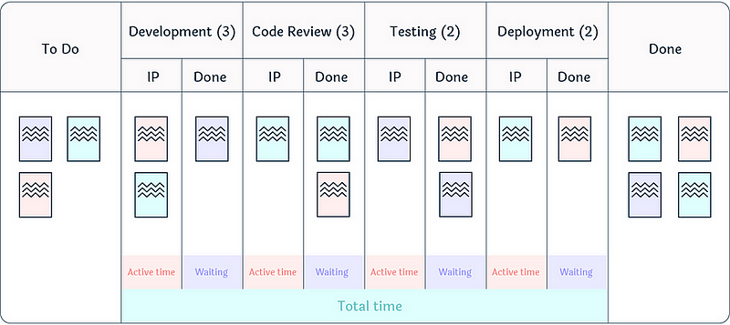
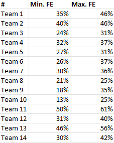
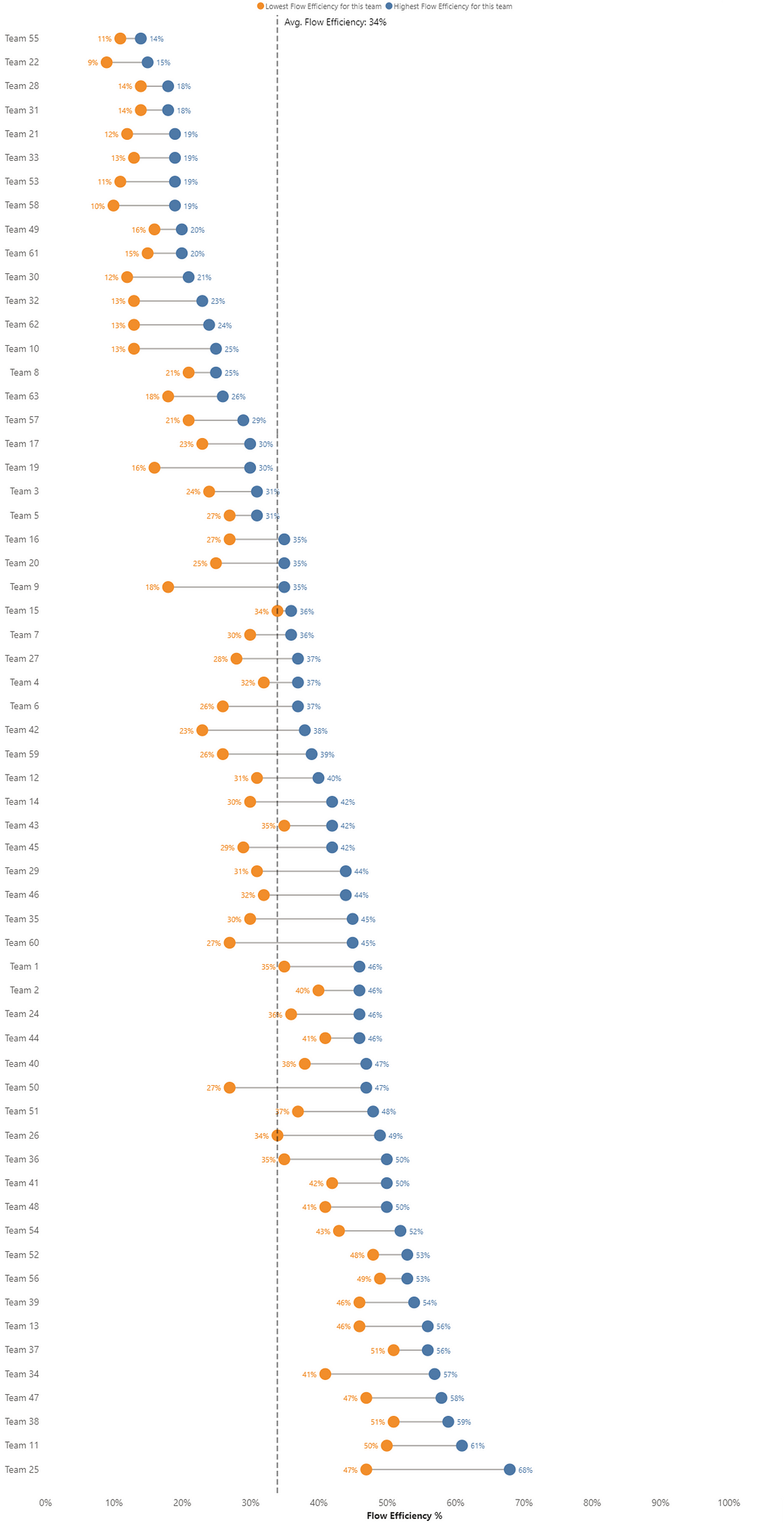
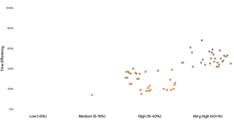
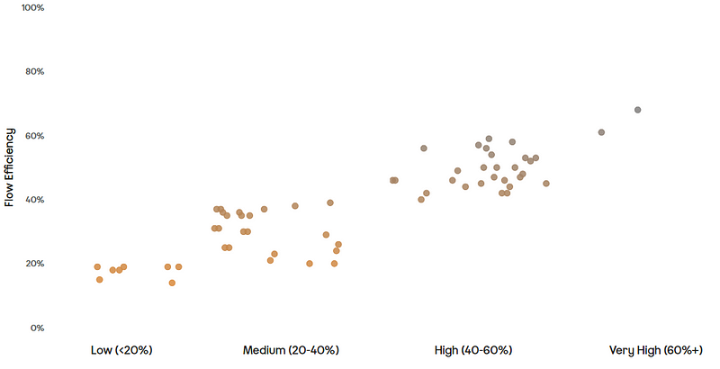
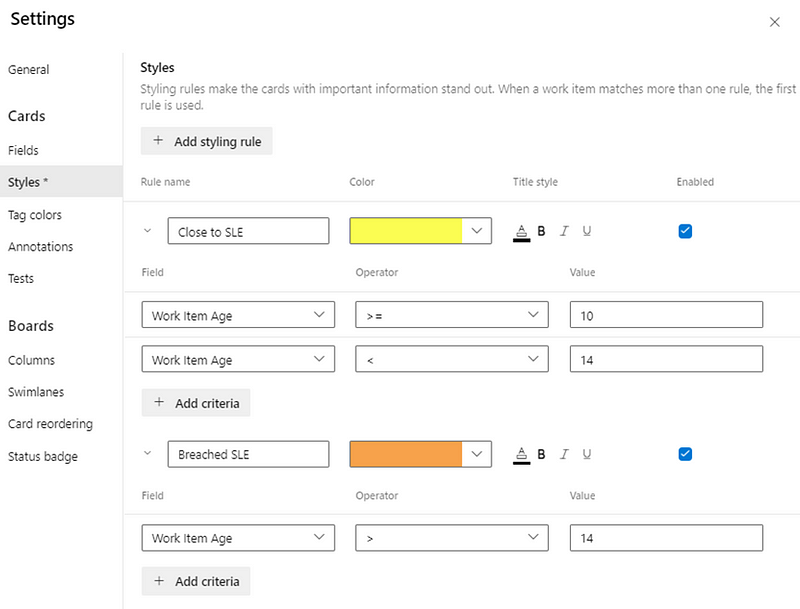
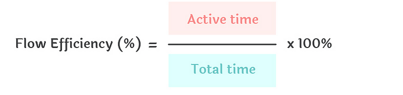
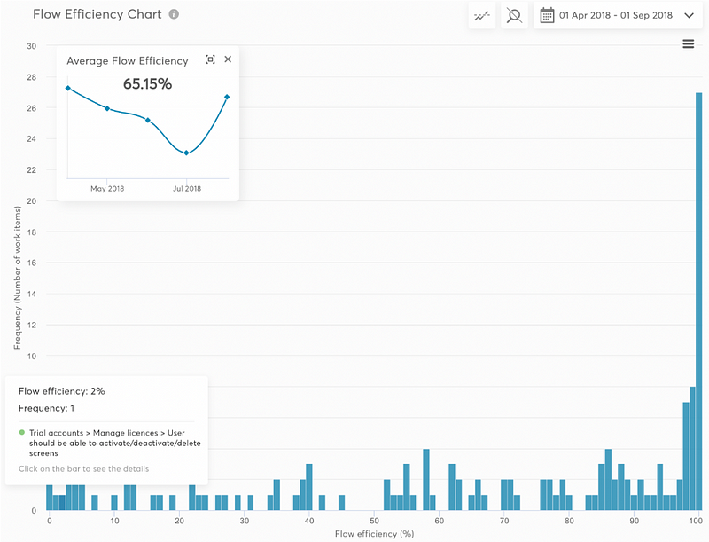
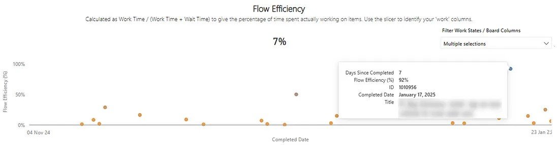
Flow Efficiency
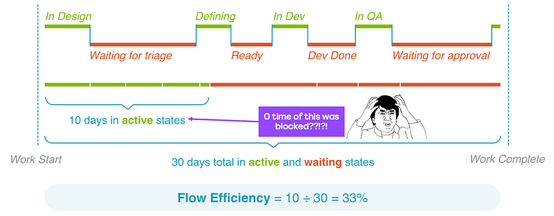
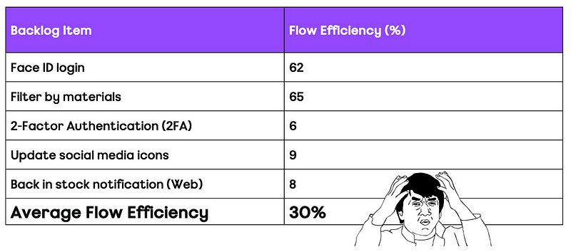
Flow efficiency is an adaptation from the lean world metric of process efficiency. This is where for a particular work item we measure the percentage of active time — i.e., time spent actually working on the item against the total time (active time + waiting time) that it took to for the item to complete.
I have blogged about the pitfalls of it as a metric before, as well as challenging what organisations see as ‘typical’ flow efficiency.

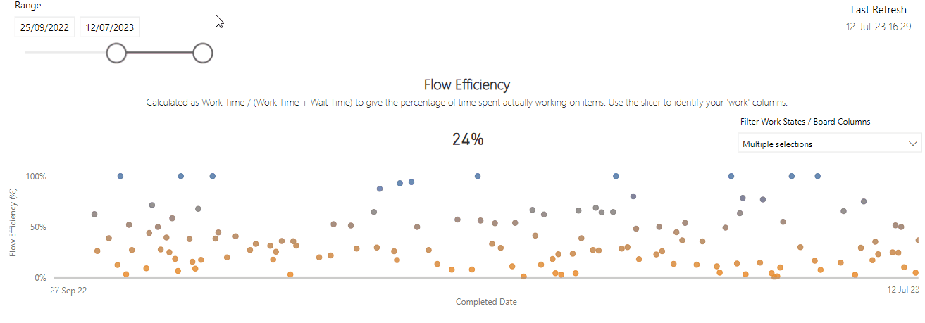
This one was probably the most surprising. A correlation coefficient of -0.343 suggests a moderate negative correlation. What this means is that as Flow Efficiency increases, Cycle Time tends to decrease. The correlation of -0.343 shows this the relationship between the two whilst not very strong is certainly meaningful.
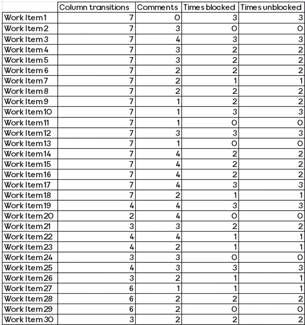
The number of times a work item was blocked
The final measure was looking at how often a work item was blocked. The thinking with this one would be if work is frequently getting blocked then surely this will increase the cycle time.

It’s worth noting a shortcoming here is not how long it was blocked for, just how often blocked. So, for example, if an item was blocked once but it was blocked for nearly all the cycle time, it would still only register as being blocked once. Similarly, this is obviously dependant on teams blocking work when it is actually blocked (and/or having a clear definition of blocked).

Here we have the weakest of all correlations, 0.021. This really surprised me as I would have thought the blocker frequency would impact cycle time, but the results of this suggest otherwise.
Summary
So what does this look like when we bring it all together? Copying the same style of DoubleLoop, we can start to see which of our measures have the strongest and weakest relationship with Cycle Time:

What does this mean for you and your teams?
Well, it’s clear that Work Item Age is the key metric to focus on, given just how closely it correlates with Cycle Time. If you’re trying to improve (reduce) Cycle Time without looking at Work Item Age, you really are wasting your efforts.
After that, you want to consider how long something has been on the backlog for (i.e. how long it was since it was created). Keeping work items regularly updated is the next thing you can be doing to reduce cycle time. Following this, retaining a balance of the time taken to start a work item and keeping an eye on the comment count would be something to consider.
The number of board columns a team has and how often work is marked as blocked seem to have no bearing on cycle time. So don’t worry too much about how simplified or complex your kanban board is, or focusing retros on those items blocked the most. That being said, a shortcoming of this data is that it is missing the impact of blockers.
Finally, stop caring so much about flow efficiency! Optimising flow efficiency is more than likely not going to make work flow faster, no matter what your favourite thought leader might say.