Metrics

Cycle Time Correlations

Improving flow is a key goal for nearly all organisations. More often than not, the primary driver for this is speed, commonly referred to as Cycle Time. As organisations try to reduce this and improve their time to (potential) value, what factors correlate with speed? This blog, inspired by the tool DoubleLoop, looks at the correlations Cycle Time has with other flow-based data…

The correlation of metrics

A few months ago I came across a tool called DoubleLoop. It is unique in that it allows you to plot your strategy in terms of your bets, the work breakdown and key metrics, all onto one page. The beauty of it is that you can see the linkage to the work you do with the metrics that matter, as well as how well (or not so well) different measures correlate with each other.

For product-led organisations, this opens up a whole heap of different options around visualising bets and their impact. The ability to see causal relationships between measures is a fantastic invitation to a conversation around measuring outcomes.

Looking at the tool with a flow lens, it also got me curious, what might these correlations look like from a flow perspective? We’re all familiar with things such as Little’s Law but what about the other practices we can adopt or the experiences we have as work flows through our system?

As speed (cycle time) is so often what people care about, what if we could see which measures/practices have the strongest relationship with this? If we want to improve our time to (potential) value, what should we be focusing on?

Speed ≠ value and correlation ≠ causation

Before looking at the data, an acknowledgement about what some of you reading may well be pointing out.

The first is that speed does not equate to value, which is a fair point, albeit one I don’t believe to be completely true. We know from the work of others that right-sizing trumps prioritisation frameworks (specifically Cost of Delay Divided by Duration — CD3) when it comes to value delivery.

Given right-sizing is part influenced by duration (in terms of calendar days), and the research above, you could easily argue that speed does impact value. That being said, the data analysed in this blog looked at work items at User Story/Product Backlog Item level, which is difficult to quantify the ‘value’ that brings.

A harder to disagree with point is the notion that correlation does not equal causation. Just like the biomass power generated in the Philippines correlates with Google searches for ‘avocado toast’, there probably isn’t a link between the two.

However, we often infer in working with our teams about things they should be doing when using visual management of work. For some, these are undoubtedly linked, for example how long an item has been in-progress is obviously going to have a strong relationship with how long it took to complete. Others are more for up for debate such as, do we need to regularly be updating work items? Or should we be going granular with our board design/workflows? The aim of this blog is to try challenge some of that thinking, backed by data.

For those curious, a total of 15,421 work items completed by 70 teams over the since June 1st 2024 were used as input to this research. Given this size, there may be other causal relationships at play (team size, length of time together, etc.) that are not included in this analysis.

Without further delay, let’s start looking at the different factors that may influence Cycle Time…

Days since an item was started (Work Item Age)

One of the most obvious factors that plays into Cycle Time is how long an item has been in-progress, otherwise known as Work Item Age.

Clearly this has the strongest correlation with Cycle Time as, when your item is in-progress, it will have been in that state for a number of days and then once it moves to ‘done’ there should never be a difference in those two values.

The results reflect that with a correlation coefficient of 1.000, and about as strong a positive correlation as you will ever see. This means that above everything else, we should always be focusing on Work Item Age if we’re trying to improve speed.

Elapsed time since a work item was created (Lead Time)

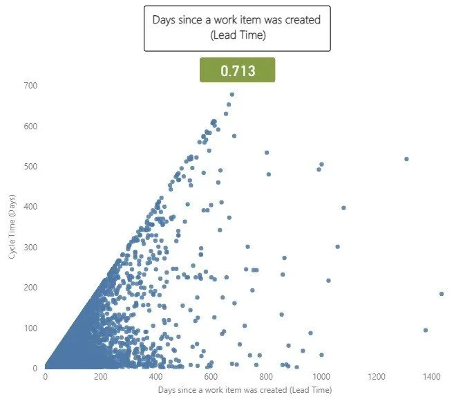
The next thing to consider is how long it’s been since an item was created. Often referred to as ‘Lead Time’, this will often be different to Cycle Time as there may be queues before work actually starts on an item.

This is useful to validate our own biases. For example, I have often made the case to teams that anything older than three months on the backlog probably should just be deleted, as YAGNI.

This had a correlation coefficient with of 0.713, which is a very strong correlation. This is to be largely expected, as longer cycle times invariably will mean longer lead times, given it (more often than not) makes up a large proportion of that metric.

Time taken to start an item

A closely related metric to this is the time (in days) it took us to start work on an item. There are two schools of thought to challenge here. One is the view of “we just need to get started” and the other being that potentially the longer you leave it, the less likely you’re going to have that item complete quickly (as you may have forgotten what it is about).

This one surprised me. I expected somewhat a stronger relationship than the 0.166 correlation. This shows there is some relationship but it is weak and therefore not going to impact your cycle time how quickly you do (or don’t!) start work on an item.

The number of comments on a work item

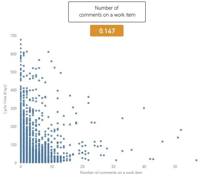
The number of comments made on a work item is the next measure to look at. The idea with this measure would be that more comments likely mean items take longer, due to their being ambiguity around the work item, blockers/delays, feedback etc.

Interestingly in this dataset there was minimal correlation, with a correlation coefficient of 0.147. This suggests there is a slight tendency for work items with more comments to have a longer cycle time, but we can see that after 12 or so comments this doesn’t seem to be true. This could be that by this point, clarification is reached/issues are resolved. Of course, once we go past this value there are far less items that have that amount of comments.

The number of updates made to a work item

How often a work item is updated is the next measure to consider. The rationale for this being teams are often focused on ensuring work items are ‘up to date’ and trying to avoid them going stale on the board:

An update is any change made to an item which, of course means that automations could be in place to skew the results. With the data used, it was very hard to determine those which were automated updates vs. genuine ones, which means there is a shortcoming in using this. There were some extreme outliers with more than 120 updates, which were easy to filter out. However once I started going past this point there was no way to easily determine which were automated vs. genuine (and I was not going to do this for all 15,421 work items!).

Interestingly here we see a somewhat stronger correlation than before, of 0.261. This is on the weak to moderate scale correlation wise. Of course this does not mean just automating updates to work items will improve flow!

The number of board columns a team has

The next measure to consider is the number of board columns a team has. The reason for looking at this is that there are different schools of thought around how ‘granular’ you should go with your board design. Some argue that To Do | Doing | Done is all that is needed. Others would say viewing by specialism helps see bottlenecks and some would even say more high-level views (e.g. Options | Identifying the problem | Solving the problem | Learning) encourages greater collaboration.

The results show that really, it doesn’t matter what you do. The weak correlation of 0.046 shows that really, board columns don’t have any part to play in relation to speed.

Flow Efficiency

Flow efficiency is an adaptation from the lean world metric of process efficiency. This is where for a particular work item we measure the percentage of active time — i.e., time spent actually working on the item against the total time (active time + waiting time) that it took to for the item to complete.

This one was probably the most surprising. A correlation coefficient of -0.343 suggests a moderate negative correlation. What this means is that as Flow Efficiency increases, Cycle Time tends to decrease. The correlation of -0.343 shows this the relationship between the two whilst not very strong is certainly meaningful.

The number of times a work item was blocked

The final measure was looking at how often a work item was blocked. The thinking with this one would be if work is frequently getting blocked then surely this will increase the cycle time.

It’s worth noting a shortcoming here is not how long it was blocked for, just how often blocked. So, for example, if an item was blocked once but it was blocked for nearly all the cycle time, it would still only register as being blocked once. Similarly, this is obviously dependant on teams blocking work when it is actually blocked (and/or having a clear definition of blocked).

Here we have the weakest of all correlations, 0.021. This really surprised me as I would have thought the blocker frequency would impact cycle time, but the results of this suggest otherwise.

Summary

So what does this look like when we bring it all together? Copying the same style of DoubleLoop, we can start to see which of our measures have the strongest and weakest relationship with Cycle Time:

What does this mean for you and your teams?

Well, it’s clear that Work Item Age is the key metric to focus on, given just how closely it correlates with Cycle Time. If you’re trying to improve (reduce) Cycle Time without looking at Work Item Age, you really are wasting your efforts.

After that, you want to consider how long something has been on the backlog for (i.e. how long it was since it was created). Keeping work items regularly updated is the next thing you can be doing to reduce cycle time. Following this, retaining a balance of the time taken to start a work item and keeping an eye on the comment count would be something to consider.

The number of board columns a team has and how often work is marked as blocked seem to have no bearing on cycle time. So don’t worry too much about how simplified or complex your kanban board is, or focusing retros on those items blocked the most. That being said, a shortcoming of this data is that it is missing the impact of blockers.

Finally, stop caring so much about flow efficiency! Optimising flow efficiency is more than likely not going to make work flow faster, no matter what your favourite thought leader might say.

Outcome focused roadmaps and Feature Monte Carlo unite!

Shifting to focusing on outcomes is key for any product operating model to be a success, but how do you manage the traditional view on wanting to see dates for features, all whilst balancing uncertainty? I’ll share how you can get the best of both worlds with a Now/Next/Later X Feature Monte Carlo roadmap…

What is a roadmap?

A roadmap could be defined as one (or many) of the following:

Where do we run into challenges with roadmaps?

Unfortunately, many still view roadmaps as merely a delivery plan to execute. They simply want a list of Features and when they are going to be done by. Now, sometimes this is a perfectly valid ask, for example if efforts around marketing or sales campaigns are dependent on Features in our product and when they will ship. More often than not though, it is a sign of low psychological safety. Teams are forced to give date estimates when they know the least and are then “held to account” for meeting that date that is only formulated once, rather than being reviewed continuously based on new data and learning. Delivery is not a collaborative conversation between stakeholders and product teams, it’s a one-way conversation.

What does ‘good’ look like?

Good roadmaps are continually updated based on new information, helping you solicit feedback and test your thinking​, surface potential dependencies and ultimately achieve the best outcomes with the least amount of risk and work​.

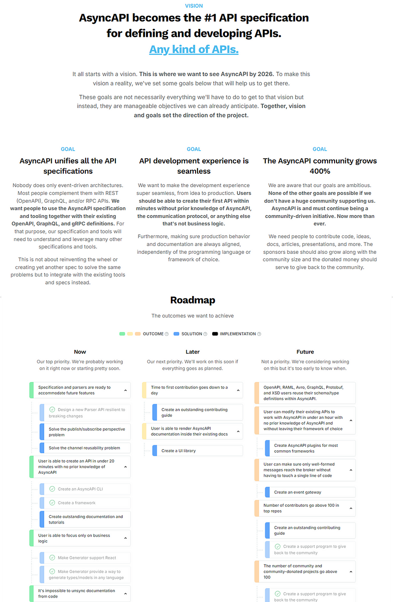
In my experience, the most effective roadmaps out there find the ability to tie the vision/mission for your product to the goals, outcomes and planned features/solutions for the product. A great publicly accessible example is the AsyncAPI roadmap:

A screenshots of the ASyncAPI roadmap

Vision & Roadmap | AsyncAPI Initiative for event-driven APIs

Here we have the whole story of the vision, goals, outcomes and the solutions (features) that will enable this all to be a success.

To be clear, I’m not saying this is the only way to roadmap, as there are tonnes of different ways you can design yours. In my experience, the Now / Next / Later roadmap, created by Janna Bastow, provides a great balance in giving insight into future trajectory whilst not being beholden to dates. There are also great templates from other well known product folk such as Melissa Perri’s one here or Roman Pichler's Go Product Roadmap to name a few. What these all have in common is they are able to tie vision, outcomes (and even measures) as well as features/solutions planned to deliver into one clear, coherent narrative.

Delivery is often the hardest part though, and crucially how do we account for when things go sideways?

The uncertainty around delivery

Software development is inherently complex, requiring probabilistic rather than deterministic thinking about delivery. This means acknowledging that there are a range of outcomes that can occur, not a single one. To make informed decisions around delivery we need to be aware of the probability of that outcome occurring so we can truly quantify the associated “risk”.

I’ve covered in a previous blog about using a Feature Monte Carlo when working on multiple features at once. This is a technique teams adopt in understanding the consequences around working on multiple Features (note: by Feature I mean a logical grouping of User Stories/Product Backlog Items), particularly if you have a date/deadline you are working towards:

An animation of a feature monte carlo chart

Please note: all Feature names are fictional for the purpose of this blog

Yet this information isn’t always readily accessible to stakeholders and means navigating to multiple sources, making it difficult to tie these Features back to the outcomes we are trying to achieve.

So how can we bring this view on uncertainty to our roadmaps?

The Now/Next/Later X Feature Monte Carlo Roadmap

The problem we’re trying to solve is how can we quickly and (ideally) cheaply create an outcome oriented view of the direction of our product, whilst still giving that insight into delivery stakeholders need, AND balance the uncertainty around the complex domain of software development?

This is where our Now/Next/Later X Feature Monte Carlo Roadmap comes into the picture.

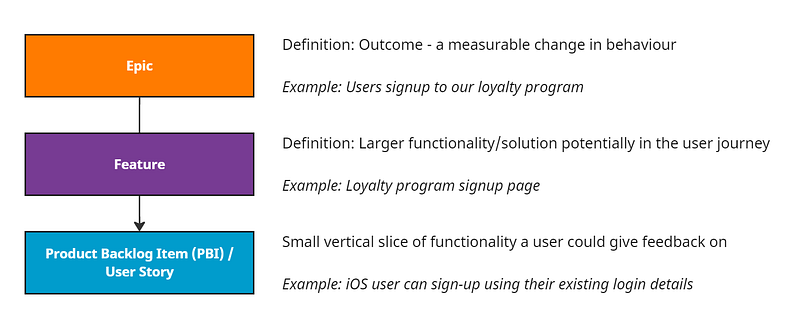
Using Azure DevOps (ADO) as our tool of choice, which has a work item hierarchy of Epic -> Feature -> Product Backlog Item/User Story. With some supporting guidance, we can make it clear around what each level should entail:

An example work item hierarchy in Azure DevOps

You can of course rename these levels if you wish (e.g. OKR -> Feature -> Story) however we’re aiming to do this with no customisation so will stick with the “out-the-box” configuration. Understanding and using this setup is important as this will be the data that feeds into our roadmap.

Now let’s take a real scenario and show how this plays out via our roadmap. Let’s say we were working on launching a brand new loyalty system for our online eCommerce site, how might we go about it?

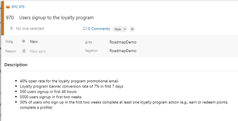
Starting with the outcomes, let’s define these using the Epic work item type in our backlog, and where it sits in our Now/Next/Later roadmap (using ‘tags’). We can also add in how we’ll measure if those outcomes are being achieved:

An example outcome focused Epic in ADO

Note: you don’t have to use the description field, I just did it for simplicity purposes!

Now we can formulate the first part of our roadmap:

A Now, Next, Later roadmap generated from ADO data

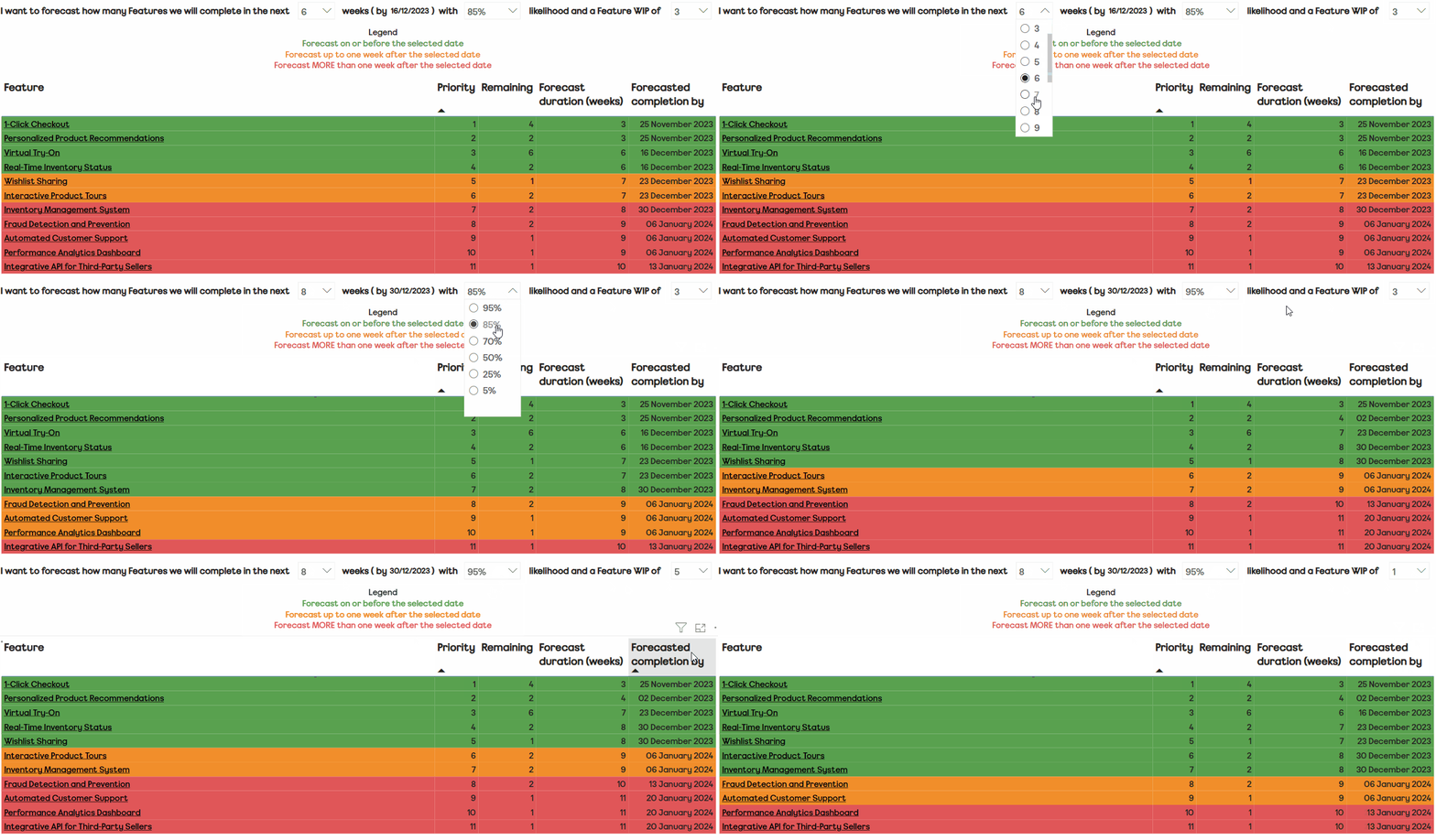
For those Epics tagged in the “Now”, we’re going to decompose those (ideally doing this as team!) into multiple Features and relevant Product Backlog Items (PBIs). This of course should be done ‘just in time’, rather than doing it all up front. Techniques like user story mapping from Jeff Patton are great for this. In order to get some throughput (completed PBIs) data, the team are then going to start working through these and moving items to done. Once we have sufficient data (generally as little as 4 weeks worth is enough), we can then start to view our Feature Monte Carlo, playing around with the parameters involved:

A Feature Monte Carlo generated from ADO data

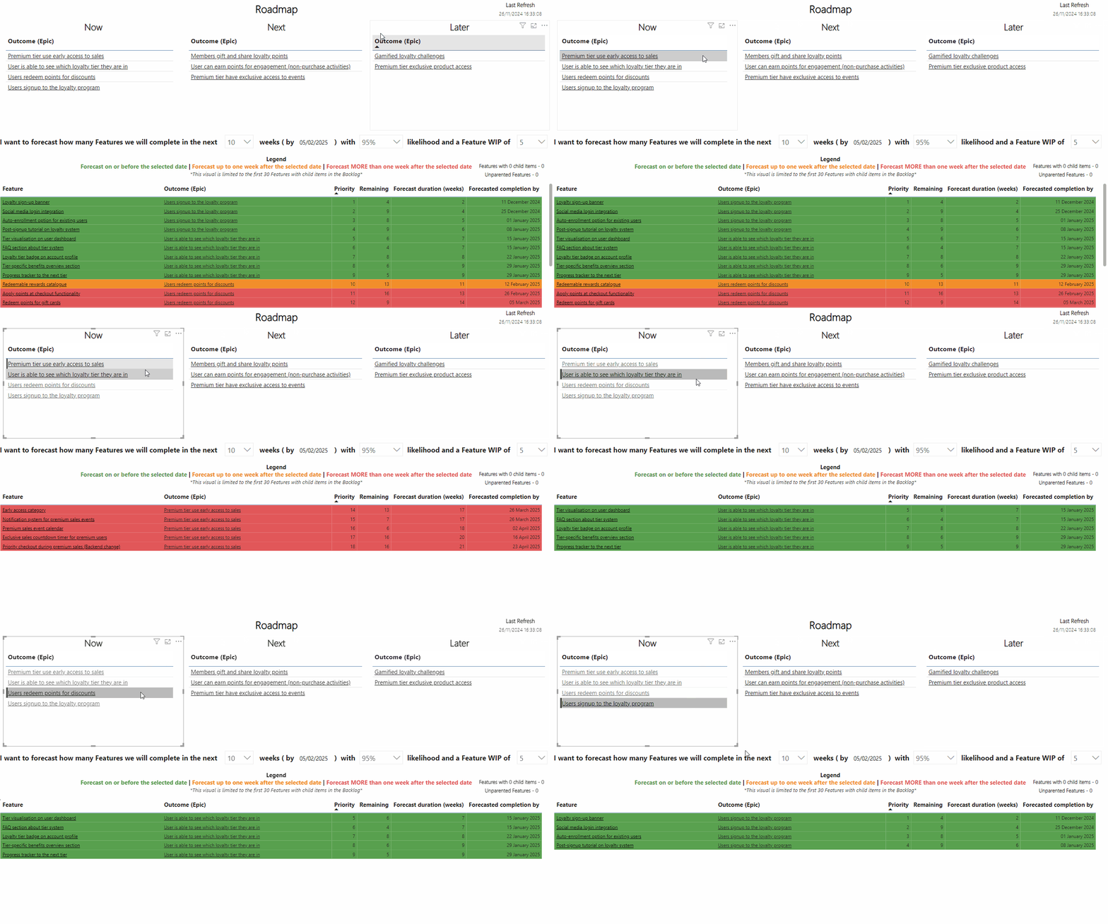
The real value emerges when we combine these two visuals. We can have the outcome oriented lens in the Now / Next / Later and, if people want to drill down to see where delivery of those Features within that Epic (Outcome) is, they can:

A now, next, later roadmap being filtered to show the Feature Monte Carlo

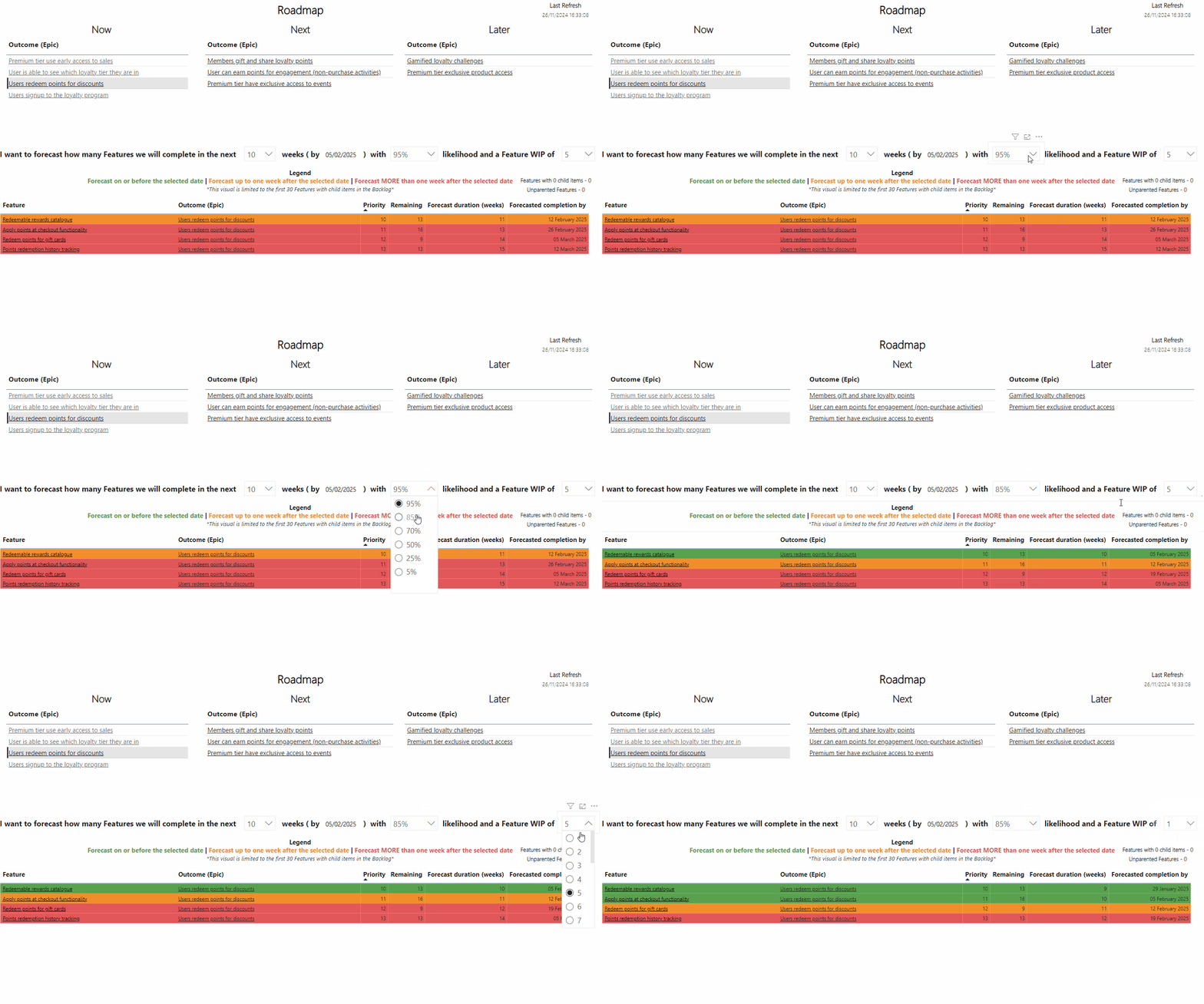
They can even play around with the parameters to understand just what would need to happen in order to make that Feature that’s at risk (Red/Amber) a reality (Green) for the date they have in mind:

A now, next, later roadmap being filtered to show the Feature Monte Carlo

It’s worth noting this only works when items in the “Now” have been broken down into Features. For our “Next” and “Later” views, we deliberately stop the dynamic updates as items at these horizons should never be focused on specific dates.

Similarly, we can also see where we have Features with 0 child items that aren’t included in the monte carlo forecast. This could be that either they’re yet to be broken down or that all the child items in it are complete but the Feature hasn’t yet moved to “done” — for example if it is waiting feedback. Similarly, it also highlights those Features that may not be linked to a parent Epic (Outcome):

A Feature monte carlo highlighted with Features without parents and/or children.

Using these tools allows for our roadmap becomes an automated, “living” document generated from our backlog that shows outcomes and the expected dates of the Features that can enable those outcomes to be achieved. Similarly, we can have a collaborative conversation around risk and what factors (date, confidence, scope change, WIP) are at play. In particular, leverage the power of adjusting WIP means we can finally add proof to that agile soundbite of “stop starting, start finishing”.
Interested in giving this a try? Check out the GitHub repo containing the Power BI template then plug in your ADO data to get started…

Objectively measuring “predictability”

Predictability is often one of the goals organisations seek with their agile teams but, in the complex domain, how do you move past say-do as a measurement for predictability? This post details how our teams at ASOS Tech can objectively look at this whilst accounting for variation and complexity in their work…

Predictability is often the panacea that many delivery teams and organisations seek. To be clear, I believe predictability to be one of a balanced set of themes (along with Value, Flow, Delivery and Culture), that teams and organisations should care about when it comes to agility.
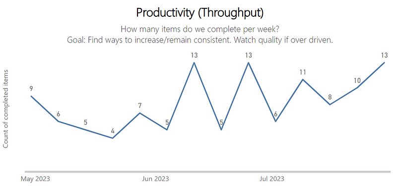
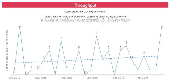
Recently, I was having a conversation around this topic with one of our Lead Software Engineers about his team. He explained how the team he leads had big variation in their weekly Throughput and therefore were not predictable, with the chart looking like so:
Upon first glance, my view was the same. The big drops and spikes suggested too much variation for this to be useful from a forecasting perspective (in spite of the positive sign of an upward trend!) and that this team was not predictable.

The challenge, as practitioners, is how do we validate this perspective? 

Is there a way that we can objectively measure predictability?

What predictability is not

Some of you may be reading and saying that planned vs. actual is how we can/should measure predictability. Often referred to as “say-do ratio”, this once was a fixture in the agile world with the notion of “committed” items/story points for a sprint. Sadly, many still believe this is a measure to look at, when in fact the idea of a committed number of items/points left the Scrum Guide more than 10 years ago. Measuring this has multiple negative impacts on a team, which this fantastic blog from Ez Balci explains.

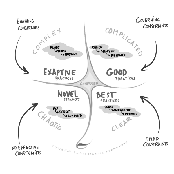
Planned Vs. Actual / Committed Vs. Delivered / Say-Do are all measurement relics of the past we need to move on from. These are appropriate when the work is clear, for example when I go to the supermarket and my wife gives me a list of things we need, did I get what we needed? Did I do what I said I was going to do? Software development is complex, we are creating something (features, functionality, etc.) from nothing through writing lines of code.

About — Cynefin Framework — The Cynefin Co

Thinking about predictability as something that is ‘black and white’ like those approaches encourage simply does not work, therefore we need a better means of looking at predictability that considers this.

What we can use instead

Karl Scotland explored similar ideas around predictability in a blog post, specifically looking at the difference in percentiles of cycle time data. For example if there is a significant difference in your 50th percentile compared to your 85th percentile. This is something that as a Coach I also look at, but more to understand variation than being predictable. Karl himself shared in a talk after exploring the ideas from the blog further how this was not a useful measure around predictability.

Which brings us on to how we can do it, using a Process Behaviour Chart (PBC). A PBC is a type of graph that visualises the variation in a process over time. It consists of a running record of data points, a central line that represents the average value, and upper and lower limits (referred to as Upper Natural Process Limit — UNPL and Lower Natural Process Limit — LNPL) that define the boundaries of routine variation. A PBC can help to distinguish between common causes and exceptional causes of variation, and to assess the predictability and stability of a process.

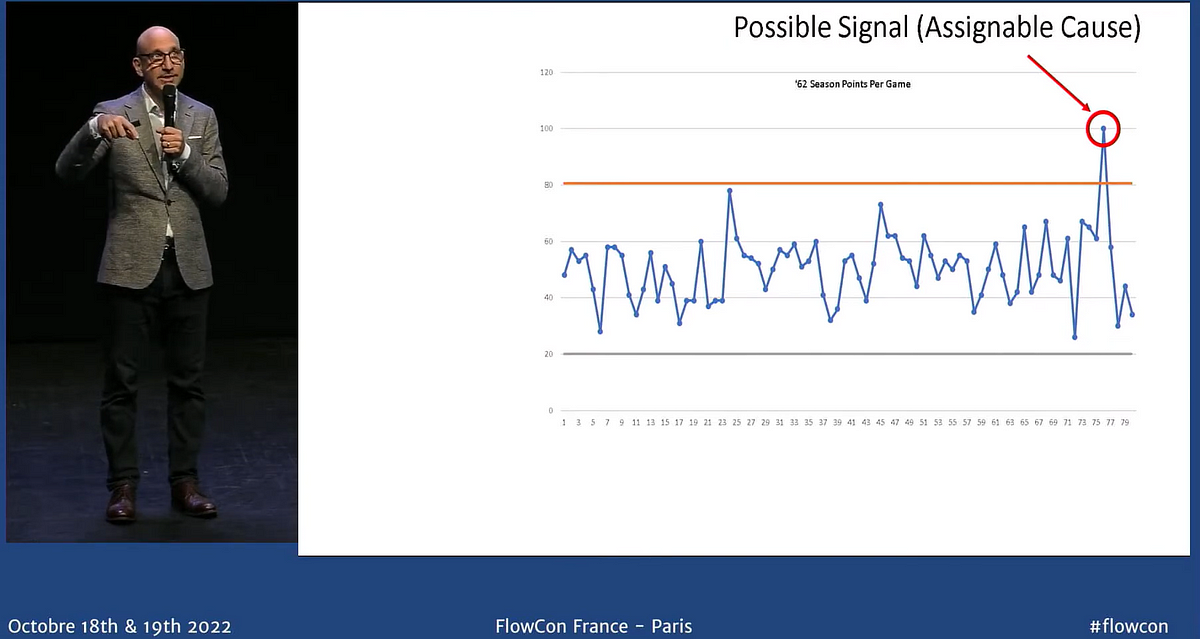
I first gained exposure to this chart through watching the Lies, damned lies, and teens who smoke talk from Dan Vacanti, as well as learning more through one of my regular chats with a fellow coach, Matt Milton. Whilst I will try my best not to spoil the talk, Dan looks at Wilt Chamberlains points scoring over the 1962 season in a PBC and in particular if the 100 point game should be attributed to what some say it was.

Dan Vacanti — Lies, Damned Lies, and Teens Who Smoke

In his new book, Actionable Agile Metrics Volume II: Advanced Topics in Predictability, Dan goes to great lengths in explaining the underlying concepts behind variation and how to calculate/visualise PBCs for all four flow metrics of Throughput, Cycle Time, Work In Progress (WIP) and Work Item Age.

With software development being complex, we have to accept that variation is inevitable. It is about understanding how much variation is too much. PBCs can highlight to us when a team's process is predictable (within our UNPL and LNPL lines) or unpredictable (outside our UNPL and LNPL lines). It therefore can (and should) be used as an objective measurement of predictability.

Applying to our data

If we take our Throughput data shown at the beginning and put it into a PBC, we can now get a sense for if this team is predictable or not:

We can see that in fact, this team is predictable. Despite us seemingly having lots of up and down values in our Throughput, all those values are within our expected range. It is worth noting that Throughput is the type of data that is zero bound as it is impossible for us to have a negative Throughput. So, by default, our LNPL is considered to be 0.

Another benefit of these values being predictable is that it also means that we can confidently use this data as input for forecasting delivery of multiple items using Monte Carlo simulation.

What about the other flow metrics?

We can also look at the same chart for our Cycle Time, Work In Progress (WIP) and Work Item Age flow metrics. Generally, 10–20 data points is the sweet spot for the baseline data in a PBC (read the book to understand why), so we can’t quite use the same time duration as our Throughput chart (as this aggregated weekly for the last 14 weeks).

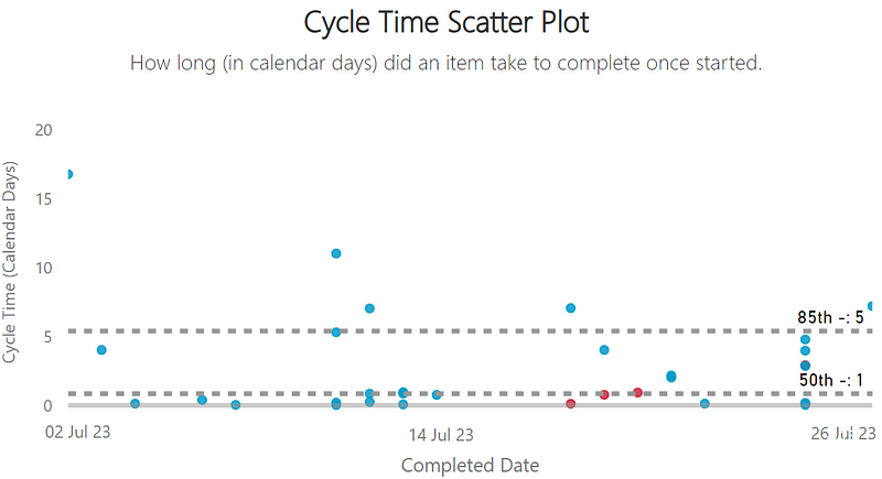
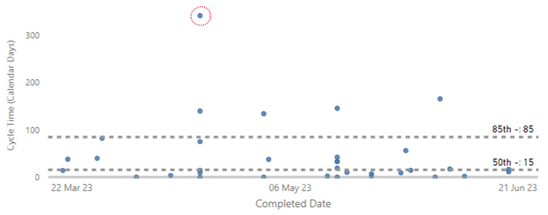
If we were to look at the most recent completed items in that same range and their Cycle Time, putting it in a PBC gives us some indication as to what we should be focusing on:

The highlighted item would be the one to look at if you were wanting to use cycle time as an improvement point for a team. Something happened with this particular item that made it significantly different than all the others in that period. This is important as, quite often, a team might look at anything above their 85th percentile, which for the same dataset looks like so:

That’s potentially four additional data points that a team might spend time looking at which were in fact just routine variation in their process. This is where the PBC helps us, helping to separate signal from noise.

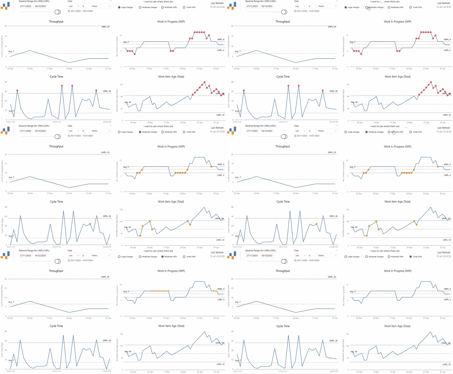
With a PBC for Work In Progress (WIP), we can get a better understanding around where our WIP has increased to the point of making us unpredictable:

We often would look to see if we are within our WIP limits when in fact, there is also the possibility (as shown in this chart) of having too low WIP, as well as too high. There may be good reasons for this, for example keeping WIP low as we approach Black Friday (or as we refer to it internally as— Peak) so there is capacity if teams need to work on urgent items.

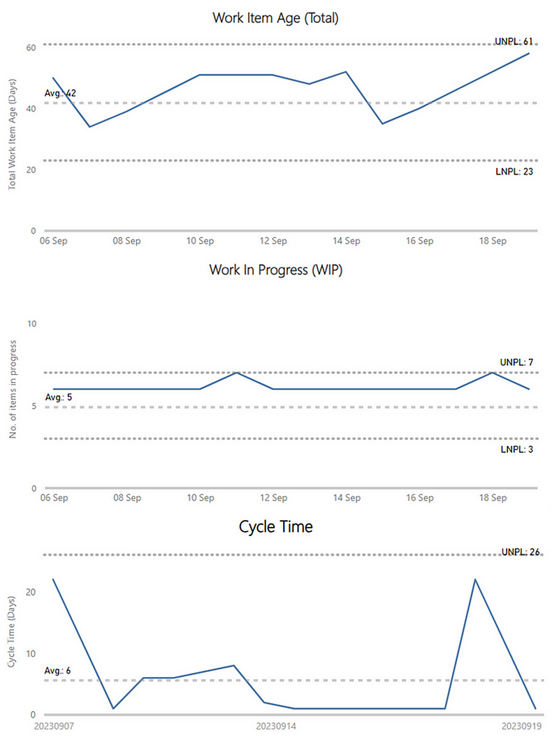
Work Item Age is where it gets the most interesting. As explained in the book, looking at this in a PBC is tricky. Considering we look at individual items and their status, how can we possibly put this in a chart that allows us to look at predictability? This is where tracking Total Work Item Age (which Dan credits to Prateek Singh) helps us:

Total Work Item Age is simply the sum of the Ages of all items that are in progress for a given time period (most likely per day). For example, let’s say you have 4 items currently in progress. The first item’s Age is 12 days. The second item’s Age is 2 days. The third’s is 6 days, and the fourth’s is 1 day. The Total Age for your process would be 12 + 2 + 6 + 1 = 21 days…using the Total Age metric a team could see how its investment is changing over time and analyse if that investment is getting out of control or not.
Plotting this gives new insight, as a team may well be keeping their WIP within limits, yet the age of those items is a cause for concern:

Interestingly, when discussing this in the ProKanban Slack, Prateek made the claim that he believes Total Work Item Age is the new “one metric to rule them all”. Stating that keeping this within limits and the other flow metrics will follow…and I think he might be onto something:

Summary

So, what does this all mean?

Well, for our team mentioned at the very beginning, the Lead Software Engineer can be pleased. Whilst it might not look it on first glance, we can objectively say that from a Throughput perspective their team is in fact predictable. When looking at the other flow metrics for this team, we can see that we still have some work to be done to understand what is causing the variation in our process.

As Coaches, we (and our teams) have another tool in the toolbox that allows us and our teams to quickly, and objectively, validate how ‘predictable’ they are. Moving to something like this allows for an objective lens on predictability, rather than relying on differing opinions of people who are interpreting data different ways. To be clear, predictability is of course not the only thing (but it is one of many) that matters. If you’d like to try the same for your teams, check out the template in this GitHub repo (shout out to Benjamin Huser-Berta for collaborating on this as well — works for both Jira and Azure DevOps).

Mastering flow metrics for Epics and Features

Flow metrics are a great tool for teams to leverage for an objective view in their efforts towards continuous improvement. Why limit them to just teams? 

This post reveals how, at ASOS, we are introducing the same concepts but for Epic and Feature level backlogs…

Flow at all levels

Flow metrics are one of the key tools in the toolbox that we as coaches use with teams. They are used as an objective lens for understanding the flow of work and measuring the impact of efforts towards continuous improvement, as well as understanding predictability.
One of the challenges we face is how we can improve agility at all levels of the tech organisation. Experience tells us that it does not really matter if you have high-performing agile teams if they are surrounded by other levels of backlogs that do not focus on flow:
Source:

Jon Smart

(via

Klaus Leopold — Rethinking Agile

)

As coaches, we are firm believers that all levels of the tech (and wider) organisation need to focus on flow if we are to truly get better outcomes through our ways of working.

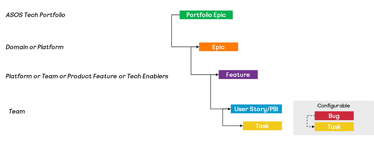
To help increase this focus on flow, we have recently started experimenting with flow metrics at the Epic/Feature level. This is mainly because the real value for the organisation comes at this level, rather than at an individual story/product backlog item level. We use both Epic AND Feature level as we have an element of flexibility in work item hierarchy/levels (as well as having teams using Jira AND Azure DevOps), yet the same concepts should be applicable. Leaving our work item hierarchy looking something like the below:

Note: most of our teams use Azure DevOps — hence the hierarchy viewed this way

Using flow metrics at this level comprises of the typical measures around Throughput, Cycle Time, Work In Progress (WIP) and Work Item Age, however, we provide more direct guidance around the questions to ask and the conversations to be having with this information…

Throughput

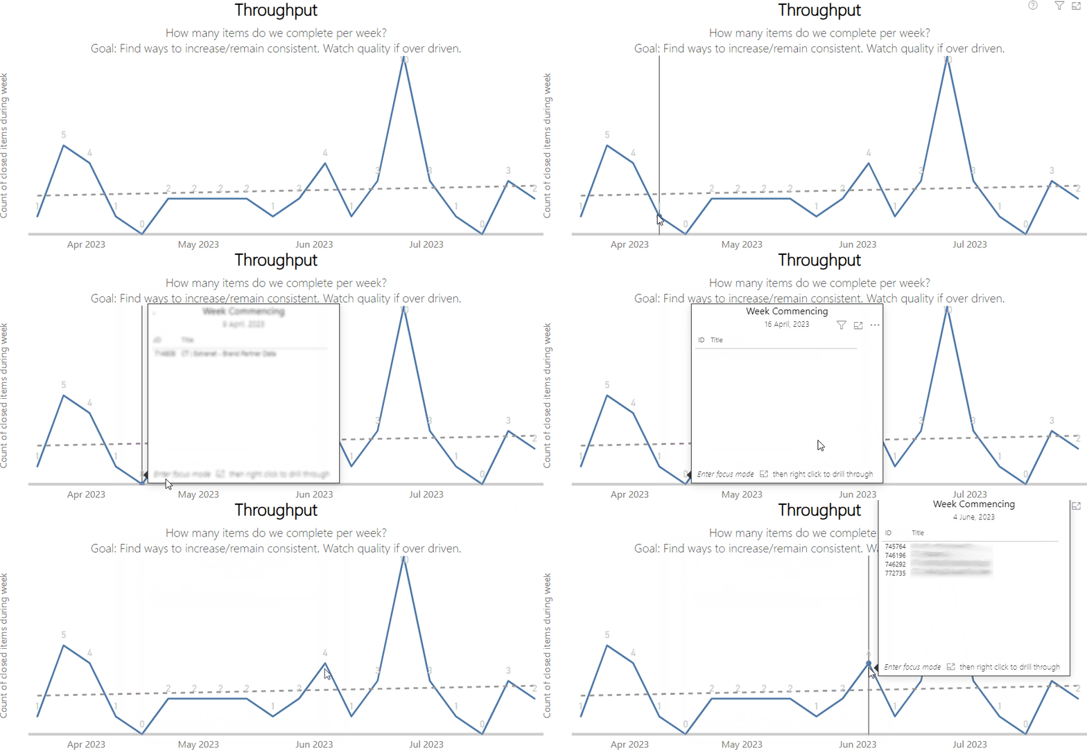
Throughput is the number of Epics/Features finished per unit of time. This chart shows the count completed per week as well as plotting the trend over time. The viewer of the chart is able to hover over a particular week to get the detail on particular items. It is visualised as a line chart to show the Throughput values over time:

In terms of how to use this chart, some useful prompts are:

What work have we finished recently and what are the outcomes we are seeing from this?

Throughput is more of an output metric, as it is simply a count of completed items. What we should be focusing on is the outcome(s) these items are leading to. When we hover on a given week and see items that are more ‘customer’ focused we should then be discussing the outcomes we are seeing, such as changes in leading indicators on measures like unique visits/bounce rate/average basket value on ASOS.com.

For example, if the Epic around Spotify partnerships (w/ ASOS Premier accounts) finished recently:

We may well be looking at seeing if this is leading to increases in ASOS Premier sign-ups and/or the click-through rate on email campaigns/our main site:

The click-through rate for email/site traffic could be a leading indicator for the outcomes of that Epic

If an item is more technical excellence/tech debt focused then we may be discussing if we are seeing improvements in our engineering and operational excellence scores of teams.

What direction is the trend? How consistent are the values?

Whilst Throughput is more output-oriented, it could also be interpreted as a leading indicator for value. If your Throughput is trending up/increasing, then it could suggest that more value is being delivered/likely to be delivered. The opposite would be if it is trending downward.

We also might want to look at the consistency of the values. Generally, Throughput for most teams is ‘predictable’ (more on this in a future post!) however it may be that there are spikes (lots of Epics/Features moving to ‘Done’) or periods or zeros (where no Epics/Feature moved to ‘Done’) that an area needs to consider:

Yes, this is a real platform/domain!

Do any of these items provide opportunities for learning/should be the focus of a retrospective?

Hovering on a particular week may prompt conversation about particular challenges had with an item. If we know this then we may choose to do an Epic/Feature-based retrospective. This sometimes happens for items that involved multiple platforms. Running a retrospective on the particular Epic allows for learning and improvements that can then be implemented in our overall tech portfolio, bringing wider improvements in flow at our highest level of work.

Cycle Time

Cycle Time is the amount of elapsed time between when an Epic/Feature started and when it finished. Each item is represented by a dot and plotted against its Cycle Time (in calendar days). In addition to this, the 85th and 50th percentile cycle times for items in that selected range are provided. It is visualised as a scatter plot to easily identify patterns in the data:

In terms of how to use this chart, some useful prompts are:

What are the outliers and how can we learn from these?

Here we look at those Epics/Features that are towards the very top of our chart, meaning they took the longest:

These are useful items to deep dive into/run a retrospective on. Finding out why this happened and identifying ways to try to improve to prevent this from happening encourages continuous improvement at a higher level and ultimately aids our predictability.

What is our 85th percentile? How big is the gap between that and our 50th percentile?

Speaking of predictability, generally, we advise platforms to try to keep Features to be no greater than two months and Epics to be no greater than four months. Viewing your 85th percentile allows you to compare what your actual size for Epics/Features is, compared to the aspiration of the tech organisation. Similarly, we can see where there is a big gap in those percentile values. Aligned with the work of Karl Scotland, too large a gap in those values suggests there may be too much variability in your cycle times.

What are the patterns from the data?

This is the main reason for visualising these items in a scatter plot. It becomes very easy to spot when we are closing off work in batches and have lots of large gaps/white space where nothing is getting done (i.e. no value being delivered):

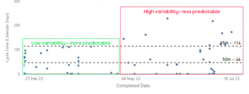
We can also see maybe where we are closing Epics/Features frequently but have increased our variability/reduced our predictability with regards to Epic/Feature cycle time:

Work In Progress (WIP)

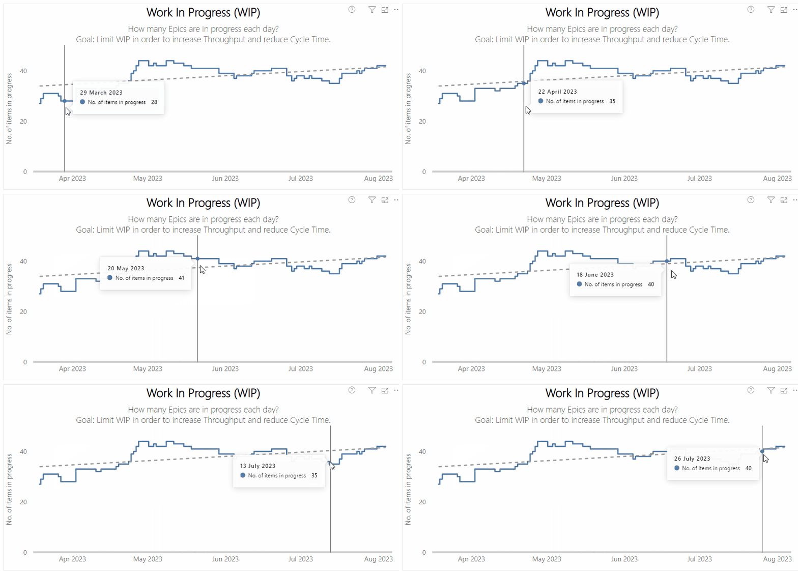
WIP is the number of Epics/Features started but not finished. The chart shows the number of Epics/Features that were ‘in progress’ on a particular day. A trend line shows the general direction WIP is heading. It is visualized as a stepped line chart to better demonstrate changes in WIP values:

In terms of how to use this chart, some useful prompts are:

What direction is it trending?

We want WIP to be level/trending downward, meaning that an area is not working on too many things. An upward trend alludes to potentially a lack of prioritisation as more work is starting and then remaining ‘in progress’.

Are we limiting WIP? Should we change our WIP limits (or introduce them)?

If we are seeing an upward trend it may well be that we are not actually limiting WIP. Therefore we should be thinking about that and discussing if WIP limits are needed as a means of introducing focus for our area. If we are using them, advanced visuals may show us how often we ‘breach’ our WIP limits:

A red dot represents when a column breached its WIP limit

Hovering on a dot will detail which specific column breached its WIP on the given day and by how much.

What was the cause of any spikes or drops?

Focusing on this chart and where there are sudden spikes/drops can aid improvement efforts. For example, if there was a big drop on a given date (i.e. lots of items moved out of being in progress), why was that? Had we lost sight of work and just did a ‘bulk’ closing of items? How do we prevent that from happening again?

The same goes for spikes in the chart— meaning lots of Epics/Features moved in progress. It certainly is an odd thing to see happen at Epic/Feature level but trust me it does happen! You might be wondering when could this happen — in the same way, some teams hold planning at the beginning of a sprint and then (mistakenly) move everything in progress at the start of the sprint, an area may do the same after a semester planning event — something we want to avoid.

Work Item Age

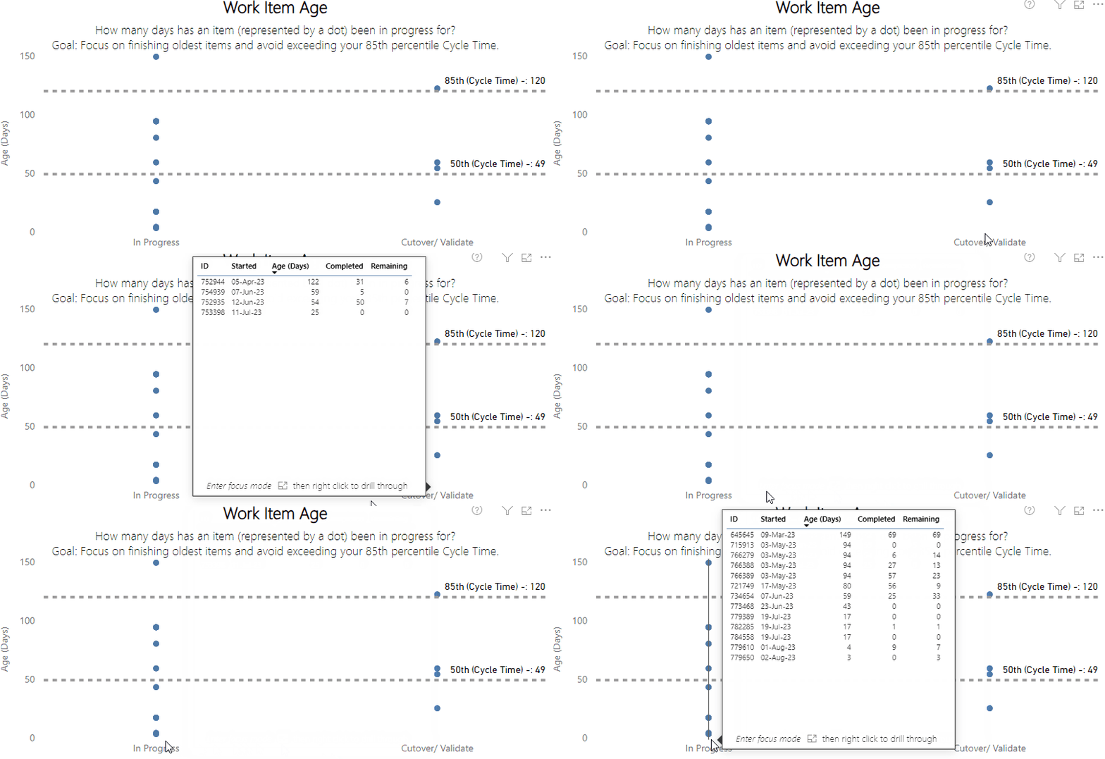
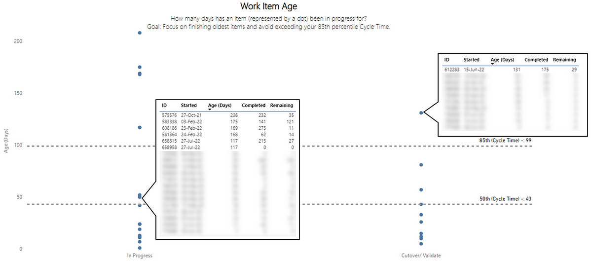
Work Item Age shows the amount of elapsed time between when an Epic/Feature started and the current time. These items are plotted against their respective status in their workflow on the board. For the selected range, the historical cycle time (85th and 50th percentile) is also plotted. Hovering on a status reveals more detail on what the specific items are and the completed vs. remaining count of their child items. It is visualised as a dot plot to easily see comparison/distribution:

In terms of how to use this chart, some useful prompts are:

What are some of our oldest items? How does this compare to our historical cycle time?

This is the main purpose of this chart, it allows us to see which Epics/Features have been in progress the longest. These really should be the primary focus as this represents the most risk for our area as they have been in flight the longest without feedback. In particular, those items that are above our 85th percentile line are a priority, as now these are larger than 85% of the Epics/Features we completed in the past:

The items not blurred are our oldest and would be the first focus point

The benefit of including the completed vs. remaining (in terms of child item count) provides additional context so we can then also understand how much effort we have put in so far (completed) and what is left (remaining). The combination of these two numbers might also indicate where you should be trying to break these down as, if a lot of work has been undertaken already AND a lot remains, chances are this hasn’t been sliced very well.

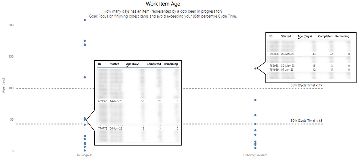
Are there any items that can be closed (Remaining = 0)?

These are items we should be looking at as, with no child items remaining, it looks like these are finished.

The items not blurred are likely items that can move to ‘Done’

Considering this, they really represent ‘quick wins’ that can get an area flowing again — getting stuff ‘done’ (thus getting feedback) and in turn reducing WIP (thus increasing focus). In particular, we’ve found visualizing these items has helped our Platform Leads in focusing on finishing Epics/Features.

Why are some items in progress (Remaining = 0 and Completed = 0)?

These are items we should be questioning why they are actually in progress.

Items not blurred are likely to be items that should not be in progress

With no child items, these may have been inadvertently marked as ‘in progress’ (one of the few times to advocate for moving items backwards!). It may, in rare instances, be a backlog ‘linking’ issue where someone has linked child items to a different Epic/Feature by mistake. In any case, these items should be moved backwards or removed as it’s clear they aren’t actually being worked on.

What items should we focus on finishing?

Ultimately, this is the main question this chart should be enabling the conversation around. It could be the oldest items, it could be those with nothing remaining, it could be neither of those and something that has become an urgent priority (although ignoring the previous two ‘types’ is not advised!). Similarly, you should also be using it in proactively managing those items that are getting close to your 85th percentile. If they are close to this value, it’s likely focusing on what you need to do in order to finish these items should be the main point of discussion.

Summary

Hopefully, this post has given some insights about how you can leverage flow metrics at Epic/Feature Level. In terms of how frequently you should look at these then, at a minimum, I’d recommend this is done weekly. Doing it too infrequently means it is likely your teams will be unclear on priorities and/or will lose sight of getting work ‘done’. If you’re curious how we do this, these charts are generated for teams using either Azure DevOps or Jira, using a Power BI template (available in this repo).

Comment below if you find this useful and/or have your own approaches to managing flow of work items at higher levels in your organisation…

Our survey says…uncovering the real numbers behind flow efficienc

Flow Efficiency is a metric that is lauded as being a true measure of agility yet it has never had any clear data supporting it, until now. This blog looks at over 60 teams here in ASOS and what numbers they see from a flow efficiency perspective…

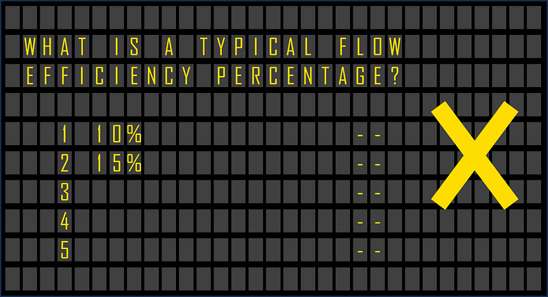
A mockup of a family fortunes scoreboard for flow efficiency

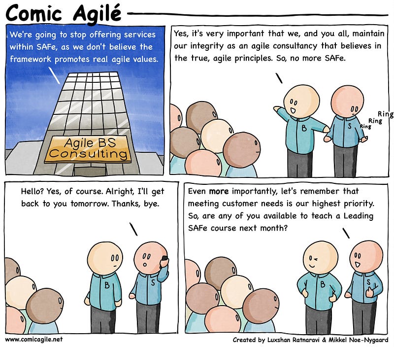
Not too long ago, I risked the wrath of the lean-agile world by documenting the many flaws of flow efficiency. It certainly got plenty of engagement — as it currently is my second most read article on Medium. On the whole it seemed to get mostly positive engagement (minus a few rude replies on LinkedIn!) which does make me question why it still gets traction through things like the flow framework and Scaled Agile Framework (SAFe). I put it down to something akin to this:

A comic of mocking a consutlancy changing their mind on selling SAFe

Source: No more SAFe

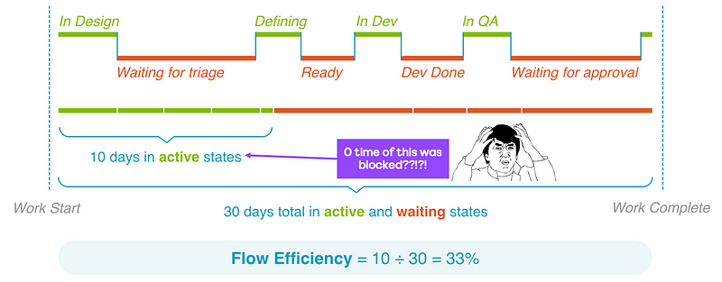
For those who missed the last post and are wondering what it is, flow efficiency is an adaptation of a metric from the lean world known as process efficiency. This is where, for a particular work item, we measure the percentage of active time — i.e., time spent actually working on the item against the total time (active time + waiting time) that it took to for the item to complete.

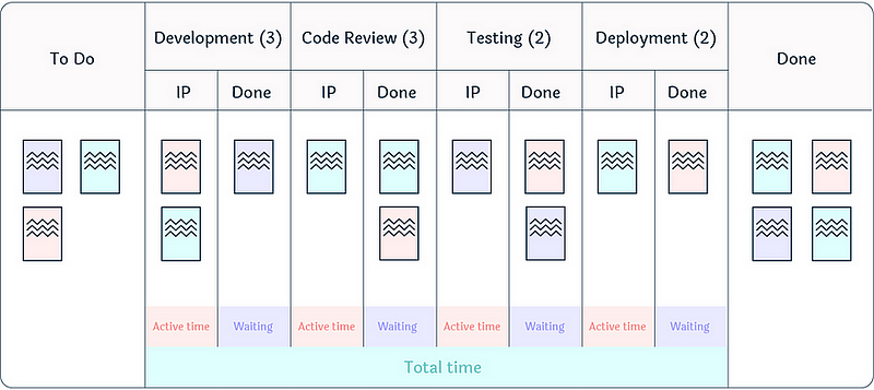
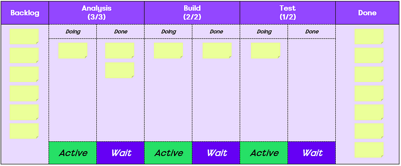
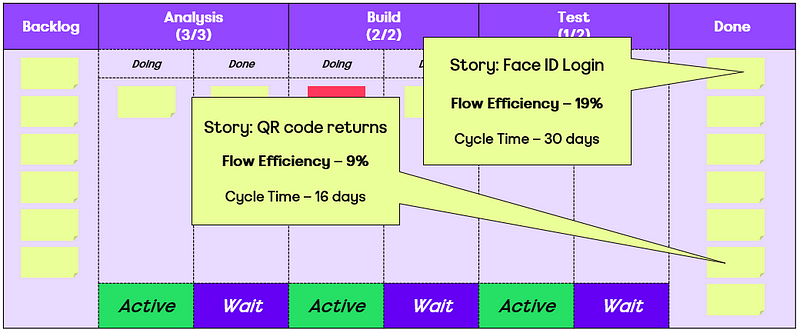
For example, if we were to take a team’s Kanban board, it may look something like this:

An example kanban board

Source: Flow Efficiency: Powering the Current of Your Work

Flow efficiency is therefore calculated like so:

An explanation of the flow efficiency calculation of active time divided by total time multiplied by 100

One of my main issues with Flow Efficiency is the way it is lauded as the ‘thing’ to measure. There are plenty of anecdotal references to it, yet zero evidence and/or data to back up the claims. Here’s some of the top results on Google:

None of these statements have any data to support the claims they make. Rather than bemoan this further, I thought, in line with the previous blog on Monte Carlo forecasting accuracy and with the abundance of teams we have in ASOS Tech, let’s actually look at what the data says…

Gathering data

At ASOS, I am very fortunate as a coach that those before me such as Helen Meek, Duncan Walker and Ian Davies, all invested time in educating teams about agility and flow. When randomly selecting teams for this blog, I found that none of the teams were missing “queues” in their workflow, which is often the initial stumbling block for measuring flow efficiency.

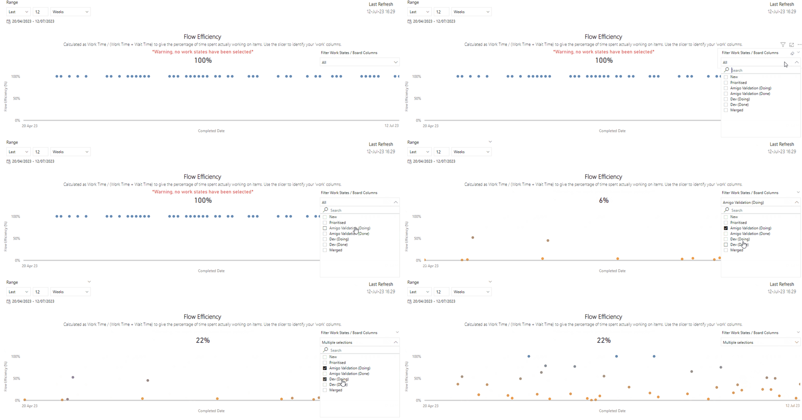
Flow Efficiency is one of the many metrics we have available to our ASOS Tech teams, to use when it comes to measuring their flow of work and as an objective lens in their efforts towards continuous improvement. Teams choose a given time period and select which steps in their workflow are their ‘work’ states (i.e. when work on an item is actually taking place):

An animation showing how teams configure their flow efficiency metric

Once they have done this, a chart will then plot the Flow Efficiency for each respective item against the completed date, as well as showing the average for all the completed items in that period. The chart uses a coloured scale to highlight those items with the lowest flow efficiency (in orange) through to those with the highest (in blue):

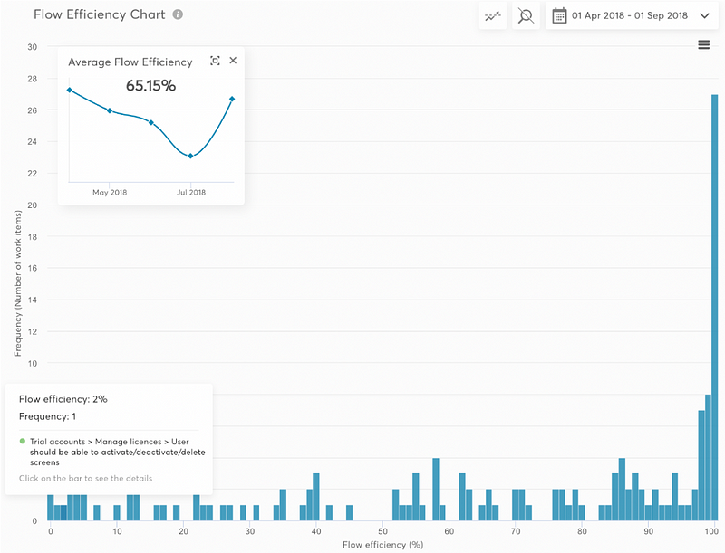
An example of a flow efficiency chart showing 29% for a completed item

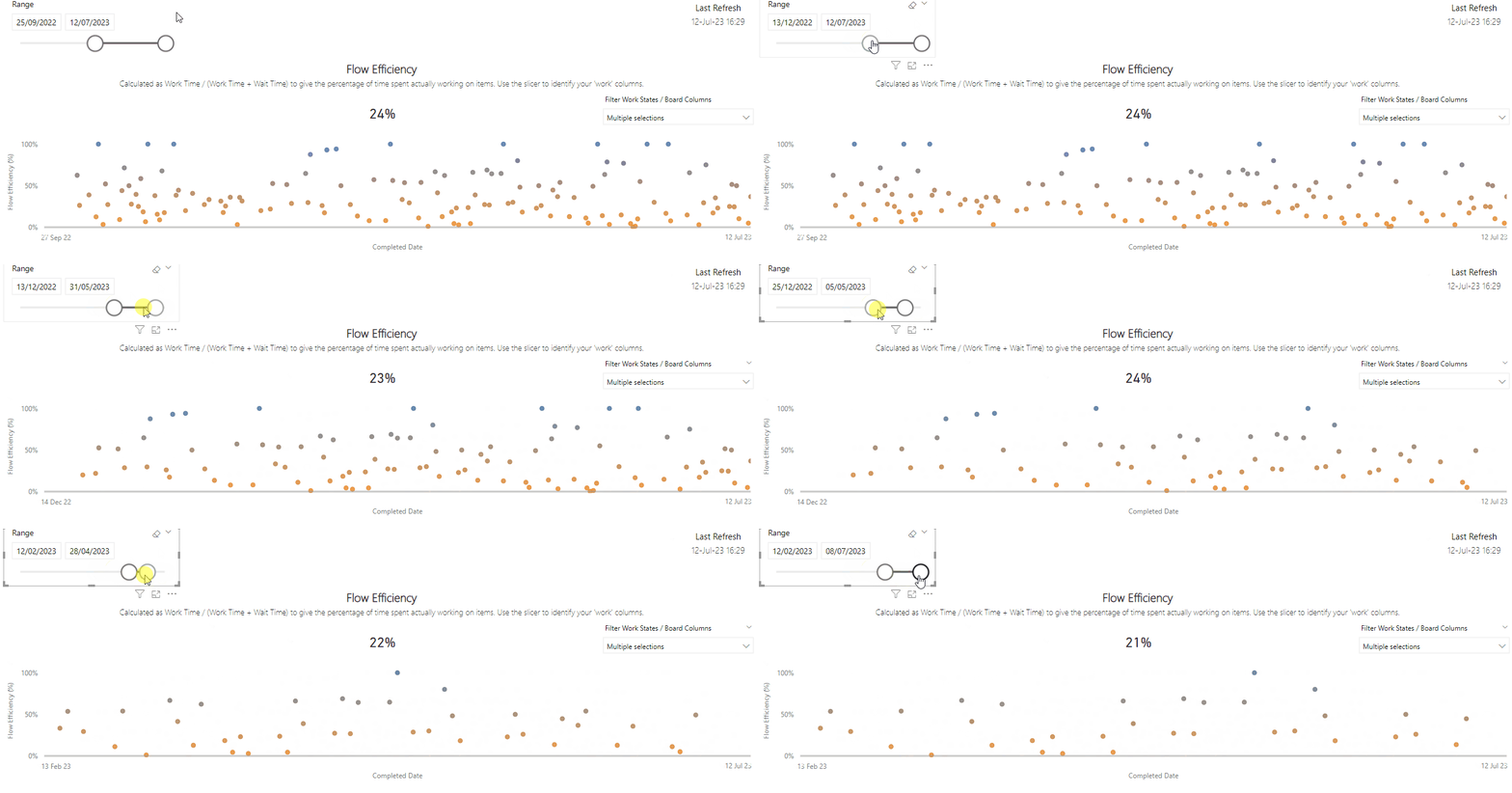
For this article, I did this process for 63 teams, playing around with the date slicer for periods over the last twelve months and finding the lowest and highest average flow efficiency values for a given period:

An animation showing the date range showing different flow efficiency calculations

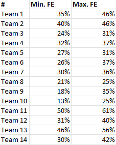
This was then recorded in my dataset like so:

A table showing the minimum and maximum flow efficiency measures for a team

All teams use a blend of different practices and frameworks — some use Scrum/ScrumBut, others use more Kanban/continuous flow or blend these with things like eXtreme Programming. Some teams are working on things you will see on the front-end/customer facing parts of the journey (e.g. Saved Items), others back-end system (e.g. tools we use for stock management and fulfilment).

Now that I’ve explained the data capture process — let’s look at the results!

Our survey says…

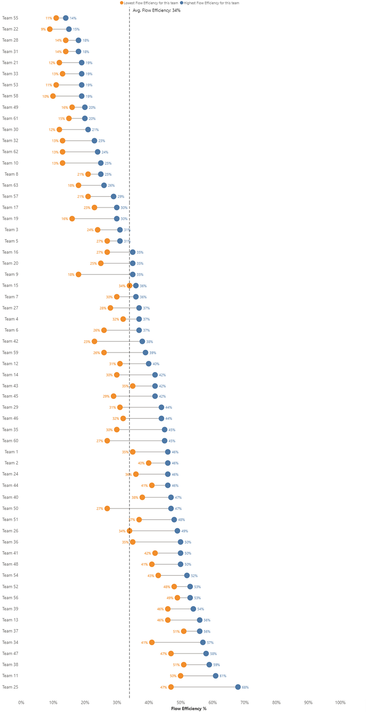
With so many teams to visualize, it’s difficult to find a way to show this that satisfies all. I went with a dumbbell chart as this allows us to show the variance in lowest-highest flow efficiency value per team and the average across all teams:

A summary dumbbell chart of the results showing a range of 9–68%

Some key findings being:

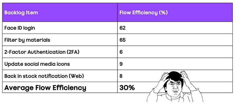
  • We actually now have concrete data around flow efficiency! We can see that with this study flow efficiency values from 9–68% have been recorded

  • The average flow efficiency is 35%

  • Flow efficiency has variability — any time you hear someone say they have seen flow efficiency values typically of n% (i.e. a single number), treat this with caution/scepticism as it should always be communicated as a range. We can see that all teams had variation in their values, with 38% of the teams in this data (25 of 63 teams) actually having a flow efficiency difference of >10%

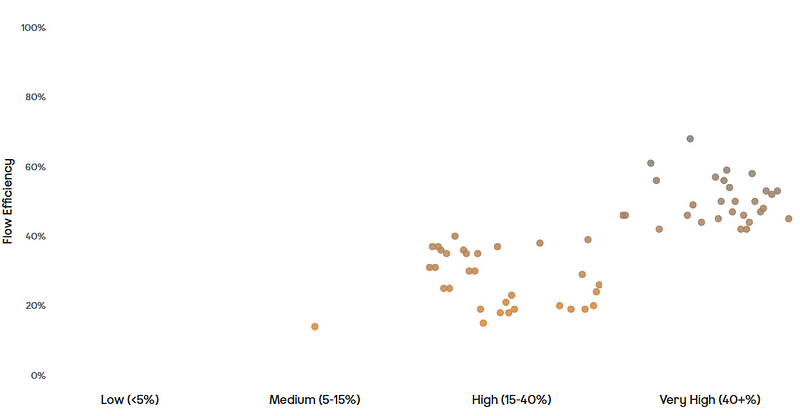
  • If we were to take some of those original quotes and categorised our flow efficiency based on what is ‘typically’ seen in to groups of Low (<5%), Medium (5–15%), High (15–40%) and Very High (>40%) then the teams would look something like this:

A chart showing the distribution of results

The problem with this is, whilst we do everything we can to reduce dependencies on teams and leverage microservices, there is no way nearly all teams have either high or very high flow efficiency.

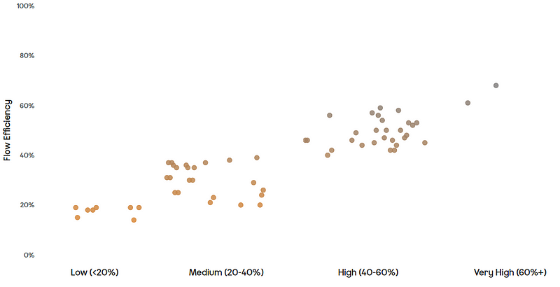
I believe a better categorisation that we should move to would be — Low (<20%), Medium (20–40%), High (40–60%) and Very High (>60%), as this would look like:

A chart showing an updated distribution of the results

But, but…these numbers are too high?!

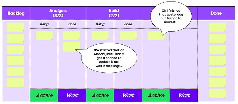
Perhaps you might be reading this and have your own experiences and/or share the same views as those sources referenced at the beginning of the blog. There is no way I can disagree with your lived experience but I do think that when talking about numbers people need to be prepared to bring more to the conversation than anecdotal reference points. Are these numbers a reflection of the “true” flow efficiency of those items? Definitely not! There is all the nuances of work items not being updated in real time, work being in active states on evenings/weekends when it clearly isn’t being worked on (I hope!), work actually being blocked but not marked as blocked etc. — all of which I explained in the previous article.

Let’s take a second and look at what it would mean practically if you wanted to get a more ‘accurate’ flow efficiency number. Assume a team has a workflow like so:

An example kanban board

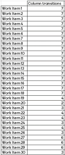
If we take for example, 30 work items that have been completed by this team in a one month period. We assume that 60% of those items went through all columns (7 transitions) and the remaining 40% skip some columns (2 to 6 transitions) — allowing for some variability in how items move through our workflow:

An example table of data showing column transitions

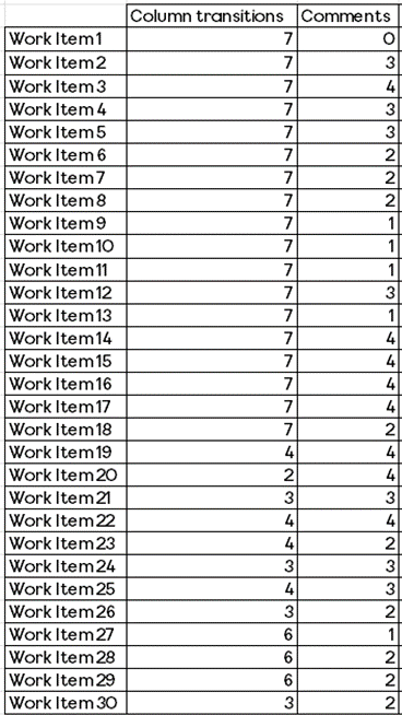
Then we assume that, like all teams at ASOS (or teams using tools like Azure DevOps or Jira), they comment on items. This could be to let people know something has progressed, clarify part of the acceptance criteria, ask a question, etc. Let’s say that this can happen anywhere from 0–4 times per item:

An example table of data showing column transitions and comment count

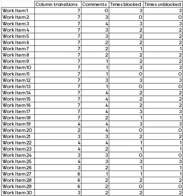
Not only that but we also mark an item when it is blocked and also then unblocked:

An example table of data showing column transitions, comment count, times blocked and unblocked

Note: randomised using Excel

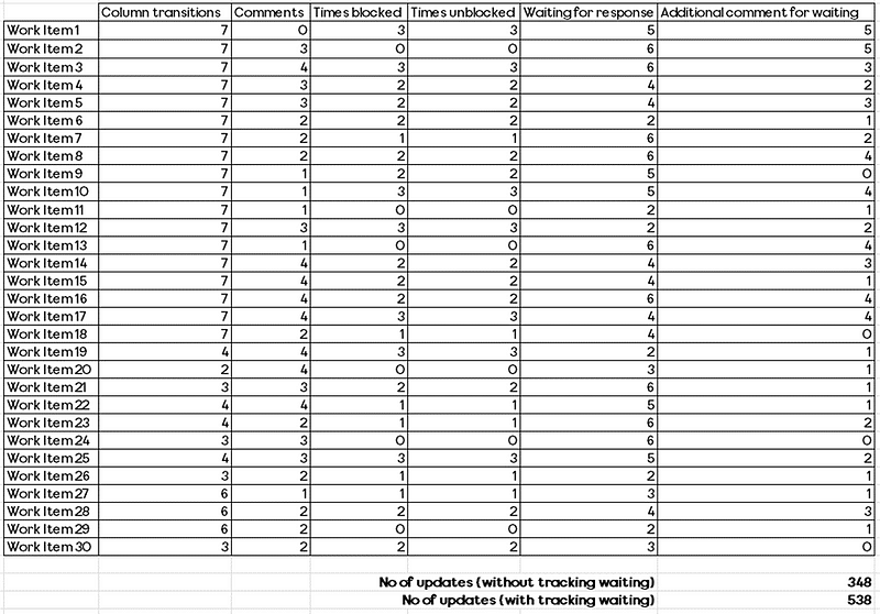
Now, if we just look at that alone, that means 348 updates to work items in a one month period. If we then wanted to add in when work is waiting, we would need to account for a few (2) or many (6 — conservatively!) times an item is waiting, as well as adding a comment sometimes (but not all the time) so that people know the reason why it is waiting:

An example table of data showing column transitions, comment count, times blocked and unblocked, wait time and waiting reason

Random values again calculated via Excel :)

We can already see that with these conservative guesses we’re adding nearly 200 more updates to just 30 work items. Once you start to do this at scale, whether that be for more items and/or more teams as well as over a longer period, you can see just how much additional work this means for teams in interacting with their tool of choice. Combine this with the costs of context switching (i.e. moving out of being ‘in the work’ to log into the tool that you are ‘waiting’) and you can see why tracking flow efficiency to more accuracy is a fools errand.

Summary

My hope is that we can now start to have a proper conversation around what ‘typical’ flow efficiency numbers we see. Whether it be what ‘typical’ values you see or what a ‘high’ flow efficiency looks like. To my knowledge this is the first attempt at something like this in our industry… and it should not be the last! In addition to this, I wanted to demonstrate what it would truly mean if you wanted a team to place more focus on getting an ‘accurate’ flow efficiency value.

For those wondering if it has changed my opinion on flow efficiency, as you can probably tell it has not. What I would say is that I have cooled a little on flaw #1 of teams not modelling queues in their workflow, given nearly all these teams had multiple queue states modelled (after good training/coaching). I still stand by the other flaws that come with it and now I hope folks who are familiarising themselves with it have this information as a common reference point when determining its appropriateness for them and their context.

What are the alternatives? Certainly Work Item Age would be a good starting point, as items aging at a rate greater than your historical cycle time might allude to an inefficient way of working. Another approach could also be looking at blocked work metrics and insights those bring.

What are your thoughts on the findings? Surprised? Sceptical? 

Let me know in the replies what you think…

Adding a Service Level Expectation to your Azure DevOps board using Power Automate

The final part in this series of three blogs covering how you can add flow metrics directly into your kanban board in Azure DevOps. This part covers how to add in your Service Level Expectation (SLE). Check out part one if you want to add Work Item Age or part two for adding Cycle Time

What is a Service Level Expectation (SLE)?

As per the Kanban Guide:

The SLE is a forecast of how long it should take a single work item to flow from started to finished. The SLE itself has two parts: a period of elapsed time and a probability associated with that period (e.g., “85% of work items will be finished in eight days or less”). The SLE should be based on historical cycle time, and once calculated, should be visualized on the Kanban board. If historical cycle time data does not exist, a best guess will do until there is enough historical data for a proper SLE calculation.

I’ve highlighted the part that is most relevant for this blog, which is about making this visible on the kanban board. Again, like the previous posts, some assumptions are made as part of this:

  • Within Azure DevOps (ADO) you have an inherited process template and access to edit this

  • You know how to generate a PAT in ADO and have already done so with full or analytics read access

  • States and state categories in your process template are configured correctly

  • You have access to Power Automate (Microsoft’s automation tool)

  • We are using data (not a best guess) to calculate our SLE and that we have enough data for it

  • We are calculating the SLE for all items on the kanban board (i.e. not breaking this down by work item type)

  • We are going to use the 85th percentile cycle time for all items flowing through our board as our SLE

Deciding where our SLE will go

The kanban guide is not explicit about where the SLE should go, simply that it should be visualized on the board. Given we are working with ADO, it limits our options in where we can make this visible. For the purpose of this blog, we will focus on how we can add it to the work item form, although the wrap up at the end of this blog will show another way that it can be done…

Adding custom fields for Cycle Time percentiles

Consistent with the previous blogs on Work Item Age and Cycle Time, we will add a couple of custom fields to our work item form. Keeping with the same theme of focusing on a single work item type, we are again going to use Product Backlog Item as our chosen type.

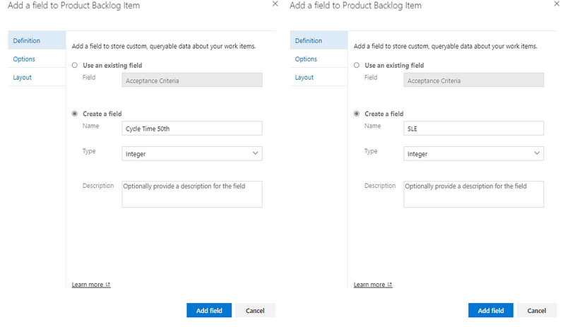
We are going to add two custom fields to the form. ‘Cycle Time 50th’ will be for the 50th percentile of Cycle Time and ‘SLE’ will be the field for the 85th percentile cycle time (our chosen percentile for our SLE). Again make sure both of these are configured as integer type fields:

Now, an optional step here is to hide these fields on the work item form. We can still populate these fields (and make them visible on the board and/or query them) but it just means less ‘distraction’ from an end user perspective:

Now those are done, we can move onto the automation!

Adding the SLE to the work item

We will start by making a slight tweak to our query we created when configuring our Work Item Age automation. If you go back to that query, you want to add in to your column options ‘Cycle Time 50th’ and ‘SLE’:

After this we are going to go to Power Automate. There are two options here for the type of automation we choose and how up to date you want your SLE to be. One way is to take the same approach we did for our Cycle Time automation and setup an automated cloud flow which would then have the SLE update as and when an item moves to ‘Closed’.

The other way (and the way this blog will cover how to do) is to use a scheduled cloud flow like we did for our Work Item Age automation:

However, what we are going to do is set this up to run more than once a day. Mainly because multiple items will (hopefully!) be moving to done during the day and we want our SLE to be as close to real-time as possible. I’ve gone with the following schedule of running every four hours:

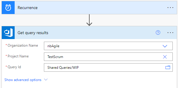
Our next step is the same as our Work Item Age one, where we will get our query results:

Again, ensure that you input the relevant Organization Name and Project Name where you have created the query:

Following this we will add a step to Initialize variable (called ‘DateRange’). This is where we are going to dynamically look at the last 12 weeks’ worth of cycle time to calculate our percentiles. The reason why we use 12 weeks is so that we have a good amount of samples in our dataset — feel free to use less or more if you prefer. Our variable is going to be called DateRange of type String, with the following expression:

formatDateTime(subtractFromTime(utcNow(), 12, 'Week'), 'yyyy-MM-ddTHH:mm:ssZ')

The next part is where we are going to do something different than previous. Rather than add a step, we are going to ‘Add a parallel branch’:

The reason why is because we are populating both our 50th percentile AND our SLE (85th percentile) on the work item form, therefore we want them to run in parallel.

Under each branch, you are going to add a step to initialize a variable. One should be called CT85 (for the 85th percentile), the other CT50 (for the 50th percentile). Both should be of type ‘Float’:

Next we are going to add an Apply to each step under each branch, populating it with the value from our ‘Get query results’ step:

After this we are going to add a step under each branch to Get work item details. Here we want to make sure our Organization Name and Project Name match what we entered at the beginning and we are going to populate our ‘Work Item Type’ and ‘Work Item Id’ fields as dynamic content from our Get query results step:

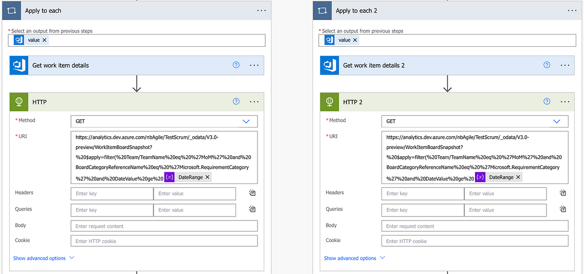
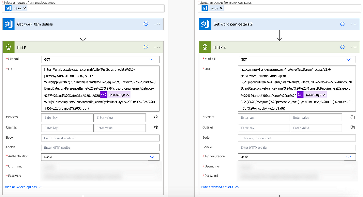
Next we are going to add a HTTP step under each branch. This is where we are going to get our cycle time percentile data. Same as before the method should be ‘GET’ and our URL should consist of the first part (same for both):

https://analytics.dev.azure.com/ORG/PROJECT/_odata/V3.0-preview/WorkItemBoardSnapshot?%20$apply=filter(%20Team/TeamName%20eq%20%27TEAM%20NAME%27%20and%20BoardCategoryReferenceName%20eq%20%27Microsoft.RequirementCategory%27%20and%20DateValue%20ge%20

Please note —it is essential here that the ORG | PROJECT | TEAM NAME values match your own ADO project, otherwise it will fail.

Next it’s the dynamic content of the DateRange variable:

Then we do something slightly different. On the branch that is the 85th percentile you need to add the following:

%20)%20/compute(%20percentile_cont(CycleTimeDays,%200.85)%20as%20CT85)%20/groupby(%20(CT85))

For the branch that is the 50th percentile you need to add the following:

%20)%20/compute(%20percentile_cont(CycleTimeDays,%200.5)%20as%20CT50)%20/groupby(%20(CT50))

Which should then look like so:

Then click ‘Show advanced options’ for both branches and add in your PAT:

Next we are going to add in a Parse JSON step. Similar to before, this is where we are going to extract the CycleTimeDays value. For both choose ‘body’ from your previous HTTP step.

For your 85th percentile branch your schema should be:

{
    "type": "object",
    "properties": {
        "@@odata.context": {
            "type": "string"
        },
        "value": {
            "type": "array",
            "items": {
                "type": "object",
                "properties": {
                    "@@odata.id": {},
                    "CT85": {
                        "type": "number"
                    }
                },
                "required": [
                    "@@odata.id",
                    "CT85"
                ]
            }
        }
    }
}

For your 50th percentile it should be:

{
    "type": "object",
    "properties": {
        "@@odata.context": {
            "type": "string"
        },
        "value": {
            "type": "array",
            "items": {
                "type": "object",
                "properties": {
                    "@@odata.id": {},
                    "CT50": {
                        "type": "number"
                    }
                },
                "required": [
                    "@@odata.id",
                    "CT50"
                ]
            }
        }
    }
}

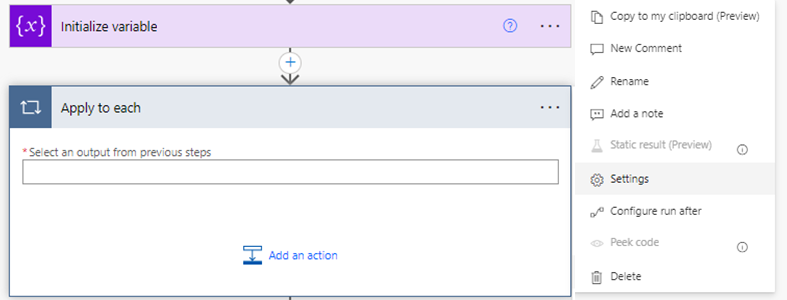
For our next step we are going to add an Apply to each for each branch. Before adding a step we need to add a concurrency control, which we do via clicking the three dots next to ‘Apply to each’ and then ‘Settings’:

Then we want to turn Concurrency Control to ‘On’ and set our degree of parallelism to 1:

Please make sure you do this for both branches!

After this we can select ‘value’ from our Parse JSON step for our ‘Select an output from previous steps’ field:

Then we are going to add a step to Set Variable which, for our respective branches, we are using dynamic content to populate the value field:

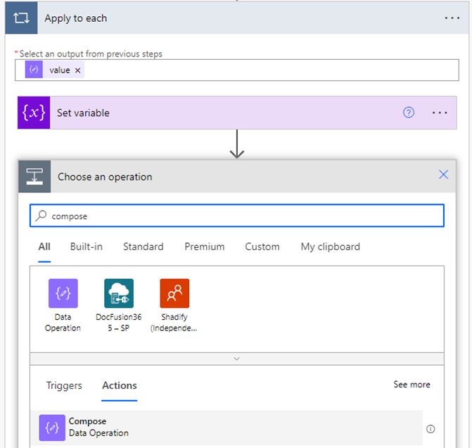
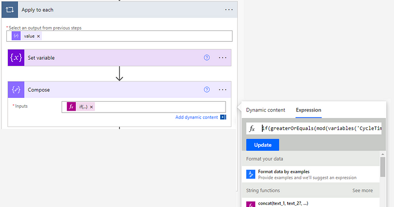
Next is a Compose step where we will use an expression. For our 85th percentile this should be:

if(greaterOrEquals(mod(variables('CT85'),1),0.5),formatNumber(variables('CT85'),'0'),if(less(mod(variables('CT85'),1),0.5),if(equals(mod(variables('CT85'),1),0),formatNumber(variables('CT85'),'0'),add(int(first(split(string(variables('CT85')),'.'))),1)),first(split(string(variables('CT85')),'.'))))

For our 50th percentile it should be:

if(greaterOrEquals(mod(variables('CT50'),1),0.5),formatNumber(variables('CT50'),'0'),if(less(mod(variables('CT50'),1),0.5),if(equals(mod(variables('CT50'),1),0),formatNumber(variables('CT50'),'0'),add(int(first(split(string(variables('CT50')),'.'))),1)),first(split(string(variables('CT50')),'.'))))

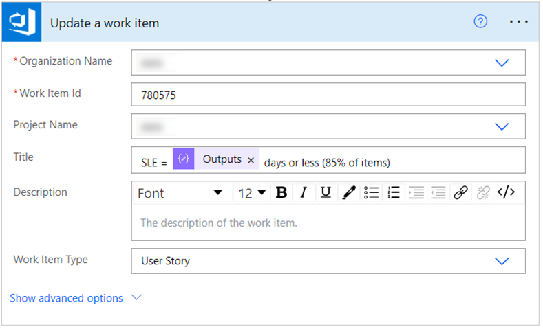
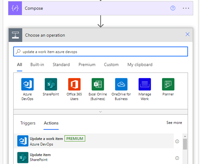
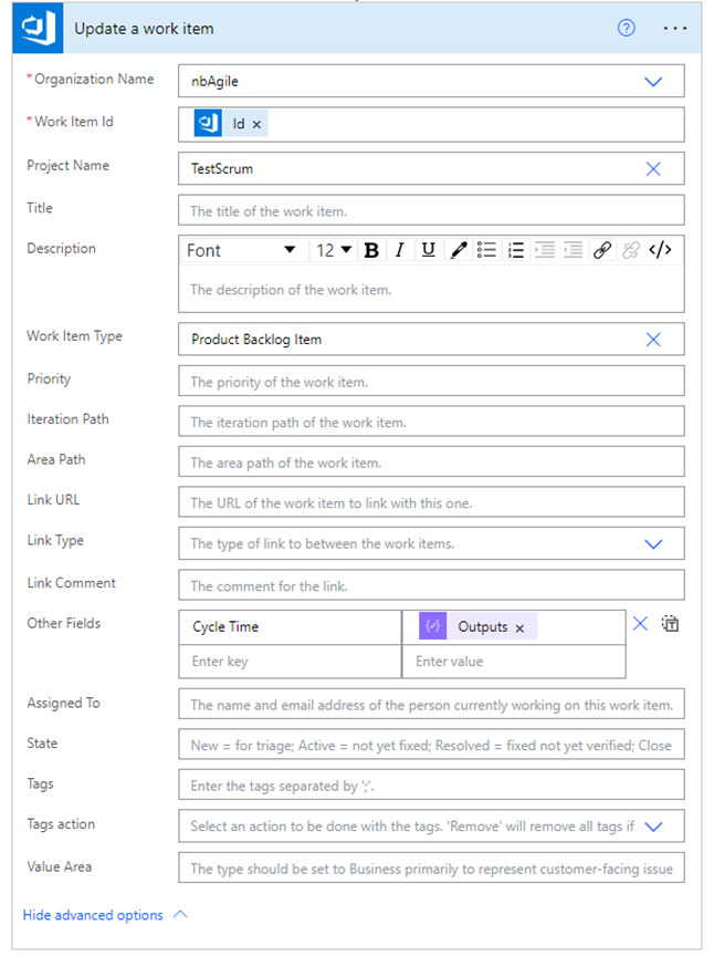
Final step for each branch is to Update a work item. This is where we are going to be adding the percentiles to the respective work item. Here we need to make sure the organization and project match what we entered previously. Our ‘Id’ and ‘Work item type’ should be dynamic content from our previous steps. Finally our respective fields for the SLE or 50th percentile should match the names we gave them at the very beginning and the values should be the ‘outputs’ of our previous Compose steps.

That’s the automation complete! Make sure all your step names match the above images and hit ‘Test’ to give it a test run:

Making this visible on the kanban board

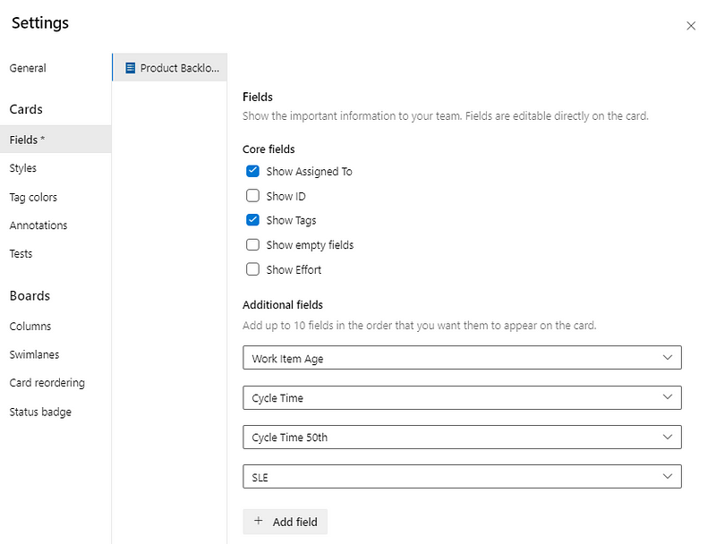
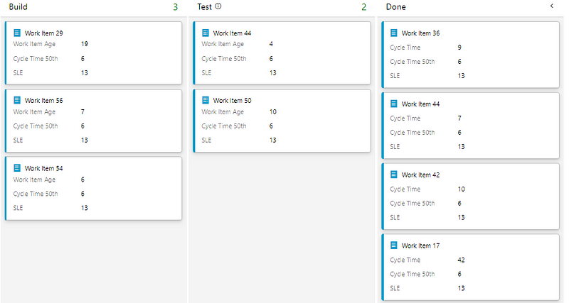
The final step is to make these fields visible on the kanban board. To do this we need to go into our board settings and find the respective work item type. Under ‘Additional fields’ you’ll want to add Cycle Time 50th and SLE:

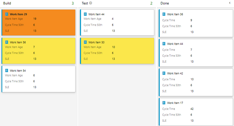
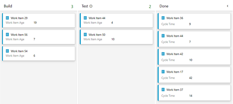
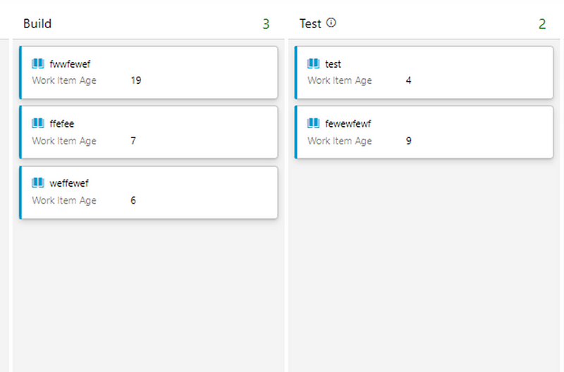
Now, we can see our Work Item Age and compares this to our 50th percentile for our cycle time as well as, more importantly, our SLE:

Taking this further…and alternative ways to display SLE

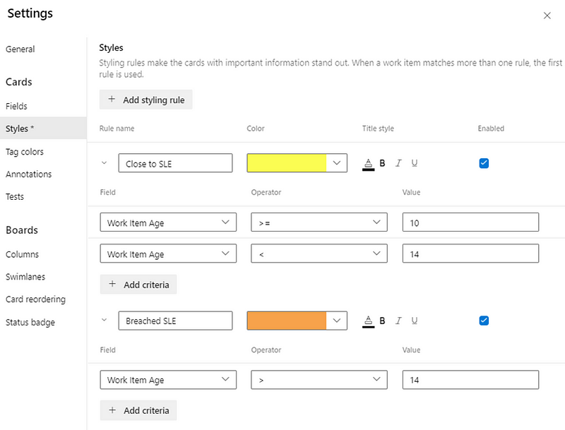
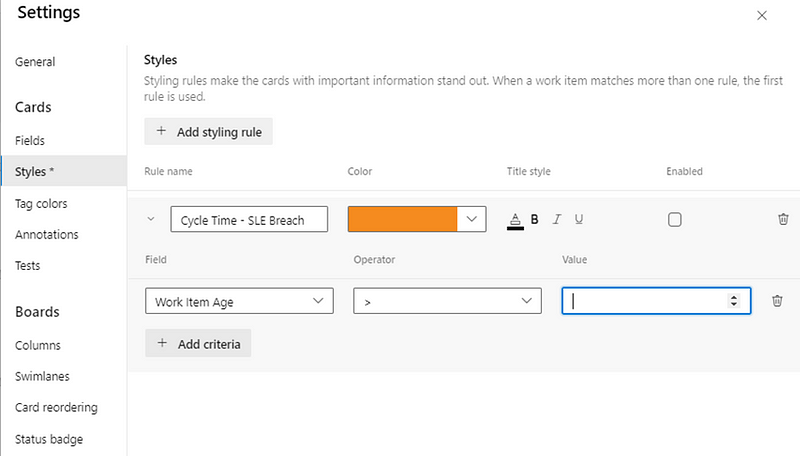
Unfortunately we cannot configure styles within the Kanban board if one field is greater than another. For example we ideally want a rule whereby if Work Item AgeCycle Time 50 then turn that item yellow and/or if Work Item AgeSLE then turn that item orange. ADO (currently) doesn’t let you do that, instead allowing just the entry of a value:

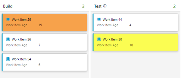
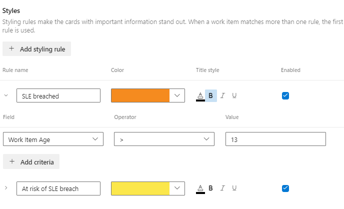
The best we can do here for now is just to use that 50th percentile and SLE information to add styling rules for at risk and/or breached items:

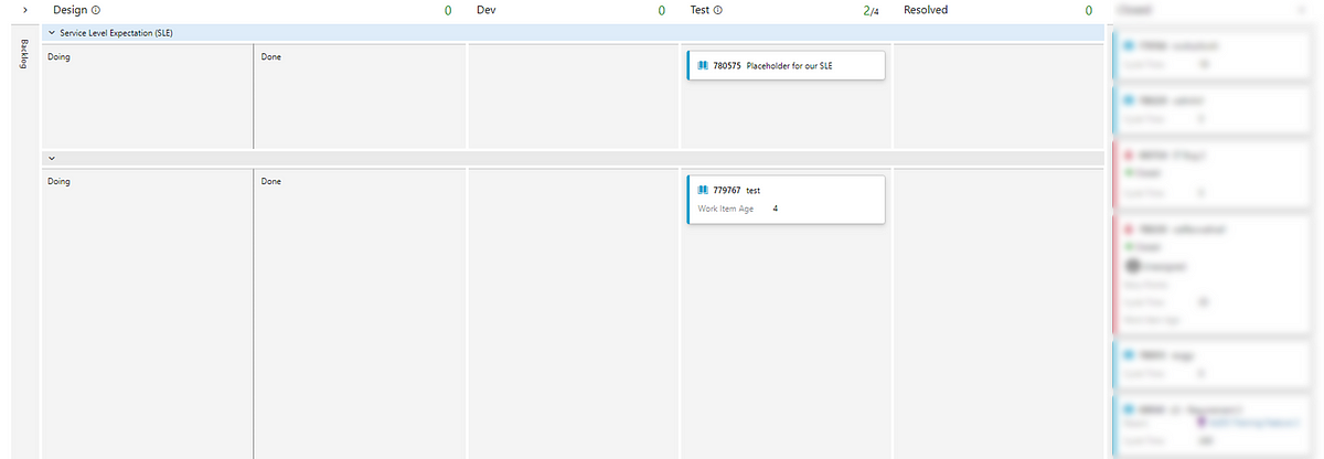
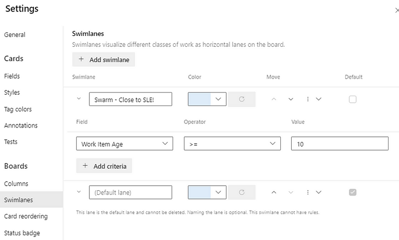
I mentioned previously about an alternative approach to making your SLE visible on your board. Another way, which may be a more controversial approach (as it directly impacts the design of the teams workflow), is to have a placeholder item on the board that will always display the current SLE. To do this, create any work item type for your board and give it any name you like (don’t worry, we are going to overwrite this). Configure a Swimlane for the top of your board called Service Level Expectation (SLE) and place this item in one of your in progress columns. Here is an example:

Following slightly different steps (not detailed in this post but can be shared if it’s of interest) we can do something like the following:

With the result being an item on the board that looks like so:

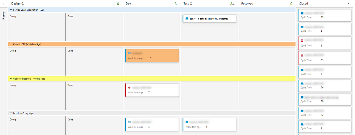
Similar to previous posts, having the SLE as a field on the card allows you to better highlight those items that may be close to exceeding this value.

Of course you could leverage the same styling rules approach as previously shown:

You can also take this further and define SLE’s for different work item types. For example if I wanted this to be dynamic for different work item types, I would adjust my HTTP action like so:

Hopefully this series of blogs have been helpful in making this information around the measures defined in the kanban guide more accessible for you and your teams. Don’t forgot to add a comment below for any feedback :)

Adding Cycle Time to your Azure DevOps board using Power Automate

The second in a series of three blogs covering how you can add flow metrics directly into your kanban board in Azure DevOps. Part one covered how to add Work Item Age. Part two (this blog) will cover adding Cycle Time and part three will show how to add in your Service Level Expectation…

What do we we mean by Cycle Time?

As per the Kanban Guide:

Cycle Time — the amount of elapsed time between when a work item started and when a work item finished.

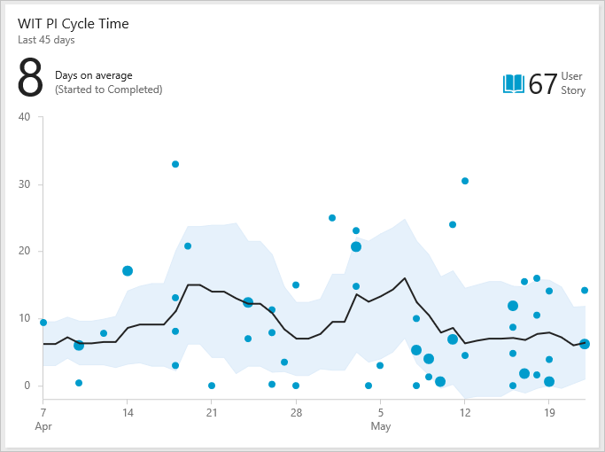
The challenge we have in Azure DevOps is that despite information around cycle time being available to populate widgets such as the cycle time chart, it requires again moving away from the board to view on a separate page.

Analytics widgets — Azure DevOps | Microsoft Learn

What would be even better for teams would be getting that information real time, ideally as soon as possible after an item moves to done. Here’s how this can be made possible…

Prerequisites

Similar to the last post, here are some assumptions made in this guidance:

With all those in place — let’s get started!

Adding a ‘Cycle Time’ field to ADO

We need to add a new field into our process template in ADO called Cycle Time. You need also to know the respective work item type(s) you want to do this for. Again, for the purpose of simplicity in this blog we will stick to Product Backlog Item (PBI) as the work item type we will do this for and be using the inheritance of the Scrum process template. Please note, if you are wanting to do this for multiple work item types you will have to repeat this process.

  • Find the PBI work item type in your inherited process work items list

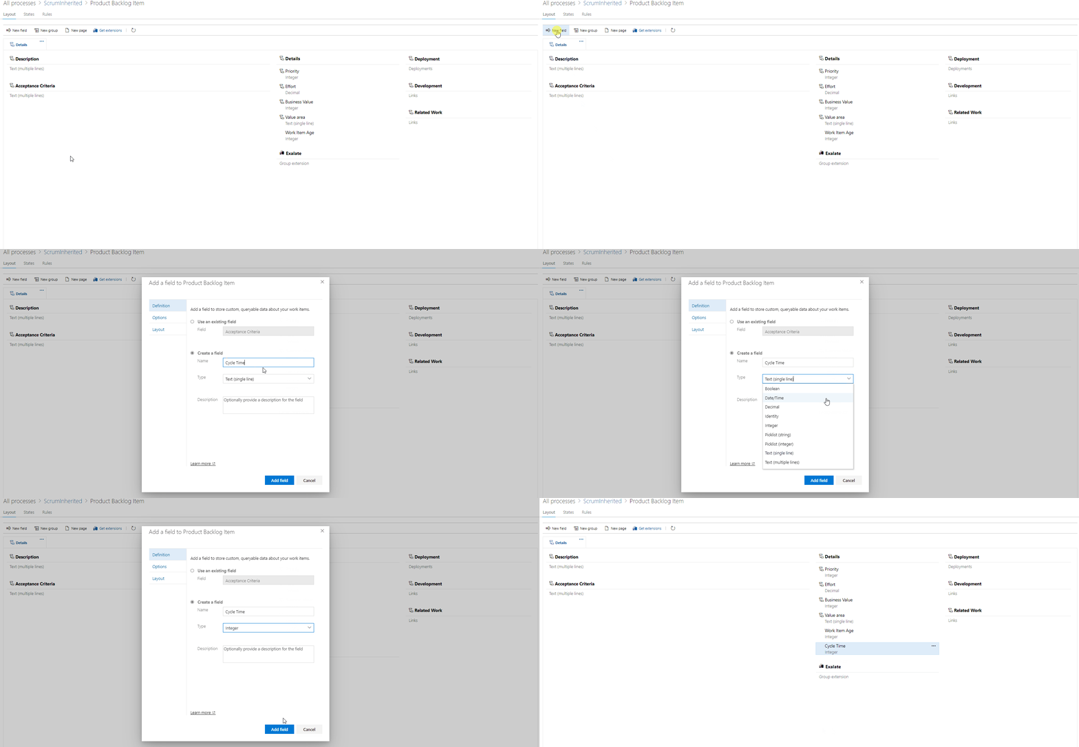
  • Click into it and click ‘New field’

  • Add the Cycle Time field — ensure you specify it as an ‘integer’

If you have followed the previous post and have added a custom Work Item Age field, you’ll want to also implement a work item rule here. This is so that when items that were in progress move to done, we clear the Work Item Age field. You can do this like so:

Now, before automating, let’s briefly recap on how cycle time is calculated…

Understanding how Cycle Time is calculated

From Microsoft’s own documentation, we can see that Cycle Time is calculated from when an item first enters an ‘In Progress’ state category to entering a ‘Completed’ state category.

Source:

Cycle Time and Lead Time control charts — Azure DevOps Services | Microsoft Learn

Fortunately for us, when this happens, Microsoft auto-calculates this cycle time, storing it in a column in the database/analytics views known as CycleTimeDays. As mentioned previously, is not the intent of this blog to get into a debate about adding +1 days to an item as there are no instances where an item has taken 0 days to complete.

Ultimately, calculating cycle time this way still aligns with the definition as set out in the kanban guide as it is still “the amount of elapsed time between when a work item started and when a work item finished.”

Time to move on to automation…

Automating the input of Cycle Time on items

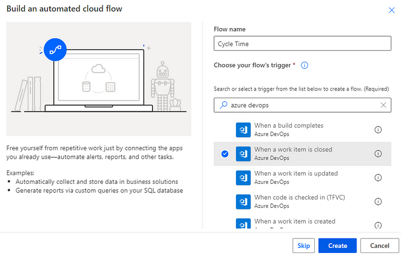
Our automation looks slightly different this time as, rather than a scheduled automation, we want this to run any time an item moves to done. Therefore we need to pick an Automated cloud flow in Power Automate:

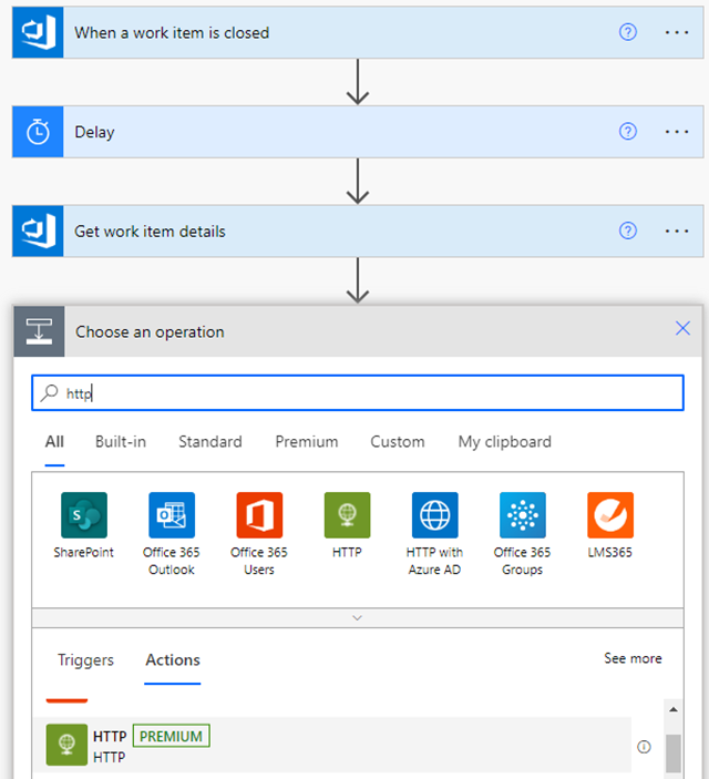
We are going to call it Cycle Time and our trigger is going to be When a work item is closed:

We will add in our ‘Organization Name’, ‘Project Name’ and ‘Type’. Again, for this instance we are going to be consistent and just use the Product Backlog Item (PBI) type.

Please note, if you are wanting to do this for multiple work item types you will have to repeat the process of adding this field for each work item type.

The closed state field should be auto-populated:

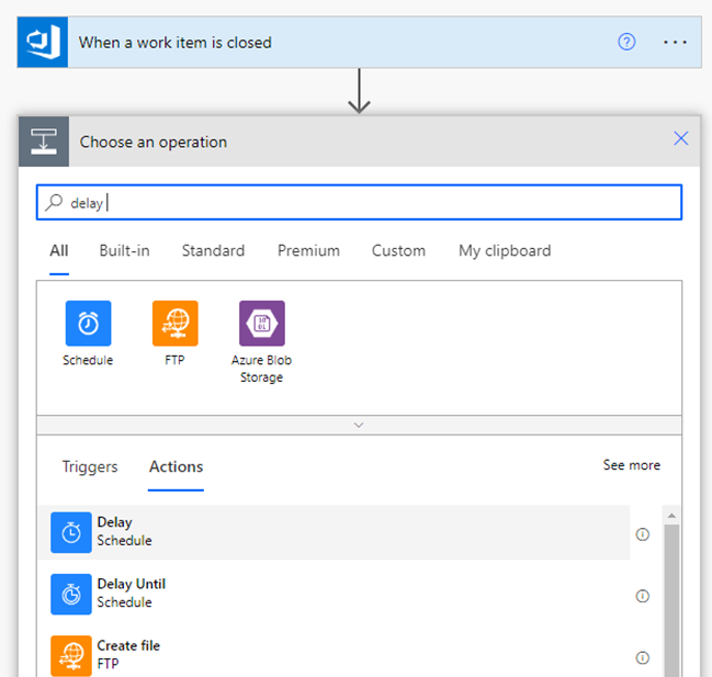
Next we need to add a step for a Delay:

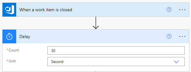
The reason for this is sometimes the calculating of cycle time by Microsoft can be a little slow. All we are going to add in here is a 30 second delay to give enough time for the CycleTimeDays column to be populated:

Following this, we are going to add a Get work item details step:

Here we want to make sure our organization, project and work item type are consistent with our first step. We also want to add in the ‘Id’ field from our first action when a work item is closed:

After this, we want to add in a HTTP step which is where we will pull in the CycleTimeDays for the completed item:

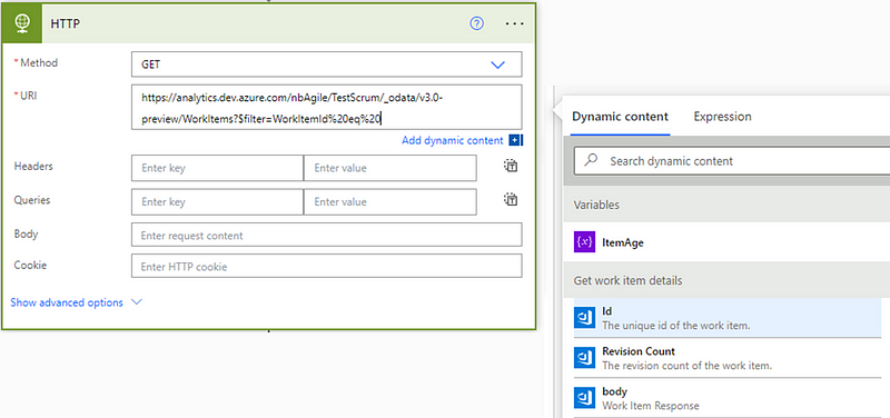
You’ll need to set the method as ‘GET’ and add in the the URL. The first part of the URL (replace ORG and PROJECT with your details) should be:

https://analytics.dev.azure.com/ORG/PROJECT/_odata/v3.0-preview/WorkItems?$filter=WorkItemId%20eq%20

Add in the dynamic content of ‘Id’ from our Get work item details step:

After the Id, add in:

&$select=CycleTimeDays

Which should then look like:

Again, ensure you have added your PAT details in the advanced options:

PAT blurred for obvious reasons!

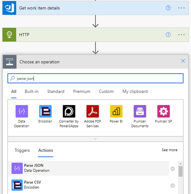
Next we are going to add a Parse JSON step, where we are going to extract the CycleTimeDays value:

For content you’ll want to choose ‘Body’ and add a schema like so:

{
    "type": "object",
    "properties": {
        "@@odata.context": {
            "type": "string"
        },
        "value": {
            "type": "array",
            "items": {
                "type": "object",
                "properties": {
                    "CycleTimeDays": {
                        "type": "number"
                    }
                },
                "required": [
                    "CycleTimeDays"
                ]
            }
        }
    }
}

Next we need to add an Initialize variable step:

This will serve the purpose of temporarily storing our cycle time before we write it back to the respective work item. Add in the following:

Apply to each is the next step to add in:

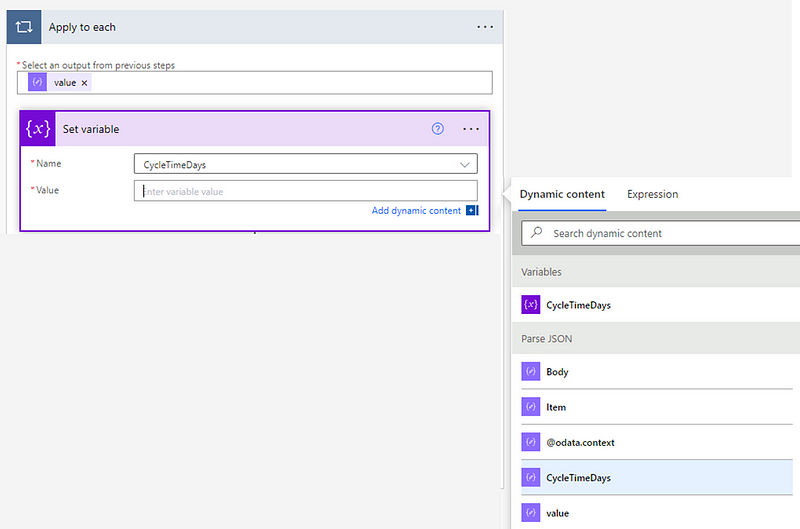
Here we will use the ‘value’ from our Parse JSON action as our output from previous steps:

Then we’ll need to add in a Set variable step which is essentially where we are going to pass through our CycleTimeDays in the value field:

Then we need to add a Compose step for rounding our Cycle Time:

Here we need to set an expression of:

if(greaterOrEquals(mod(variables('CycleTimeDays'),1),0.5),formatNumber(variables('CycleTimeDays'),'0'),if(less(mod(variables('CycleTimeDays'),1),0.5),if(equals(mod(variables('CycleTimeDays'),1),0),formatNumber(variables('CycleTimeDays'),'0'),add(int(first(split(string(variables('CycleTimeDays')),'.'))),1)),first(split(string(variables('CycleTimeDays')),'.'))))

The final action is to write this back to Azure DevOps. Here we want to add a step to Update a work item:

Ensure the organization, project and work item type all match our previous steps. We want to choose ‘Id’ from our Get Work Item Details action previously. Click Advanced Options and ensure that Cycle Time is populated with the outputs of our previous step:

Then hit save and the flow is created!

To test if it works, you will need to create a dummy item and move it to your closed state on your board to see if the flow works. With a successful run looking like so:

Making this visible on the kanban board

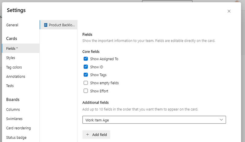
The final step is to make this visible on the kanban board. To do this we need to go into our board settings and find the respective work item type. Under ‘Additional fields’ you’ll want to add Cycle Time:

Then, when an item moves to done and the flow runs, you will then see the cycle time for your completed items:

Please note — this will not retrospectively update for items that were in a Closed/Done state before this automation was setup. You could however combine the logic of this and the previous blog post to do that :)

Ways you could take it further

Now, teams who are using the board as part of their daily sync/scrum also have the cycle time for completed items visible on the cards themselves. This provides insights around how long items actually took. You could then take this further, for example adding styling rules for any items that took longer than an agreed duration (or a Service Level Expectation — SLE).

This team may choose to do that for anything that took over 10 days:

Which could be the basis for discussing these orange items in a retrospective.

Now you have two of the four flow metrics visible for all in progress and completed items on your board, which is hopefully this is a useful next step for increasing awareness around the flow of work :)

Check out part three which covers how to automate the adding of a Service Level Expectation (SLE) to the kanban board…

Adding Work Item Age to your Azure DevOps board using Power Automate

The first in a series of three blogs covering how you can add flow metrics directly into your kanban board in Azure DevOps. Part one (this blog) will cover adding Work Item Age. Part two covers adding Cycle Time and part three will show how to add in your Service Level Expectation (SLE)…

Context

As teams increase their curiosity around their flow of work, making this information as readily available to them is paramount. Flow metrics are the clear go-to as they provide great insights around predictability, responsiveness and just how sustainable a pace a team is working at. There is however, a challenge with getting teams to frequently use them. Whilst using them in a retrospective (say looking at outliers on a cycle time scatter plot) is a common practice, it is a lot harder trying to embed this into their every day conversations. There is no doubt these charts add great value but, plenty of teams forget about them in their daily sync/scrums as they will (more often than not) be focused on sharing their Kanban board. They will focus on discussing the items on the board, rather than using a flow metrics chart or dashboard, when it comes to planning for their day. As an Agile Coach, no matter how often I show it and stress the importance of it, plenty of teams that I work with still forget about the “secret sauce” of Work Item Age in their daily sync/scrum as it sits on a different URL/tool.

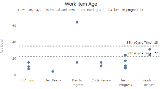
Example Work Item Age chart

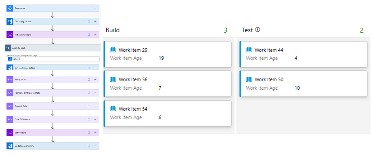
This got me thinking about how we might overcome this and remove a ‘barrier to entry’ around flow. Thankfully, automation tools can help. We can use tools like Power Automate, combined with other sources, to help improve the way teams work through making flow data visible…

Prerequisites

There are a few assumptions made in this series of posts:

With all those in place — let’s get started!

Adding a ‘Work Item Age’ field to ADO

We first need to add a new field into our process template in ADO called Work Item Age. You need to also know the respective work item type(s) you want to do this for. For the purpose of simplicity in this blog we will stick to Product Backlog Item (PBI) as the work item type we will set this up for and be using an inheritance of the Scrum process template.

Please note, if you are wanting to do this for multiple work item types you will have to repeat the process of adding this field for each work item type.

  • Find the Product Backlog Item type in your inherited process template work items list

  • Click into it and click ‘new field’

  • Add the Work Item Age field — ensuring you specify it as an ‘integer’ type

That’s the easy part done, now let’s tackle the trickier bits…

Understanding how Work Item Age is to be calculated

From Microsoft's own documentation, we can see that in ADO their Cycle Time calculation is from when an item first enters an ‘In Progress’ state category to entering a ‘Completed’ state category:

Source:

Cycle Time and Lead Time control charts — Azure DevOps Services | Microsoft Learn

Therefore, we can determine that for any items that have been started but not completed, the Work Item Age is calculated as the difference, in calendar days, between the current date and the time when an item first entered the ‘In Progress’ state category, also known as the InProgressDate.

It is not the intent of this blog to get into a debate about adding +1 days to an item as there are no instances where an item has taken 0 days to complete — for that we have Drunk Agile ;)

Ultimately, calculating Work Item Age this way still aligns with the definition as set out in the kanban guide as it is still “the amount of elapsed time between when a work item started and the current time.”

Now let’s jump into the automation…

Automating Work Item Age

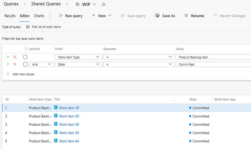
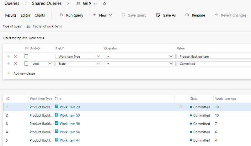
We start by creating a query in ADO of all our current ‘in progress’ items. The complexity of this will of course vary depending on your ADO setup. For this we are keeping it simple — any PBI’s in our single ‘In Progress’ state of Committed:

Please ensure that Work Item Age is added as one of your columns in your query. It needs to be saved as a shared query and with a memorable title (sometimes I like to add DO NOT EDIT in the title).

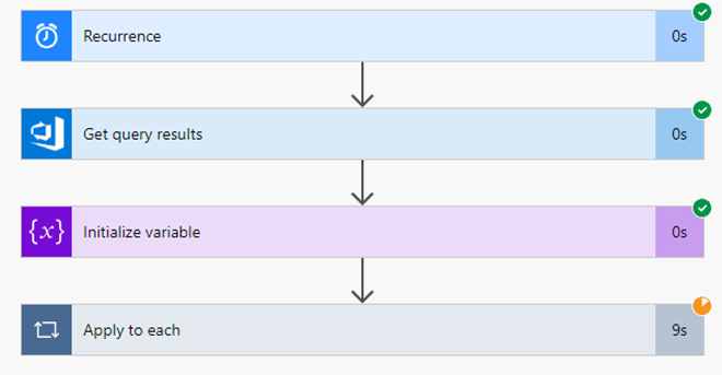
Next we go to Power Automate and we create a Scheduled cloud flow:

We are going to call this ‘Work Item Age’ and we will want this to run every day at a time that is before a teams daily sync/scrum (e.g. 8am).

Once you’re happy with the time click create:

Next we need to click ‘+ new step’ and add an action to Get query results from the query we just set up:

Please ensure that you input the relevant ‘Organization Name’ and ‘Project Name’ where you have created the query:

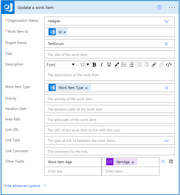
Following this we are going to add a step to Initialize variable — this is essentially where we will ‘store’ what our Work Item Age is which, to start with, will be an integer with a value of 0:

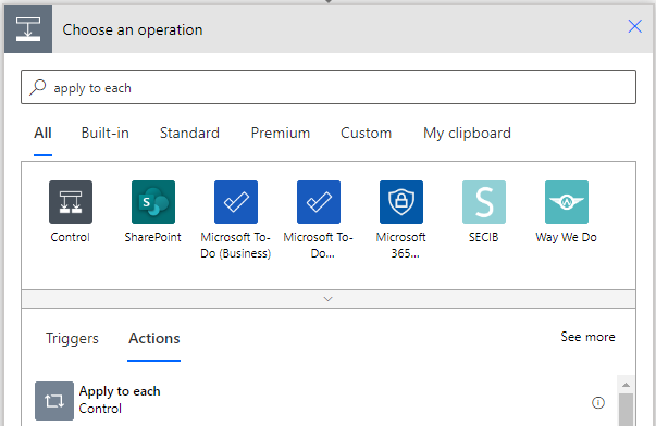
Then we are going to add an Apply to each step:

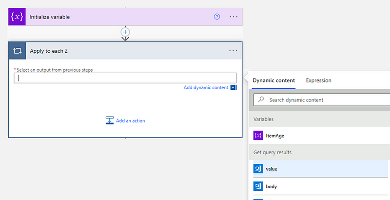
We’ll select the ‘value’ from our ‘Get query results’ step as the starting point:

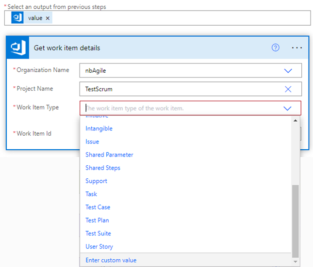
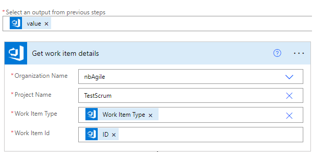
Then we’ll add a Get work item details step. Here we need to make sure the ‘Organization’ and ‘Project’ match what we set out at the beginning.

For Work Item Type we need to choose ‘Enter Custom Value’:

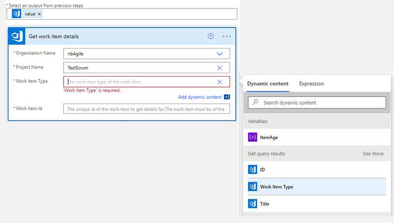
We can then choose ‘Work Item Type’ and ‘ID’ as dynamic content from our ‘Get query results’ step previously:

With the end result being:

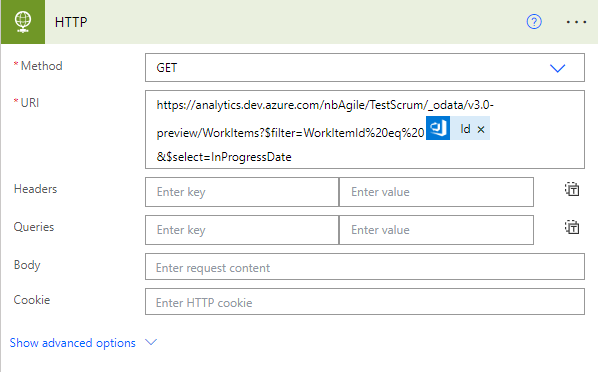
Next we need to add a HTTP step. This is essentially where we are going to get the InProgressDate for our items:

You’ll need to set the method as ‘GET’ and add in the the URL. The first part of the URL (replace ORG and PROJECT with your details) should be:

https://analytics.dev.azure.com/ORG/PROJECT/_odata/v3.0-preview/WorkItems?$filter=WorkItemId%20eq%20

Add in the dynamic content of ‘Id’ from our Get work item details step:

After the Id, add in:

&$select=InProgressDate

Which should look like:

You’ll then need to click ‘Show advanced options’ to add in your PAT details. Set the authentication to ‘Basic’, add in a username of ‘dummy’ and paste your PAT into the password field:

PAT blurred for obvious reasons!

Then we need to add in a Parse JSON step:

This is where we are essentially going to extract our InProgressDate

Choose ‘body’ as the content and add a schema like so:

{
    "type": "object",
    "properties": {
        "@@odata.context": {
            "type": "string"
        },
        "value": {
            "type": "array",
            "items": {
                "type": "object",
                "properties": {
                    "InProgressDate": {
                        "type": "string"
                    }
                },
                "required": [
                    "InProgressDate"
                ]
            }
        }
    }
}

Then we need to format this how we want so it’s easier to do the date difference calculation. Add a Compose step:

Rename this to be Formatted InProgressDate and with the following as an expression:

formatDateTime(body('Parse_JSON')?['value'][0]['InProgressDate'], 'yyyy-MM-dd')

Then add another Compose step, this time to get the Current Date, which should be an expression like so:

formatDateTime(utcNow(), 'yyyy-MM-ddTHH:mm:ssZ')

Then we will add one more Compose step to calculate the Date Difference, which is the following expression:

div(sub(ticks(outputs('Current_Date')), ticks(outputs('Formatted_InProgressDate'))), 864000000000)

This is essentially doing a (rather long-winded!) date difference calculation. This appears to be the only way to do this type of calculation in Power Automate.

Then we need to add a step to Set variable, which was something we established earlier on to store the work item age:

Here we just need to choose the same variable name (ItemAge) and use the ‘outputs’ from the previous step (Date Difference) as the dynamic content:

Final step is to populate this on the respective work item in ADO. To do this, search for an Update a work item step:

Then you will want to populate it with the ‘organization name’ and ‘project’ you’ve been using throughout. You also need to ensure you add in ‘Id’ for the Work Item Id and ‘Work Item Type’ from your steps previous:

Then you need to click ‘Show advanced options’ and add ‘Work Item Age’ into other fields and choose ‘ItemAge’ as the value:

Then hit save and the flow is created (ensure all your step names match the below):

Then it’s best to do a test run, which you can do by clicking Test, select ‘Manually’ and then click Test > Run Flow:

Clicking ‘Done’ will take you to a page that will show you if steps have been successful and which are in progress:

You can also view the ‘Run history’ to see if it is successful. Please note the amount of in progress items will impact how long the flow takes:

Once run, if you check back into Azure DevOps and your query, you should now see your Work Item Age field populated:

Making this visible on the Kanban board

The final step is to make this visible on the Kanban board. To do this we need to go into our board settings and find the respective work item type. Under ‘Additional fields’ you’ll want to add Work Item Age:

Then, when your board refreshes, you will see the Work Item Age for your ‘In Progress’ items:

Ways you could take it further

Now, teams who are using the board as part of their daily sync/scrum also have the age of work items visible on the cards themselves. This allows them to make informed decisions about their plan for the day, without having to flip between different tools/links to view any charts.

You can then take this further, for example adding styling rules for when items go past a particular age:

Similarly, you could also leverage the swimlane rules functionality that was recently released and create a swimlane for items a team should be considering swarming on. This could be where items are close to exceeding a teams’ forecasted cycle time or Service Level Expectation (SLE):

Hopefully this is a useful starting point for increasing awareness of Work Item Age on the board for a team.

Check out part two which details how to automate the adding of Cycle Time to the work item form for completed items…

The many flaws of Flow Efficiency

As organisations try to improve their ways of working, better efficiency is often a cited goal. ‘Increasing flow’ is something else you may hear, with Flow Efficiency being a measure called out as something organisations need to focus on. The problem is that few, if any, share the many flaws of this metric.

Read on to find out just what these pitfalls are and, more importantly, what alternatives you might want to focus on instead to improve your way of working…

Queues

Queues are the enemy of flow in pretty much every context, but especially software development. Dependencies, blockers and org structure(s) are just a few that spring to mind when thinking about the reasons why work sits idle. In the world of Lean manufacturing, Taiichi Ohno once stated that in a typical process only around 5% is defined as value adding activity. There is also the measure of overall equipment effectiveness (OEE), with many manufacturing lines only 60% productive.

More recently, the work of Don Reinertsen in the Principles of Product Development Flow has been a frequent inspiration for Agile practitioners, with this quote in particular standing out:

Our greatest waste is not unproductive engineers but work products sitting idle in process queues.

Many thought leaders, coaches and consultants champion the use of a metric known as flow efficiency when coaching teams and organisations about improving their way of working, but what exactly is it?

What is flow efficiency?

Flow efficiency is an adaptation from the lean world metric of process efficiency. This is where for a particular work item (backlog item, user story, whatever your preferred taxonomy is) we measure the percentage of active time — i.e., time spent actually working on the item against the total time (active time + waiting time) that it took to for the item to complete.

For example, if we were to take a software development team’s Kanban board, it may look something like this:

Source: Flow Efficiency: Powering the Current of Your Work

Where flow efficiency would be calculated like so:

Flow efficiency (%) = Active time / Total time x 100%

The industry standard says that anything between 15% and 40% flow efficiency is good.

In terms of visualizing flow efficiency, it typically will look like this:

Flow Efficiency: Powering the Current of Your Work

In this chart, we can see the frequency (number) of work items with a certain percentage flow efficiency, and an aggregated view of what the average flow efficiency looks like.

All makes sense, right? Many practitioners would also advocate this as an important thing to measure.

I disagree. In fact, I would go as far as to say that I believe flow efficiency to be the least practical and overhyped metric in our industry.

So, what exactly are some of the problems with it?

Anecdotal evidence of “typical” flow efficiency

Now I don’t disagree with the ideas of those above regarding queues being an issue with a lot of time spent waiting. I also don’t deny that flow efficiency in most organisations is likely to be poor. My issue comes with those who cite flow efficiency percentages or numbers, quoting ‘industry standards’ and what good looks like without any solid proof. “I’ve seen flow efficiency percentages of n%” may be a common soundbite you hear — #DataOrItDidntHappen needs to be a more frequent hashtag for some claims in our industry. If we take a few examples near the top of a quick Google search:

I finally thought I’d found some hard data with “the average Scrum team Process Efficiency for completing a Product Backlog Item is on the order of 5–10%” which is cited in Process Efficiency — Adapting Flow to the Agile Improvement Effort. That is until we see the full text:

And then the supporting reference link:

Surveying a few people in a classroom ‘the average Scrum team’. 

It amazes me that in all the years of data collated in various tools, as well as our frequent emphasis on empiricism — there is not one single study that validates the claims made around what flow efficiency percentages “typically” are.

Lack of wait states

Now, discounting the lack of a true study, let’s look at how a typical team works. Plenty of teams do not know or have not identified the wait states in their workflow:

In this example (which is not uncommon) — all the workflow states are ‘active’ states, therefore there is no way to calculate when work is waiting, thus flow efficiency will always be 100% (and therefore useless!). Plenty of teams have this where they do in fact know what their wait states are yet have not modelled them appropriately in their workflow.

Impossibility of measuring start/stop time

Let’s say now we’ve identified our wait states and modelled them appropriately in our workflow:

How often (IME fairly regularly!) do we hear updates when reviewing the board like the below:

Expecting near real-time updates (in order to accurately reflect active vs. wait time) is just not practical and therefore any flow efficiency number is flawed due to this delay in updating items. Furthermore, there are so many nuances with product development that making a binary call as to whether something is active vs. wait is impossible. Is thinking through something on a walk active time or idle time? What about experimentation? Even more so think about when we leave for work at the end of the day. None of our items are being worked on, so shouldn’t they all be marked as ‘waiting’ until the next day?

Not accounting for blockers

Keeping the same workflow as before, the next scenario to consider is how we handle when work is blocked.

This particular item is highlighted/tagged due to being blocked as we need feedback before we can move it along in our workflow. Yet it’s in a ‘work’ state as it cannot be progressed. More often than not, this is not factored into any flow efficiency calculation or literature, such as this example:

Tasktop — Where is the Waste in Your Software Delivery Process?

There is no way an item was “In Dev” for a clear, uninterrupted period and therefore it is not a realistic picture presented in terms of how product development actually happens.

That’s NumberWang!

For those unaware, Numberwang is a well-known sketch from the comedy TV show That Mitchell and Webb Look. It is a fictional gameshow where the two contestants call out random numbers which are randomly then told by the ‘host’ to be “Numberwang!”

[embed]https://youtu.be/0obMRztklqU[/embed]

Why is this relevant? Well, when looking at items that have moved through our process and their respective flow efficiency percentage, all we are doing is playing an Agilists version of the same comedy sketch.

Face ID Login has a flow efficiency of 19% but QR code returns only had 9%! OMG :( :( :( So what? It’s just a numbered percentage— it doesn’t mean anything! Also, look at the cycle time for those items, can we definitively say that one item was “more efficient” than the other? Does this tell us anything about how to improve our workflow and where our bottlenecks are? No! It’s just reading out numbers and thinking it means something because it’s “data”.

The Flaw of Averages

Anyone who has read previous posts of mine will know that any sort of use of average with flow metrics is a way to push my buttons. Unfortunately, the visualisation of flow efficiency often comes with an average of the efficiency for a collection of completed work items, like so:

Using averages with any sort of metrics is a dangerous flirtation with misleading information, and we can see that for a series of items this is quite easy to do:

Three of our five completed items have poor flow efficiency yet aggregating to a single number alludes to (if the close to 40% flow efficiency being “good” anecdote is being cited!) us having a fairly effective process. By aggregating we are losing all that context of those ‘inefficient’ items and where we might be using them as the basis for a conversation around improving our way of working.

What should we use instead?

In theory flow efficiency seems like a good idea, however when you look at all those reasons above that it is simply not practical for teams and organisations to actually implement and put to effective use (without at least being clear they are using flawed data). Proceed with caution for anyone advocating it without those caveats mentioned above!

https://twitter.com/danvacanti/status/1321547554136428544https://twitter.com/DReinertsen/status/1106975020432031744

A better metric/use of your time is looking at blocker data and going after those that occur the most frequently and/or are the most impactful. Troy Magennis has a great tool for this (thank you also to Troy for sharing some thoughts on this piece).

Here are some of the examples we use for some of our teams here at ASOS:

Shout out to

Francis Gilbert

in our Saved Items team for these!

Which can then be used to reduce the frequency of particular blockers occurring and seeing where you need to next focus:

Shout out to Gary Sedgewick in our PayTech team for this!

This way you’re actually going after the problems teams face, which will in turn positively impact the flow of work. All this is done without the need of some ‘efficiency’ measure/number.

What are your thoughts? Agree? Disagree? 

I’d love to hear what you think in the comments below…

Weeknotes #15

Metrics and Curiosity

This week I spent a few days (along with some big help from my colleague Tim) reworking one of troy.magennis amazing team dashboards from Excel into Google Sheets.

I view Troy’s work as really important to what we do in our industry, and the fact he gives it all away for free in a format that is easily consumable with clear instructions is even better. He has been one of my biggest inspirations in the last few years, always available to chat, give feedback and share ideas with. If you are going to Agile 2019 this year, be sure to check out the Data & Metrics track he has put together (I’m biased as I helped review the submissions!).

On the topic of metrics, it’s great how beneficial they are in unearthing information that isn’t immediately visible to a Coach/Scrum Master/Delivery Manager. A great example of that was this week with someone I’m coaching, where we looked at a scatter plot for her team:

Now, whilst this is great in showing you how long things in general take (85th percentile — 16 days — not bad as this team are doing two week sprints), it should, if it’s an effective chart, spark curiosity and questions. 

Good coaches then find a way to safely introduce this information to the team (See: Goodhart’s Law) and leverage it to have better conversations as a team.

If we go back to the original visual, these are the sort of things I would be considering:

That way we’re asking open questions centered on improvement, rather than making the team feel they are being critiqued for performance using data.

Estimation

Estimation is always an interesting topic in the Agile world, from story points, t-shirt sizes, fibonacci or fibonacci-esque, cost of delay or even #noestimates there is always passionate discussion in this area. This week task estimation came up, specifically the topic of needing to estimate in hours for tasks, with some of our coaches working with teams saying that they ‘needed’ the team to estimate tasks in hours to understand capacity. Now I’ll admit this was a practice I once encouraged at the beginning of my career, however having learned and experimented with other techniques I can see it’s not effective, and something I wouldn’t get teams to start with now. The days of telling (or as I witness from some other Scrum Masters — yelling 😐) a team member to change their hours remaining in the digital tool from 3 to 2 are ones I look back on and cringe at. I was trying to explain to the coaches that it’s a bad practice, hourly estimation is nigh on impossible and that we should focus on flow, small stories and limiting WIP. 

Don’t believe me? Sutherland himself says:

We want to abandon hours as a reporting tool for Scrum teams as data on over 60,000 teams in a Rally survey shows that the slowest teams use hours. 

The fastest teams use small stories, no tasking, and no hourly estimation.

So as practitioners who are all about empiricism, why push old/bad practices on teams and ignore the empiricism that shows they don’t work?

Focus on flow, manage WIP, and slicing work into small vertical slices will tackle your capacity issue in a much more effective manner than updating your hours in any respective digital tool will.

A framework for Agile collaboration

On Thursday night I went along to an executive dinner at the Connaught Hotel hosted by IDC & Slack.

It was a really interesting evening, with approx 30–40 people from different organisations big and small sharing about their own Agile journey, challenges they were facing and success stories. Common themes over the dinner around approaches that help to success were, leadership buy in is a must for success, trust, measure outcomes over outputs and the shift from project -> product. The two challenges I heard most frequently used were culture and the funding model, which I would agree with.

A member of a large bank on our table in particular stressed the importance of having HR as part of the change which, given what I mentioned earlier, helped me validate we were making the right steps forward. 

Some surprising points for me were around technical practices, in particular on our table where some people didn’t think they were key (albeit important) to organisational agility. When you consider the work from DORA and Accelerate, which both talk about how technical practices directly influence organisational performance, I found that odd. Another interesting observation was around the love digital tools (Jira, Azure DevOps, Trello etc) were getting from everyone.

One table in particular began their answer to the main topic discussion point with “tools and process”. This was confusing to me given the values in the manifesto. In summary, I don’t think there was anything massively * new * I learnt over the evening, other than big organisations have similar issues to ours. It confirmed to me certainly that our current approach is sound and, whilst it may take years to get there we are getting there incrementally.

Next Week

Next week I’ve got some conversations around release management, which should be interesting given the inroads Jon made this week in automating ticket creation/closing for deployments with SNow and Azure DevOps. 

I’ll also be heading up to our Manchester office, running another 1-day Agile Foundations session for a number of new joiners in our IT organisation.

Weeknotes #06

Measure what matters

This week I’ve had a number of coaching conversations around metrics and measurement. On Tuesday we had our weekly portfolio review meeting which always proves to be one I find challenging. With an inordinate amount of WIP in our IT portfolio it’s proving very difficult to help people ‘get it’ and focus on finishing over starting, as well as slicing demand down to small batch sizes of work, regardless of methodology used. This boiled over as I found myself disagreeing/arguing with an attendee of the meeting who viewed slicing work down as admin, that customers have no problems with our delivery and that the data was “wrong”.

I wasn’t particularly proud of the fact I’d resorted to calling someone out publicly, but it did make me question what matters to people measurement wise, and challenge my own thinking. As you can probably tell I’m obsessed with small batch sizes of work and swarming on aged WIP, using empiricism to support the actions you take, mainly because for me you are viewing this with a customer lens. However it’s clear based on what happened this week that these metrics aren’t quite what matter to others. A positive was the conversation I had the following day which centered on setting limits within the overall WIP (say for a particular type of work), which showed that some were embracing the idea. 

Checking today I can see that Throughput for this week has gotten to the joint highest it has been in the past six months, so looks like the message on Tuesday did land.

Slowly, slowly catchy monkey

Shameless plug

This week, the video of myself and my role within PwC was published to our careers website. Whilst I always find being filmed a bit awkward I did enjoy having the opportunity to share my experience, in particular as I feel people can have a certain view on the ‘big four’ life. It’s definitely not what I had imagined it would be like and I can safely say the last year (I’ve been here three and a half years) has been the most enjoyable I’ve had in any organisation so far. Watch the video below if you want to see someone over emphasise hand movements!

[embed]https://www.youtube.com/watch?v=5-wg9CyLZr8[/embed]

Sprint Reviews

This week I attended a couple of sprint reviews, both of which were not particularly great to actually dial into. One was flat with little/nothing demonstrated (showing your Azure DevOps kanban board does not count), and no energy in the room. The other had an enthusiastic group ready to have good discussion but a main stakeholder who accepted didn’t turn up, which lead to the team just moving on to the retrospective.

Once you start taking Agile outside of software then the sprint reviews are hard, but not impossible. I’ve found that to make them engaging you should have meaningful discussion points and/or at least something to show. 

If you are falling into the trap I mentioned at the beginning, be sure to take a read of Your Sprint Reviews suck, and that’s why!

Next week

Next week is a quieter week, with no training planned. We’re getting an increasing amount of project teams who, whilst not delivering in an Agile manner are at least wanting to adopt a kanban board for visualization/management of work. This for me is a good start for people on their Agile journey, and I’ve got 4/5 teams lined up next week to speak to and get them started on that journey…