A guide on how you can automate the continuous right-sizing of your Jira Epics using it’s REST API and Power Automate…

Context
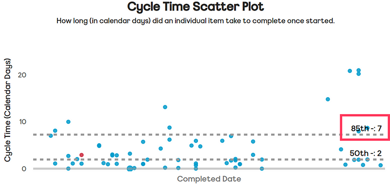
Right-sizing is a flow management practice that ensures work items remain within a manageable size. Most teams apply this at the User Story level, using historical Cycle Time data to determine the 85th percentile as their right-size, meaning 85% of items are completed within a set number of days. This is often referred to as a Service Level Expectation (SLE).

“85% of the time we complete items in 7 days or less”
In combination with this, teams use Work Item Age, the amount of elapsed time in calendar days since a work item started, to proactively manage the flow of work that is “in-progress”. Previously I have shared how you can automate the Work Item Age to your Jira issues.

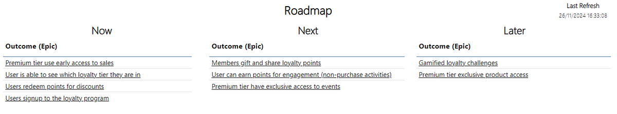
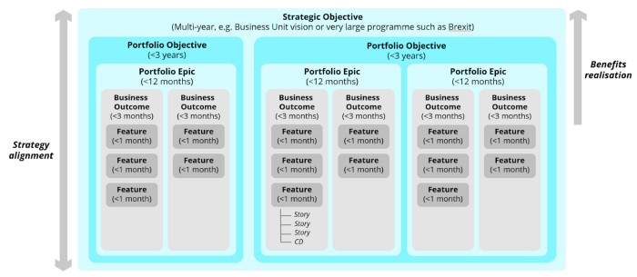
Right-sizing isn’t limited to Stories — it also applies to Epics, which group multiple Stories. For Epics, right-sizing means keeping the child item count below a manageable limit.
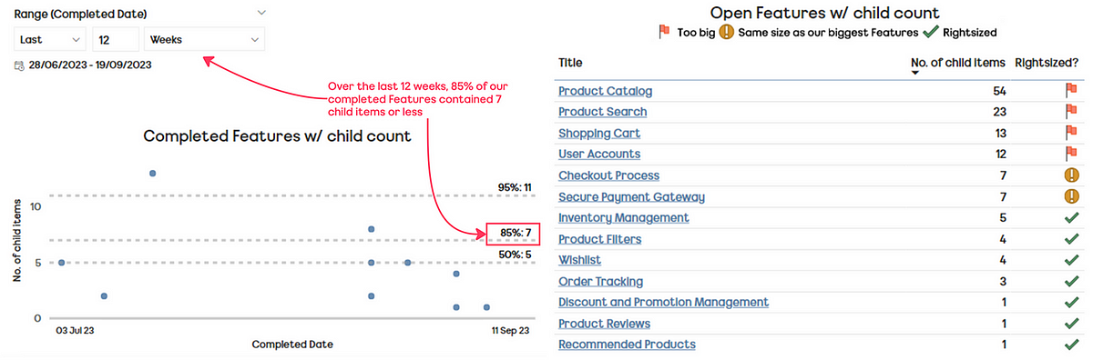
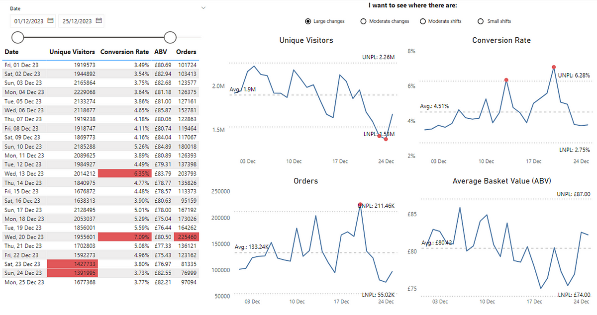
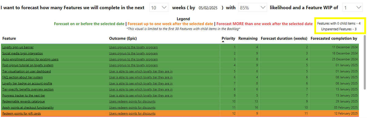
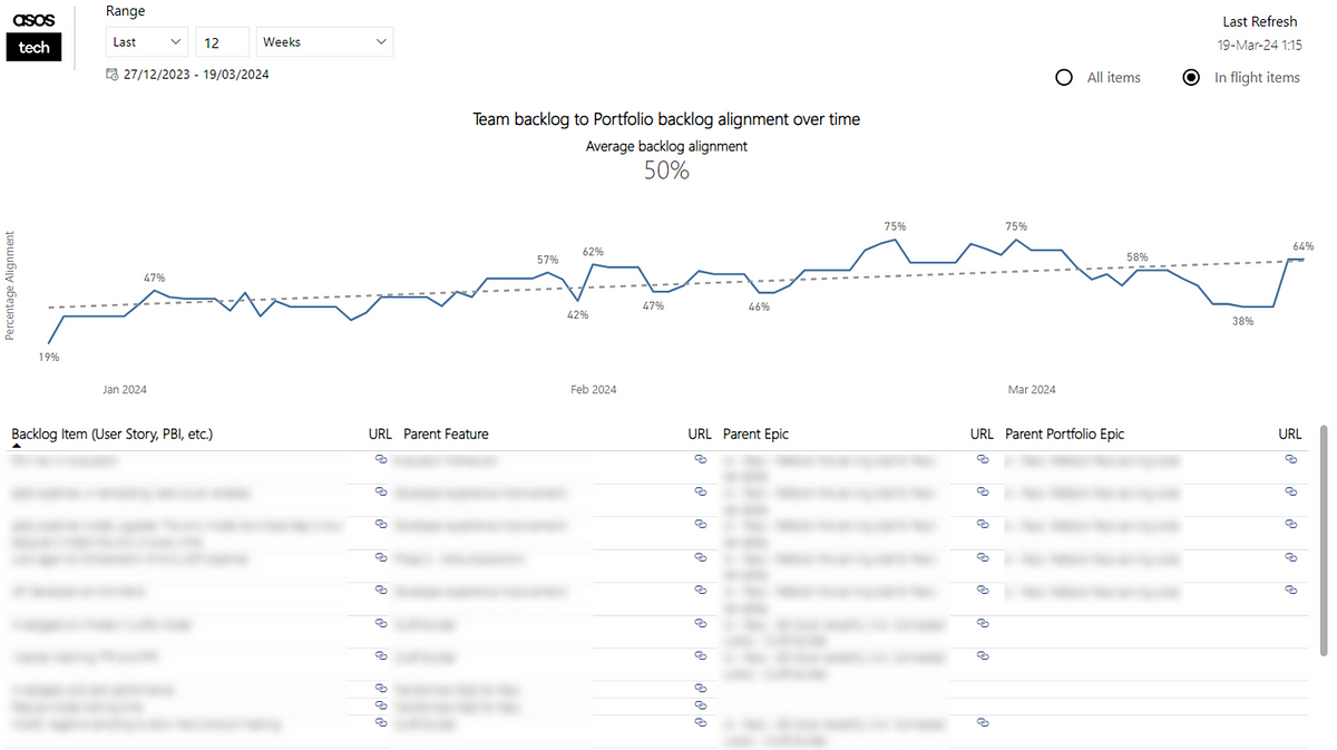
To understand what this right-size is, we choose a selected date range, plotting our completed Epics against the date they were completed and the number of child items they had. We can then use percentiles to derive what our ‘right-size’ is (again typically taking the 85th percentile):

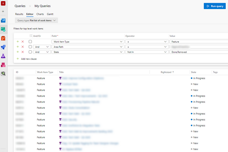
Good teams will then use this data to proactively check their current ‘open’ Epics (those in progress/yet to start) and see if those Epics are right-sized:

Right-sizing brings many benefits for teams as it means faster feedback, reduced risk and improved predictability. The challenge is that this data/information will almost always live in a different location to the teams’ work. In order for practices such as right-sizing to become adopted by more teams it needs to be simple and visible every day so that teams are informed around their slicing efforts and growth of Epic size.
Thankfully, we can leverage tools like Power Automate, combined with Jira’s REST API to make this information readily accessible to all teams…
Prerequisites
This guide assumes the following prerequisites:
Within Jira you have access to add custom fields to a project
You know how to create (and have created) an API token in Jira
Statuses/status categories in your Jira project are configured correctly
Epics are owned by a single ‘team’ — rather than shared across teams
Epics regularly flow to ‘done’ — rather than remaining open forever
You have access to Power Automate and can create premium flows
With all those in place — let’s get started!
Adding a custom field for if an Epic is right-sized is not
We first need to add a new field into our Epics called Right-sized? As we are focusing on right-sizing of Epics, for the purpose of simplicity in this blog we will stick to Epic as the issue type we will set this up for.
Please note, if you are wanting to do this for multiple issue types you will have to repeat the process of adding this field for each work item type.
Click on ‘Project settings’ then choose Epic
Choose ‘Text’ and give the field the name of Rightsized
Add any more information if you want to do so (optional)
Once done, click ‘Save Changes’

We also then need to find out what this new custom field is called, as we will be querying this in the API. To do so, follow this guide that Caidyrn Roder pointed me to previously.
Understanding our Epic right-size
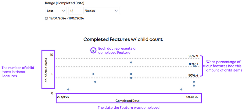
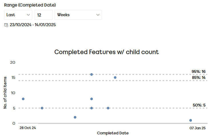
As mentioned earlier in the blog, we plot our completed Epics over a given time period (in this case 12 weeks) against the date they were completed on and the number of child items those Epics had. We can then draw percentiles against our data to understand our ‘right-size’:

If you’re wondering where the tools are to do this, I have a free template for Power BI you can download and connect to/visualise your Jira data.
For the purpose of simplicity, in this blog we’re going to choose our 85th percentile as our right-size value so, for this team, they have a right-size of 14 child items or less.
Automating our right-size check
Start by going to Power Automate and creating a Scheduled cloud flow. Call this whatever you want but we want this to run every day at a time that makes sense (probably before people start work). Once you’re happy with the time click create:

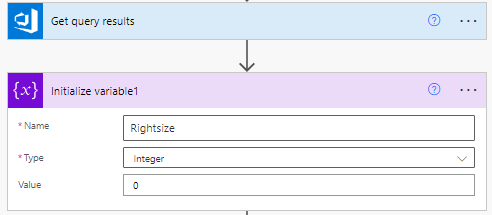
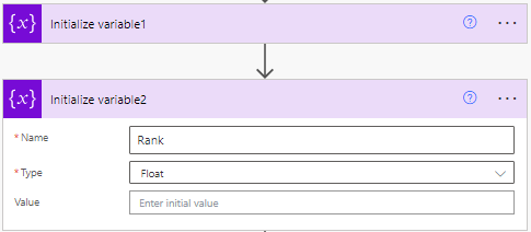
Next we need to click ‘+ new step’ to Initialize variable — this is essentially where we will ‘store’ what our Rightsize is which, to start with, will be an Integer with a value of 0:

We’re going to repeat this step a few more times, as we’re Initialize variable for ranking Epics (as a ‘float’ type) by their child item count:

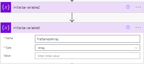
Then we will Initialize Variable to flatten our array value, which we’re going to need towards the end of the flow to get our data in the format we need it to be in to do the necessary calculations:

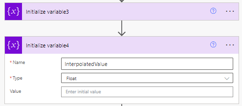
Our final Initialize Variable will be for our Interpolated Value, which is a ‘float’ value we’re going to need when it comes to calculating the percentile for our right-sizing:

Then we’re going to choose a HTTP step to get back all our Epics completed in the last 12 weeks. You’ll need to set the method as ‘GET’ and add in the the URL. The URL (replace JIRAINSTANCE and PROJECT with your details) should be:
https://JIRAINSTANCE.atlassian.net/rest/api/3/search?jql=project%20%3D%20PROJECT%20AND%20statuscategory%20%3D%20Complete%20AND%20statuscategorychangeddate%20%3E%3D%20-12w%20AND%20hierarchyLevel%20%3D%201&fields=id&maxResults=100
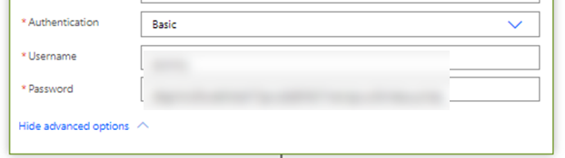
Click ‘Show advanced options’ to add in your access token details:

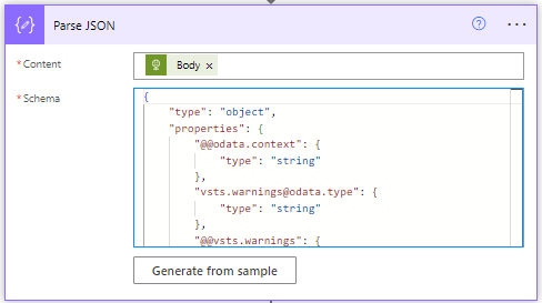
Then we need to add in a Parse JSON step. This is where we are essentially going to extract our the Issue Key from our completed Epics. Choose ‘body’ as the content and add a schema like so:
{
    "type": "object",
    "properties": {
        "expand": {
            "type": "string"
        },
        "startAt": {
            "type": "integer"
        },
        "maxResults": {
            "type": "integer"
        },
        "total": {
            "type": "integer"
        },
        "issues": {
            "type": "array",
            "items": {
                "type": "object",
                "properties": {
                    "expand": {
                        "type": "string"
                    },
                    "id": {
                        "type": "string"
                    },
                    "self": {
                        "type": "string"
                    },
                    "key": {
                        "type": "string"
                    }
                },
                "required": [
                    "expand",
                    "id",
                    "self",
                    "key"
                ]
            }
        }
    }
}
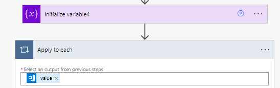
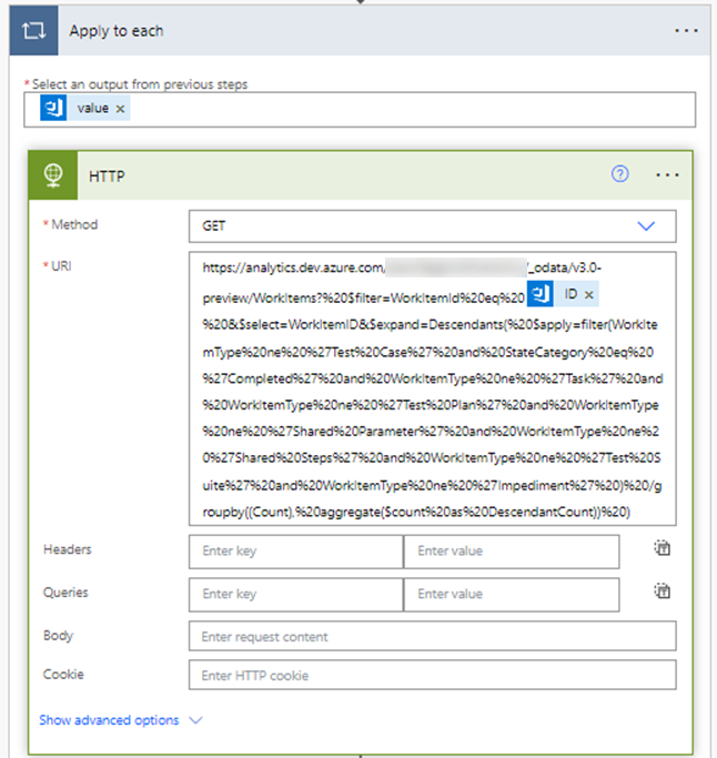
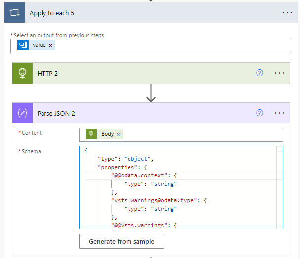
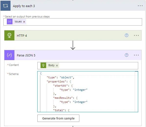
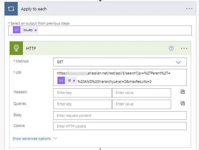
Then we’re then going to add an Apply to each step, using the ‘issues’ value from our previous step. Then add a HTTP actionwhere we’re going to take the child count for each Epic. The first part of the URL (replace JIRAINSTANCE with your details) should be:
https://JIRAINSTANCE.atlassian.net/rest/api/3/search?jql=%27Parent%27=Then the id, and then:
%20AND%20hierarchyLevel=0&maxResults=0Which should then look like so:

Don’t forget to click ‘Show advanced options’ and add your access token details again. Then we’re going to add a Parse JSON action using Body as the content and the following schema:
{
    "type": "object",
    "properties": {
        "startAt": {
            "type": "integer"
        },
        "maxResults": {
            "type": "integer"
        },
        "total": {
            "type": "integer"
        },
        "issues": {
            "type": "array"
        }
    }
}
Which should look like so:
Next add a Compose action with the total from the previos step:

Next we’re going to Append to array variable the output of this to our ‘FlattenedArray’ variable:

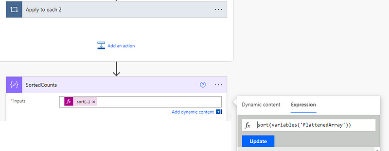
Then we’re going to go outside our Apply to each loop and add a Compose step to sort our child item counts:
sort(variables('FlattenedArray'))
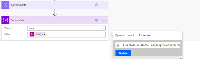
Then we’re going to add a Set Variable step where we’re going to set our Rank variable using the following expression:
float(add(mul(0.85, sub(length(outputs('SortedCounts')), 1)), 1))
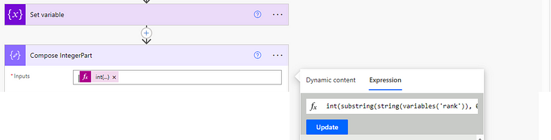
Next we’re going to do the part where we work out our 85th percentile. To start with, we first need to figure out the integer part. Add a compose action with the following expression:
int(substring(string(variables('rank')), 0, indexOf(string(variables('rank')), '.')))
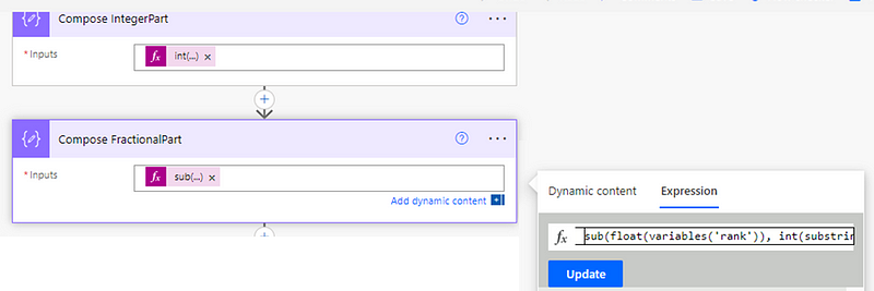
Then add another compose part for the fractional part, using the expression of:
sub(float(variables('rank')), int(substring(string(variables('rank')), 0, indexOf(string(variables('rank')), '.'))))
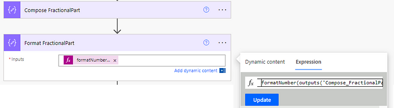
Then we’re going to add a Compose step for formatting this to be one decimal place, we do using:
formatNumber(outputs('Compose_FractionalPart'), 'N1')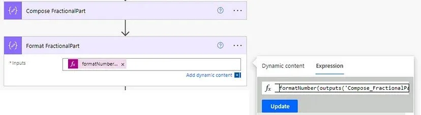
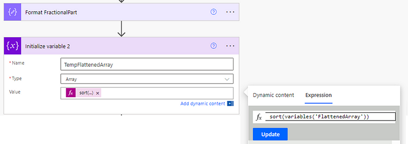
Then we’re going to initialize another variable, which we do simply to “re-sort” our array (I found in testing this was needed). This will have a value of:
sort(variables('FlattenedArray'))
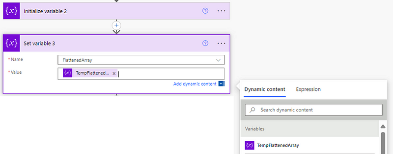
Then we’re going to set our FlattenedArray variable to be the output of this step:

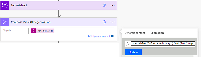
Then we need to calculate the value at our Integer position:
variables('FlattenedArray')[sub(int(outputs('Compose_IntegerPart')), 1)]
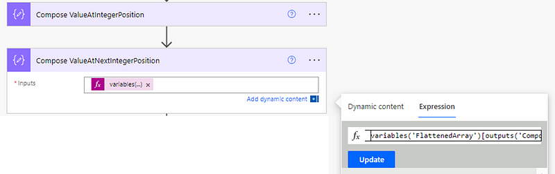
Then do the same again for the value at the next integer position:
variables('FlattenedArray')[outputs('Compose_IntegerPart')]
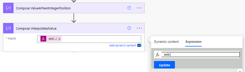
Then add a compose for our interpolated value:
add(
    outputs('Compose_ValueAtIntegerPosition'),
    mul(
        outputs('Compose_FractionalPart'),
        sub(
            outputs('Compose_ValueAtNextIntegerPosition'),
            outputs('Compose_ValueAtIntegerPosition')
        )
    )
)
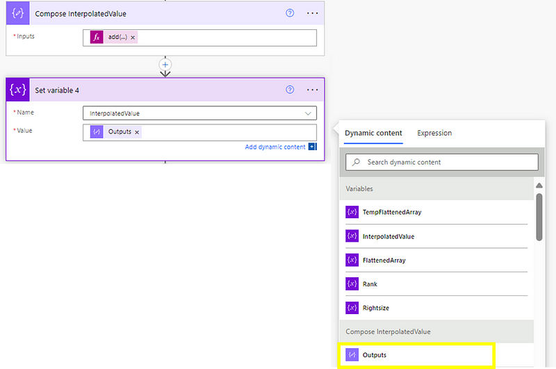
Remember the variable we created at the beginning for this? This is where we need it again, using the outputs of the previous step to set this as our InterpolatedValue variable:
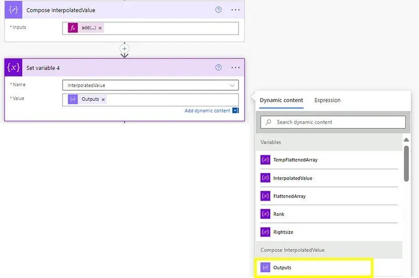
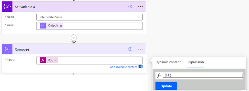
Then we need to add a Compose step:
if(
    greaterOrEquals(mod(variables('InterpolatedValue'), 1), 0.5),
    formatNumber(variables('InterpolatedValue'), '0'),
    if(
        less(mod(variables('InterpolatedValue'), 1), 0.5),
        if(
            equals(mod(variables('InterpolatedValue'), 1), 0),
            formatNumber(variables('InterpolatedValue'), '0'),
            add(int(first(split(string(variables('InterpolatedValue')), '.'))), 1)
        ),
        first(split(string(variables('InterpolatedValue')), '.'))
    )
)
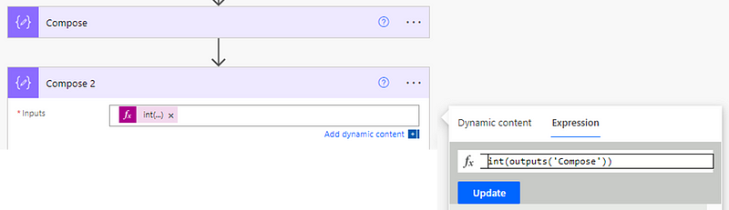
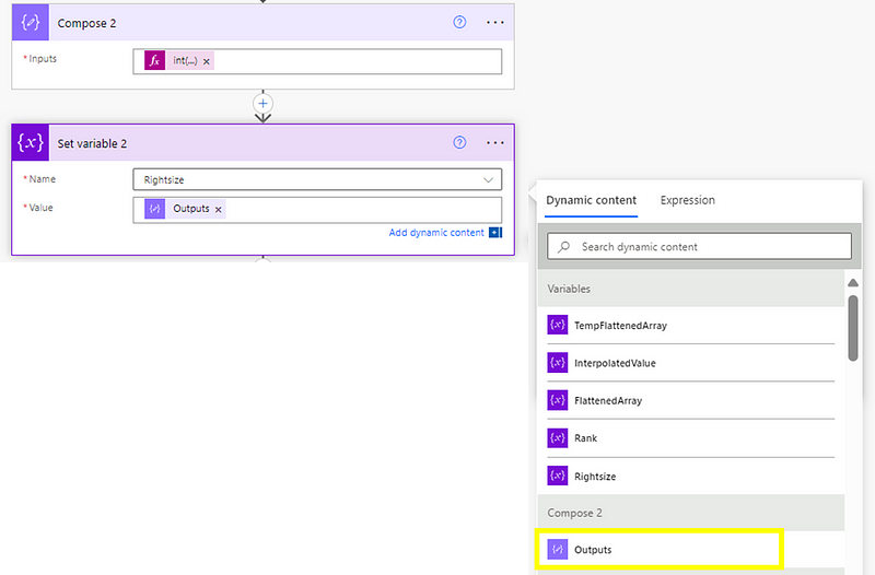
Then we just need to reformat this to be an integer:
int(outputs('Compose'))
Then we use the output of this to set our rightsize variable:

Next step is to use HTTP again, this time getting all our open Epics in Jira. It should be a GET with the URL (replace JIRAINSTANCE and PROJECT with your details) of:
https://JIRAINSTANCE.atlassian.net/rest/api/3/search?jql=project%20%3D%20PROJECT%20AND%20statuscategory%20%21%3D%20Done%20AND%20hierarchyLevel%20%3D%201%0AORDER%20BY%20created%20DESC&fields=id&maxResults=100
Again, don’t forget to click ‘Show advanced options’ and add in your access token details.
Next we’re going to add a Parse JSON step with the ‘body’ of the previous step and the following schema:
{
    "type": "object",
    "properties": {
        "expand": {
            "type": "string"
        },
        "startAt": {
            "type": "integer"
        },
        "maxResults": {
            "type": "integer"
        },
        "total": {
            "type": "integer"
        },
        "issues": {
            "type": "array",
            "items": {
                "type": "object",
                "properties": {
                    "expand": {
                        "type": "string"
                    },
                    "id": {
                        "type": "string"
                    },
                    "self": {
                        "type": "string"
                    },
                    "key": {
                        "type": "string"
                    }
                },
                "required": [
                    "expand",
                    "id",
                    "self",
                    "key"
                ]
            }
        }
    }
}
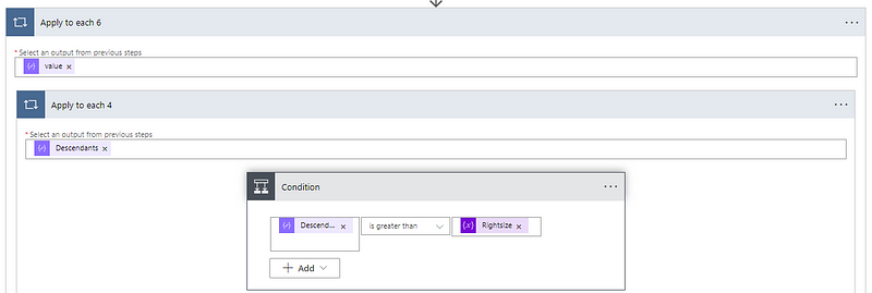
Then you’re going to add in an Apply to each step, using issues from the previous step. Add in a HTTP step, the first part of the URL (replace JIRAINSTANCE with your details) should be:
https://JIRAINSTANCE.atlassian.net/rest/api/3/search?jql=%27Parent%27=Add in the id field from our Parse JSON step then follow it with:
%20AND%20hierarchyLevel=0&maxResults=0Which looks like so:
You should know by now what to do with your access token details ;)
Add a Parse JSON with body of the previous step and the following schema:
{
    "type": "object",
    "properties": {
        "startAt": {
            "type": "integer"
        },
        "maxResults": {
            "type": "integer"
        },
        "total": {
            "type": "integer"
        },
        "issues": {
            "type": "array"
        }
    }
}
Then add a Compose step where we’re just going to take the total of the previous step:

Finally, we’re going to add a condition. Here we’ll look at each open Epic and see if the child count is less than or equal to our Rightsize variable:

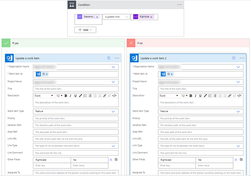
If yes, then we add an Edit Issue (V2) step where we add in our Jira instance, the Issue ID (which we get from a previous step) and, crucially, what our customfield is for our ‘right-sized’ value (remember at the beginning when we worked out what this was? If not go back and re-read!). We update this with “No” if it’s greater than the right-size, or “yes” if it is not:

And that’s it — you’re (finally) done!
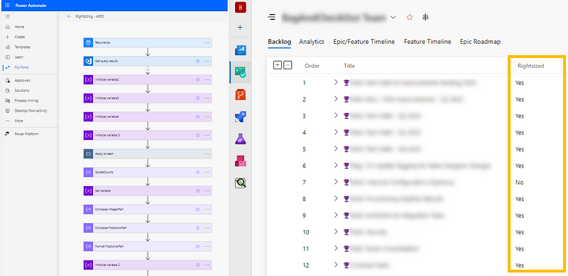
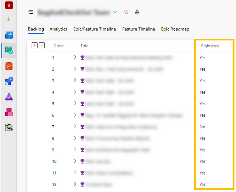
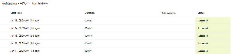
If you run the automation, then it should successfully update your Epics if they are/are not right-sized:

It’s worth noting that any Epics with 0 child items aren’t updated with yes/no, purely due to this likely being too early on in the process. Saying an Epic with 0 child items is ‘right-sized’ feels wrong to me but you are welcome to amend the flow if you disagree!
By implementing continuous right-sizing in Jira using Power Automate, teams can drive faster feedback loops, reduce delivery risks, and improve predictability. Automating the right-sizing check ensures the data remains visible and actionable, empowering teams to stay focused on maintaining manageable work sizes. With this flow in place, you’re not just optimising Epics — you’re fostering a culture of continuous improvement and efficiency.