The first in a two-part series where we share how at ASOS we are measuring agility across our teams and the wider tech organisation. This part covers the problems we were looking to solve, what the themes are, as well as exploring the four themes in detail…
Context and purpose
As a team of three coaches with ~100 teams, understanding where to spend our efforts is essential to be effective in our role. Similarly, one of our main reasons to exist in ASOS is to help understand the agility of the organisation and clearly define ‘what good looks like’.
Measuring the agility of a team (and then doing this at scale) is a difficult task and in lots of organisations this is done through the usage of a maturity model. Whilst maturity models can provide a structured framework, they often fall short in addressing the unique dynamics of each organisation, amongst many other reasons. The rigidity of these models can lead to a checklist mentality, where the focus is on ticking boxes (i.e. ‘agile compliance’) rather than fostering genuine agility. Similarly they assume everyone follows the same path where we know context differs.

Such as this…
Unfortunately, we also found we had teams at ASOS that were focusing on the wrong things when it comes to agility such as:
Planned vs. actual items per sprint (say-do ratio)
How many items ‘spill over’ to the next sprint
How many story points they complete / what’s our velocity / what is an “8-point story” etc.
Do we follow all the agile ceremonies/events correctly
When it comes to agility, these things do not matter.
We therefore set about developing something that would allow our teams to self-assess, which focuses on the outcomes agility should lead to. With the main problems to solve being:
Aligning ASOS Tech on a common understanding of what agility is
Giving teams a lightweight approach to self-assess, rather than relying on Agile Coaches to observe and “tell them” how agile they are
Having an approach that is more up to date with industry trends, rather than how people were taught Scrum/Kanban 5, 10 or 15+ years ago
Having an approach to self-assessment that is framework agnostic yet considers our ASOS context
Allowing senior leaders to be more informed about where their teams are agility wise
Our overarching principle being that this is a tool to inform our collective efforts towards continuous improvement, and not a tool to compare teams, nor to be used as a stick to beat them with.
The Four Themes
In the spirit of being lightweight, we restricted ourself to just four themes, these being things that we think are most important for teams when it comes to the outcomes you should care about when it comes to your way of working.
Flow — the movement of work through a teams workflow/board.
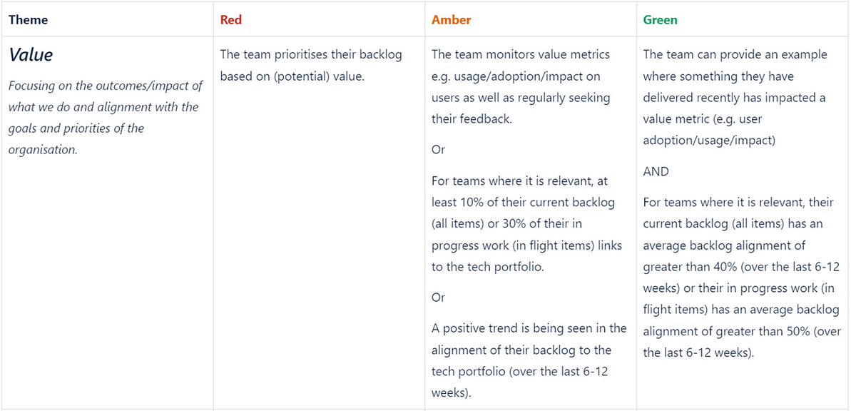
Value — focusing on the outcomes/impact of what we do and alignment with the goals and priorities of the organisation.
Culture — the mindset/behaviours we expect around teamwork, learning and continuous improvement.
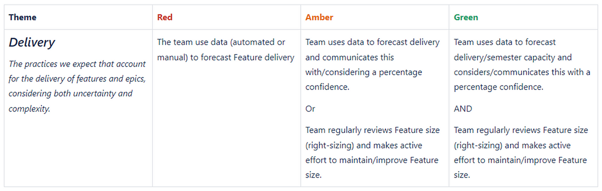
Delivery— the practices we expect that account for the delivery of features and epics, considering both uncertainty and complexity.
Each theme has three levels, which are rated on a Red/Amber/Green scale — mainly due to this being an existing scale of self-assessment in other tools our engineering teams have at their disposal.
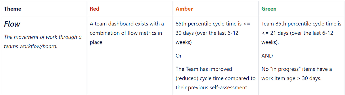
Flow
The focus here is around flow metrics, specifically Cycle Time and Work Item Age, with the three levels being:
Teams already have flow metrics available to them via a Power BI app, so are able to quickly navigate and understand where they are:
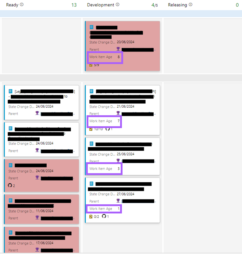
The goal with this is to make teams aware just how long items are taking, as well as how long the “in-flight” items have actually been in progress. The teams that are Green are naturally just very good at breaking work down, and/or have already embedded looking at this on a regular basis into their way of working (say in retrospectives). Those teams that are at Red/Amber have since adopted techniques such as automating the age of items on the kanban board to highlight aging items which need attention:
Value
The focus with this theme is understanding the impact of what we do and ensuring that we retain alignment with the goals and priorities of the organisation:
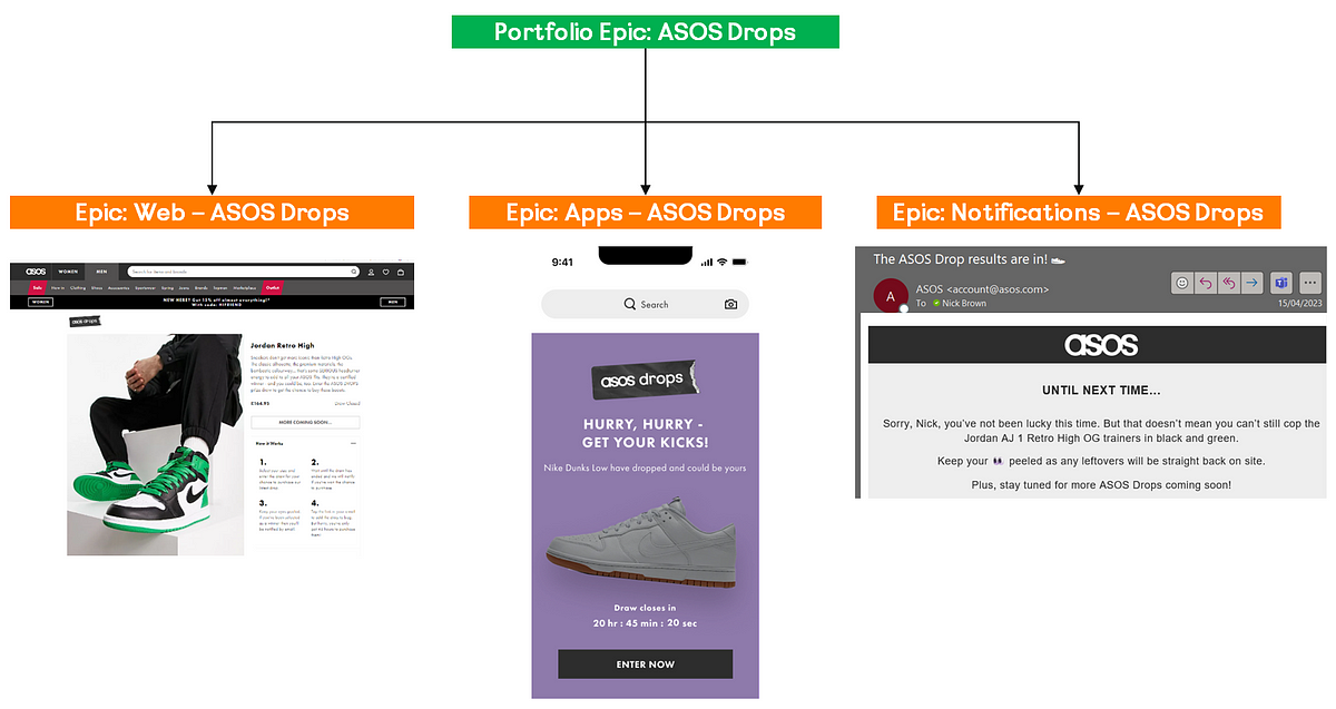
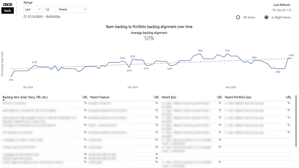
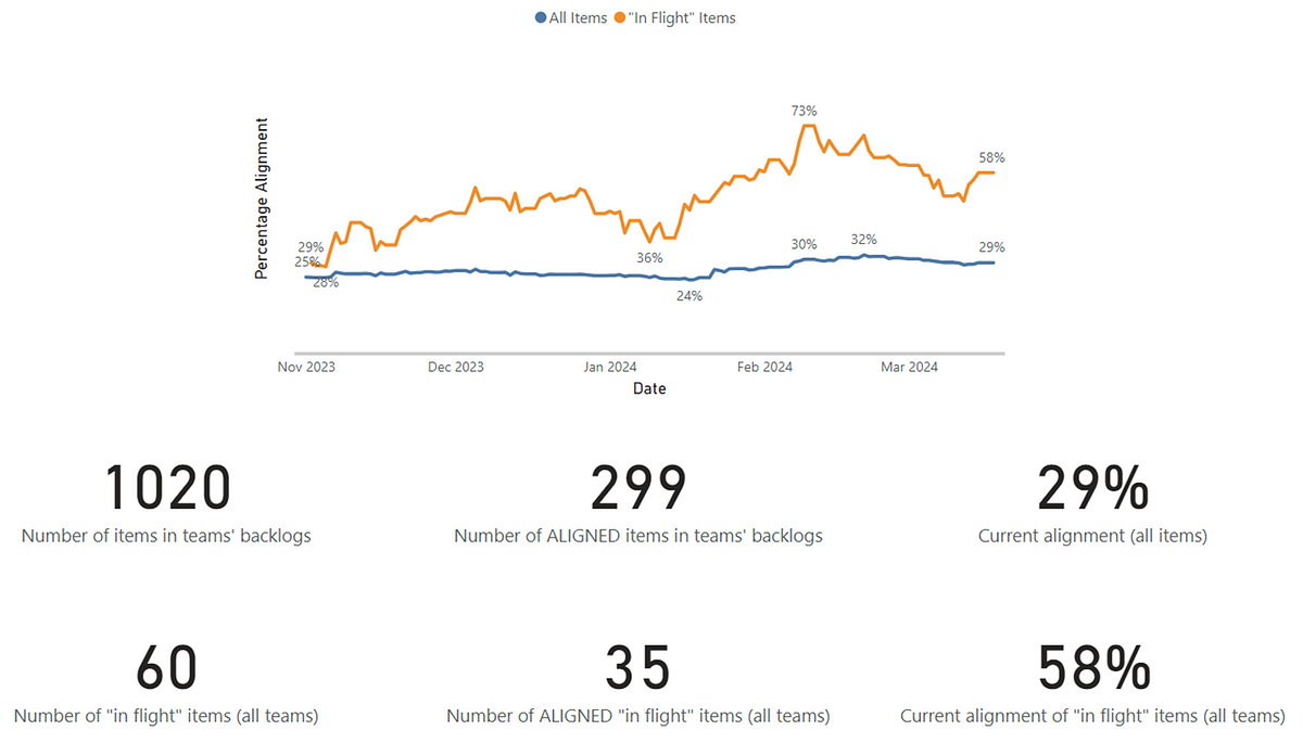
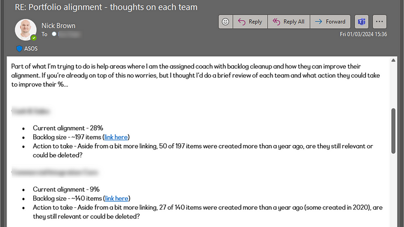
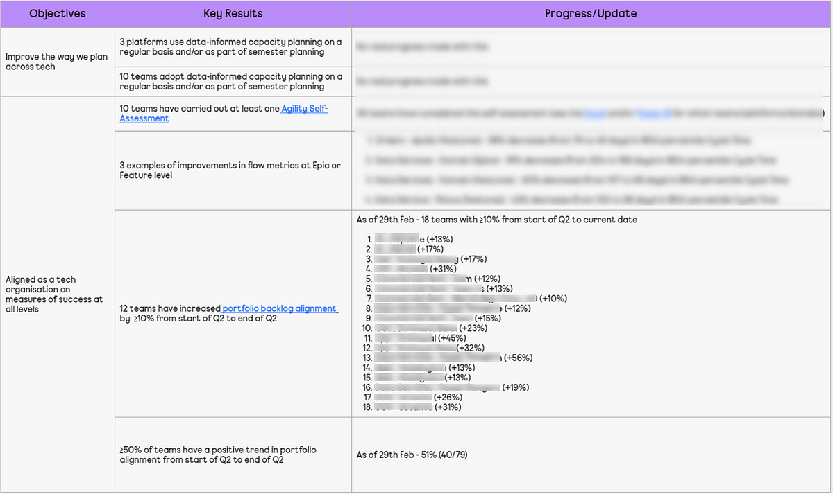
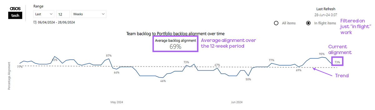
In case you haven’t read it, in the ASOS Tech blog previously I’ve covered how we go about measuring portfolio alignment in teams. It essentially is looking at how much of a team backlog goes from PBI/User Story > Feature > Epic > Portfolio Epic. We visualise this in a line chart, where teams can see the trend as well as flipping between viewing their whole backlog vs. just in-flight work:
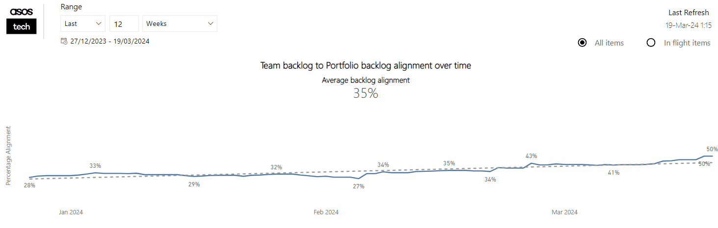
Similar to flow metrics, teams can quickly access the Power BI app to understand where they are for one part of value:
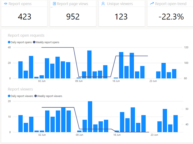
The second part is where many teams currently face a challenge. Understanding the impact (value) of what you deliver is essential for any organisation that truly cares about agility. We’re all familiar with feature factories, so this was a deliberate step change to get our teams away from that thinking. What teams deliver/provide support for varies, from customer facing apps to internal business unit apps and even tools or components that other teams consume, so having a ‘central location’ for looking at adoption/usage metrics is impossible. This means it can take time as either data is not readily available to teams or they had not actually really considered this themselves, most likely due to being a component part of a wider deliverable.
Still, we’ve seen good successes here, such as our AI teams who measure the impact of models they build around personalised recommendations, looking at reach and engagement. Obviously for our Web and Apps teams we have customer engagement/usage data, but we also have many teams who serve other teams/internal users, like our Data teams who look at impact in terms of report open rate and viewers/views of reports they build:
Culture
Next we look at the behaviours/interactions a team has around working together and continuously improving:

Ultimately, we’re trying to get away from the idea that many have around agility that continuous improvement = having retrospectives. These are meaningless if they are not identifying actionable (and measurable) improvements to your way of working, no matter how “fun” it is to do a barbie themed format!
We aren’t prescriptive in what team health tool teams use, so long as they are doing it. This could be our internal tool, PETALS (more on this here), the well known Spotify Team/Squad Health Check or even the Team Assessment built into the retrospectives tool in Azure DevOps:

All tools welcome!
The point is that our good teams are regularly tracking this and seeing if it is getting better.
A good example of what we are looking for at ‘green’ level is from this team who recently moved to pairing (shout out to Doug Idle and his team). Around 8 weeks before this image was taken they moved to pairing, which has not only made them happier as a team, but has clearly had a measurable impact in reducing their 85th percentile cycle time by 73%:
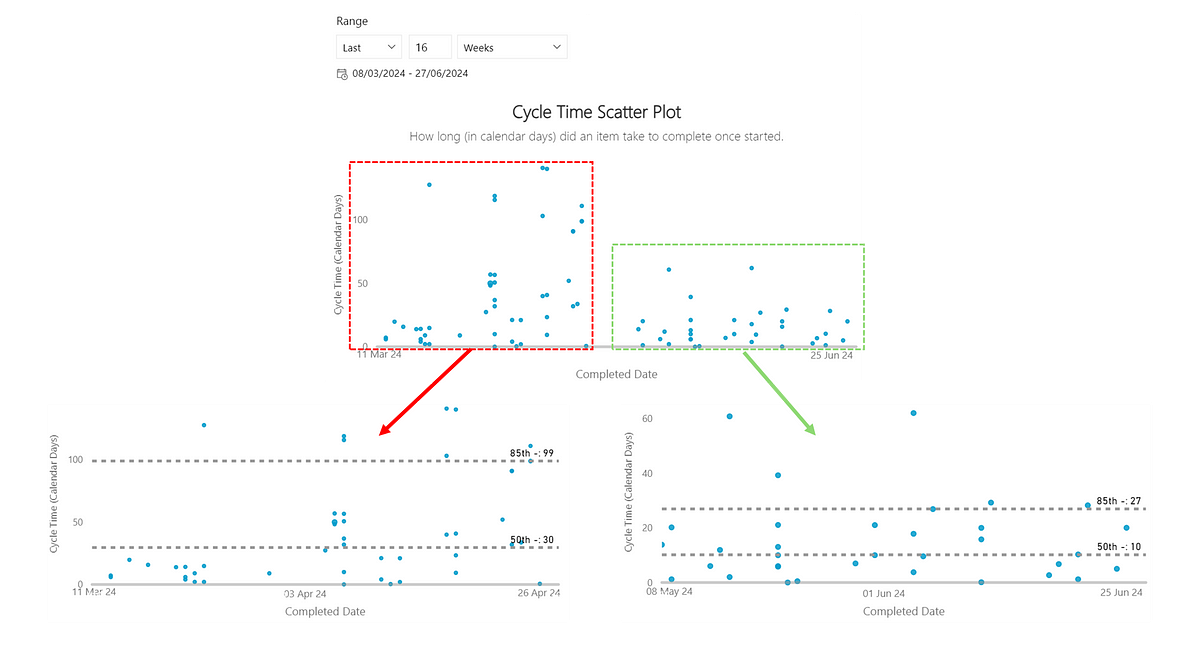
73% reduction (from 99 to 27 days) in 85th percentile Cycle Time as a result of pairing
Combine this with then sharing more widely, primarily so teams can learn from each other, then this is what we are after in our strongest teams culturally.
Delivery
The final theme touches on what many agile teams neglect which is ultimately about delivering. When we mean delivery in this context we’re focusing on delivery of Features/Epics (as opposed to PBI/Story level). Specifically, we believe it’s understanding risk/uncertainty and striving towards predictability and what this means when using agile principles and practices:
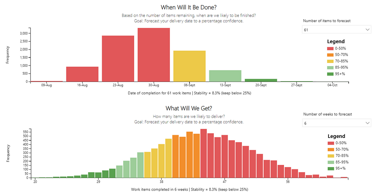
The good teams in this theme understand that due to software development being complex, you need to forecast delivery with a percentage confidence, and do this regularly. This means using data which, for our teams is available to them within a few clicks, here they can forecast, given a count of items when will they be done or, given a time box, what can they deliver.
Many teams have multiple features in their backlog, thus to get to ‘green’ our teams should leverage Feature Monte Carlo so the range of outcomes that could occur for multiple Features is visible:
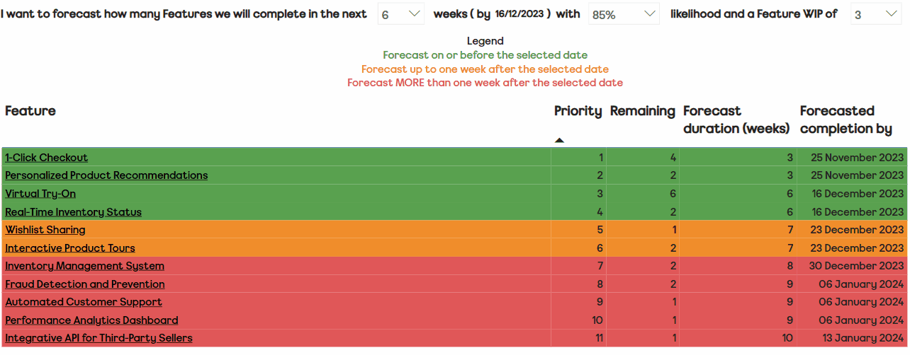
Note: Feature list is fictional/not from any actual teams
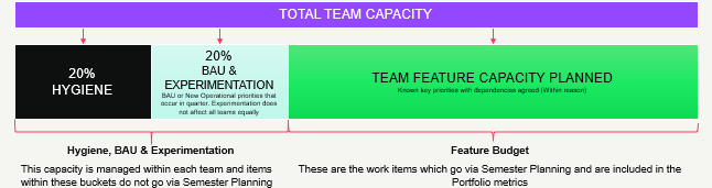
Previously I’ve covered our approach to capacity planning and right-sizing, where teams focus on making Features no bigger than a certain size (batch) and thus can quickly (in seconds) forecast the amount of right-sized features they have capacity for, which again is what we look for in our ‘green’ criteria:
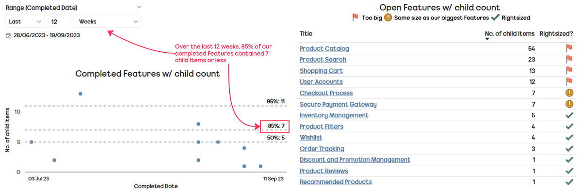
Note: Feature list is fictional/not from any actual teams

The best way to do this really is to have a regular cadence where you specifically look at delivery and these particular metrics, that way you’re informed around your progress and any items that may need breaking down/splitting.
Part two…
In this post I share how teams submit their results (and at what cadence) as well as how the results are visualised, what the rollout/adoption has been like, along with our learnings and future direction for the self-assessment…