The second in a two-part series where we share how at ASOS we are measuring agility across our teams and the wider tech organisation…
Recap on part one
For those who didn’t get a chance to read part one, previously I introduced our holistic measurement to agility, covering four themes of:
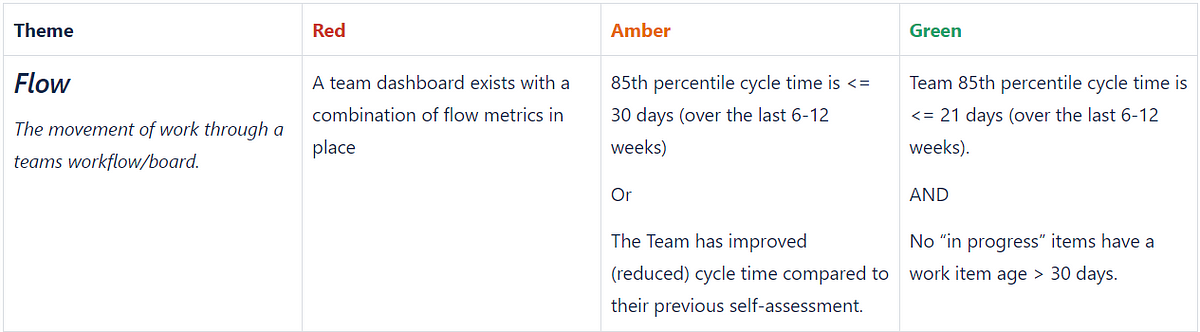
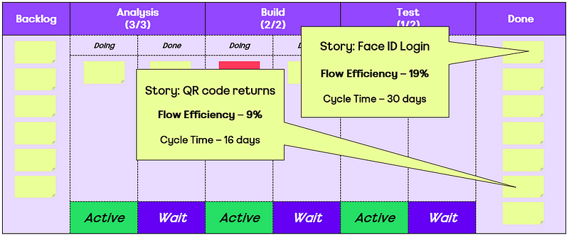
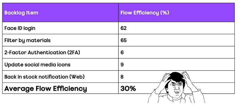
Flow — the movement of work through a teams workflow/board.
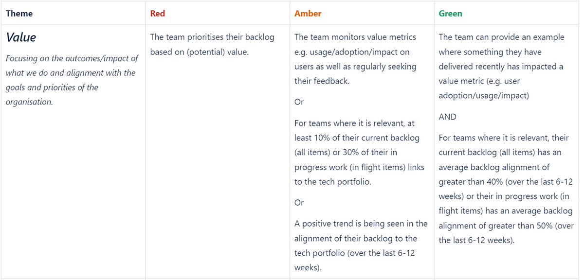
Value — the outcomes/impact in what we do and alignment with the goals and priorities of the organisation.
Culture — the mindset/behaviours we expect around teamwork, learning and continuous improvement.
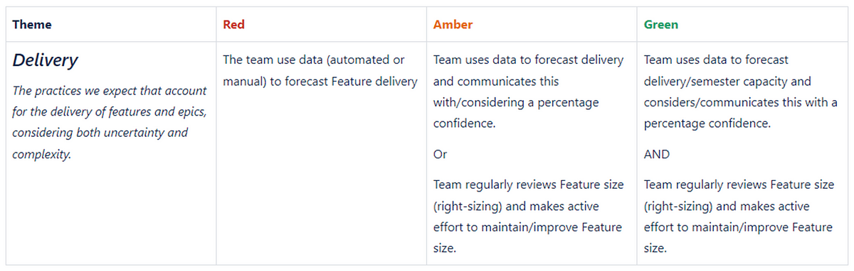
Delivery — the practices we expect that account for the delivery of Epics/Features, considering both uncertainty and complexity.
Now let’s get to explaining how the results are submitted/visualized, what the rollout/adoption has been like along with our learnings and future direction.
Submitting the results
We advise teams to submit a new assessment every six to eight weeks, as experience tells us this gives enough time to see the change in a particular theme. When teams are ready to submit, they go to an online Excel form and add a new row, then add the rating and rationale for each theme:
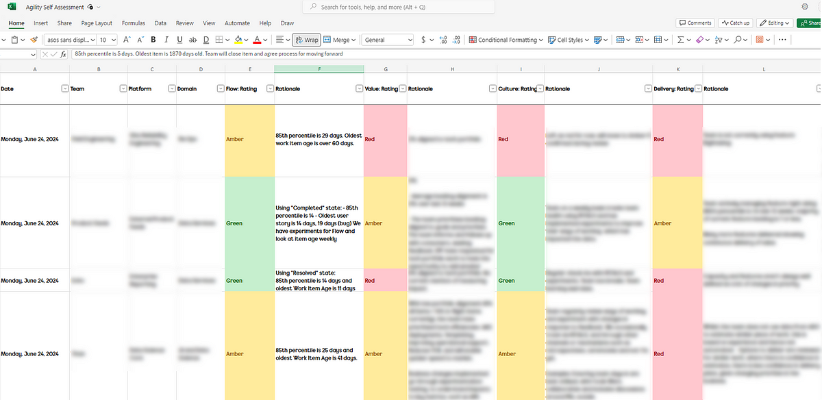
Excel online file for capturing ratings and rationale for each theme
Visualizing the results
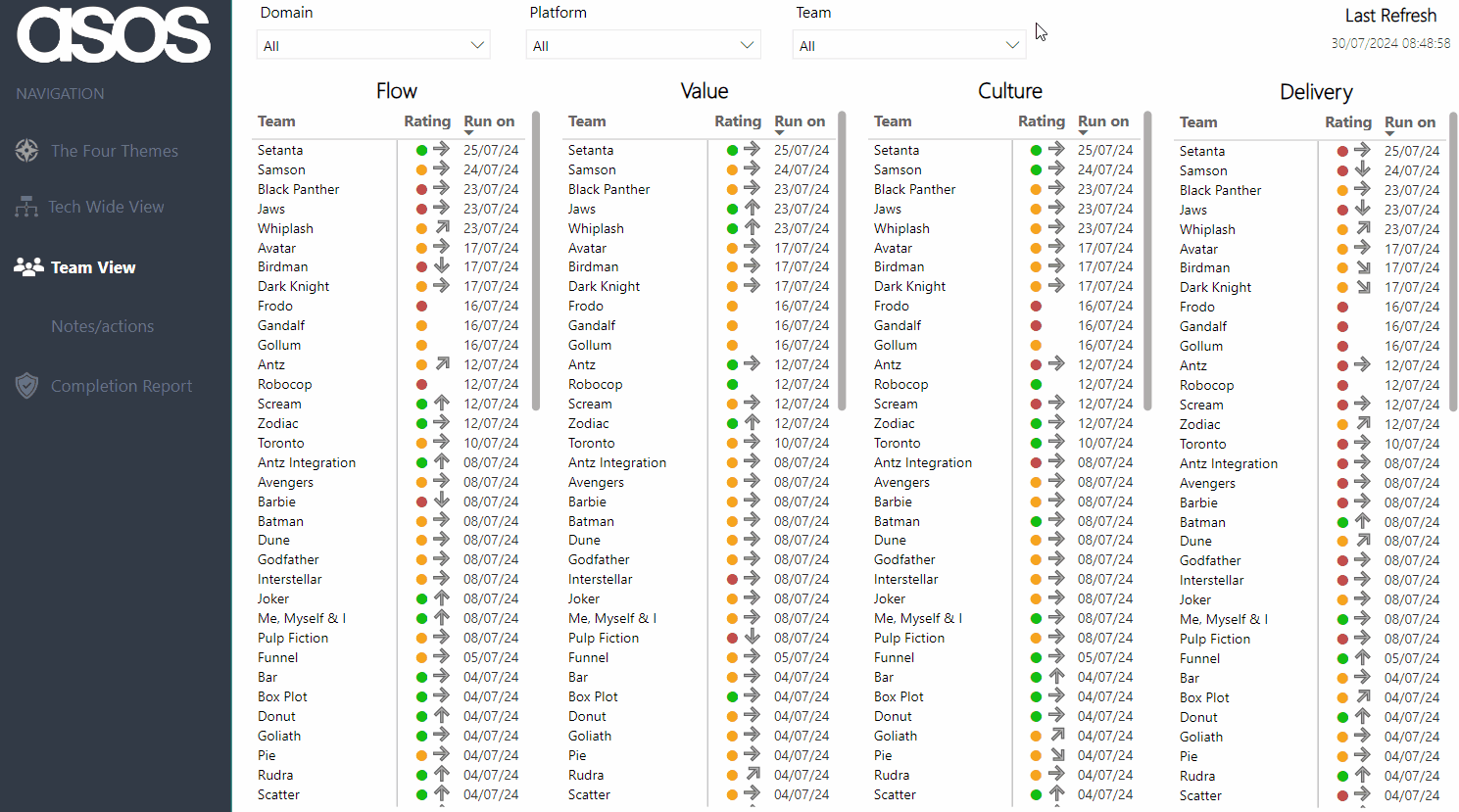
Team view
By default, all teams and their current rating/trend, along with the date when the last assessment was run are visible upon opening the report:
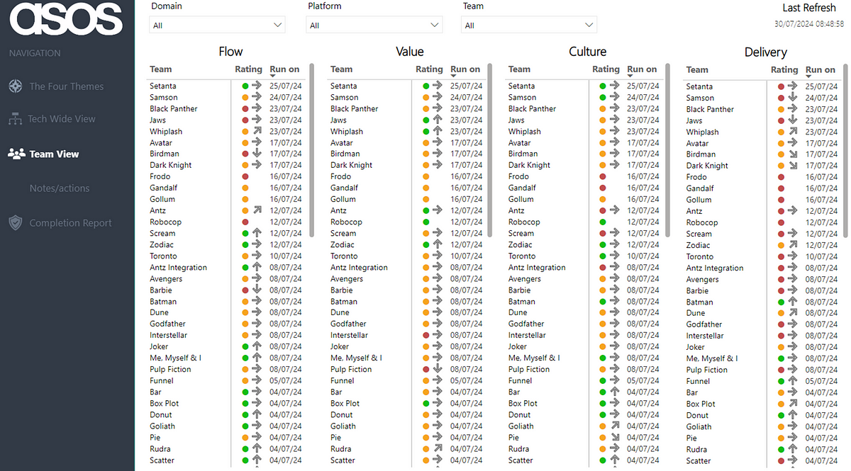
Note: all Team/Platform/Domain names anonymised for the purposes of this blog!
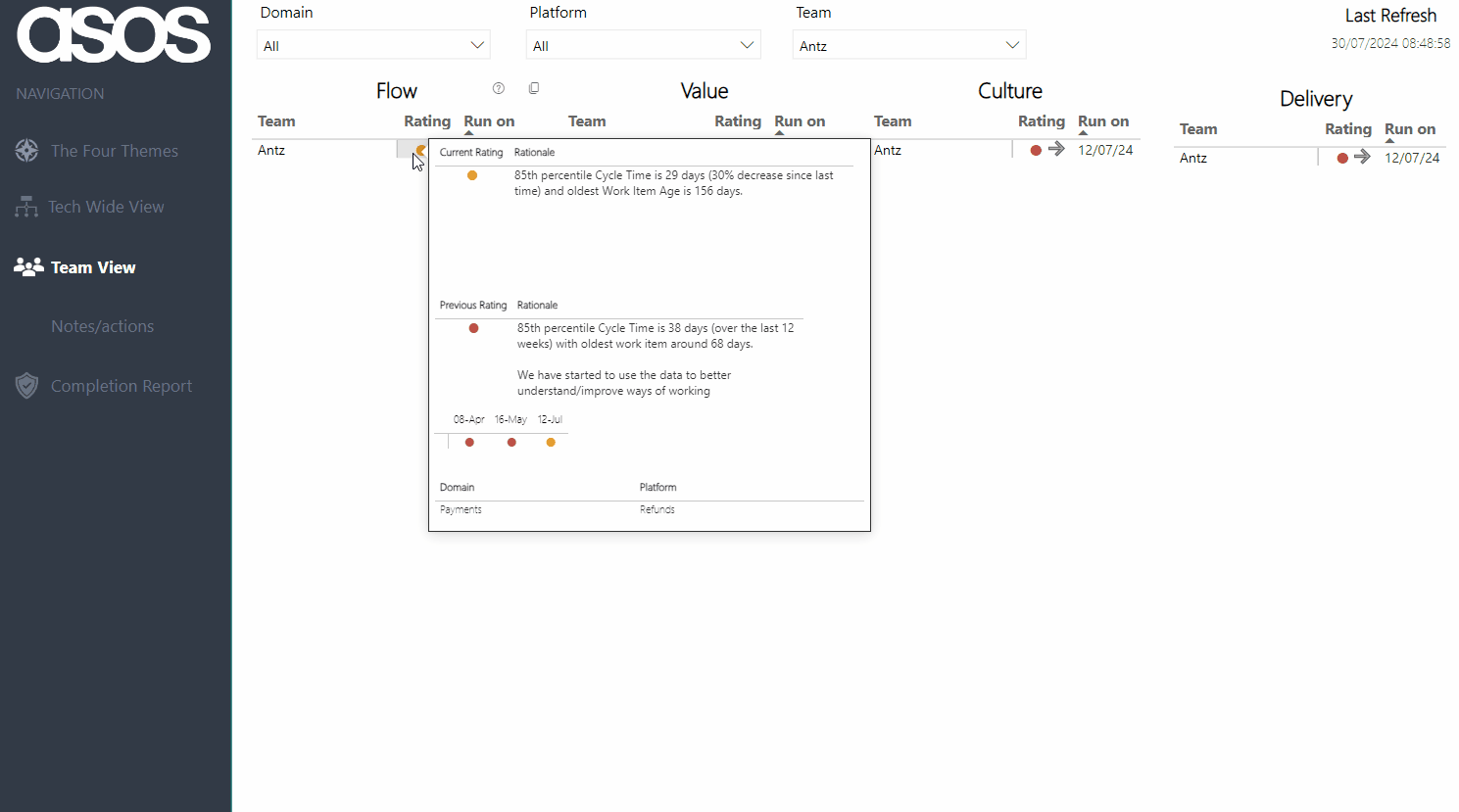
Viewers can then filter to view their team — hovering on the current rating provides the rationale as well as the previous rating and rationale. There is also a history of all the submitted ratings for the chosen theme over time:
Note: all Team/Platform/Domain names anonymised for the purposes of this blog!
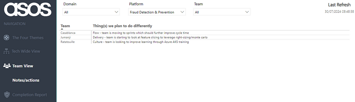
Filters persist across pages, so after filtering you can also then click through to the Notes/Actions page to remind yourself of what your team has identified as the thing to focus on improving:
Note: all Team/Platform/Domain names anonymised for the purposes of this blog!
Platform/Domain view
Normally, we facilitate a regular discussion at ‘team of teams’ level which, depending on the size of an area, may be a number of teams in a platform or all the teams and platforms in a Domain:
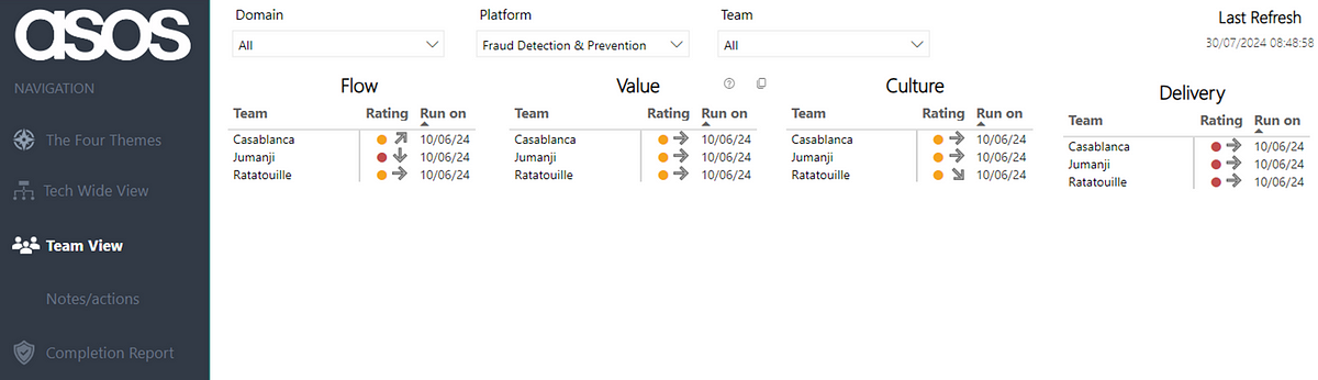
Note: all Team/Platform/Domain names anonymised for the purposes of this blog!
This helps leaders in an area understand where the collective is at, as well as being able to focus on a particular team. It also can highlight where teams in an area learn from each other, rather than just relying on an Agile Coach to advise. Again filtering persists to allow for Leaders to have a holistic view of improvements across teams:
Note: all Team/Platform/Domain names anonymised for the purposes of this blog!
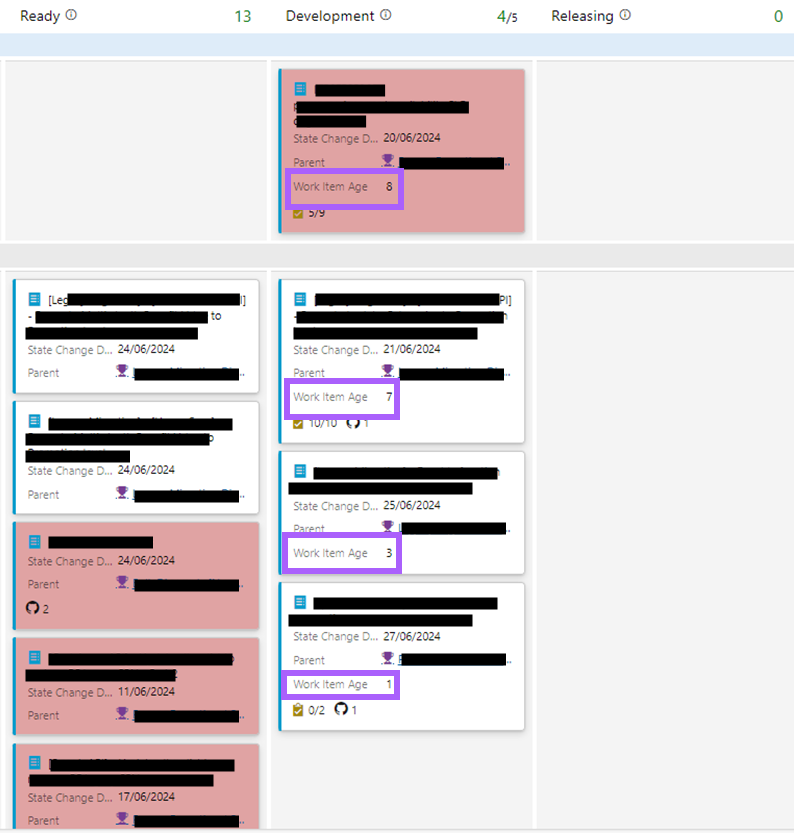
This is key for leaders as it informs them in understanding how they can support an environment towards continuous improvement and agility. For example if a team was experimenting with WIP limits to improve their rating for Flow, if a leader is pushing more work to them then this probably isn’t going to result in the theme improving!
Tech Wide View
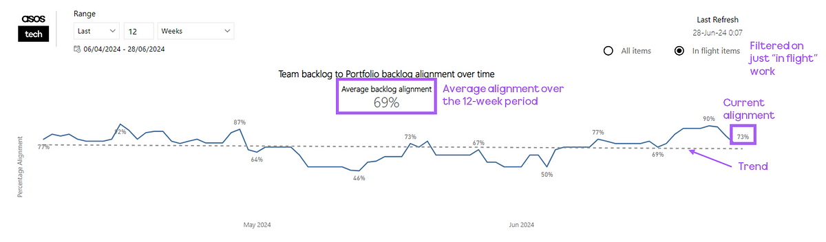
The Tech Wide View provides an overview of the most recent submissions for all teams across the organisation. We feel this gives us the clearest ‘measurement’ and holistic view of agility in our tech organisation, with the ability to hover on a specific theme to see if ratings are improving:
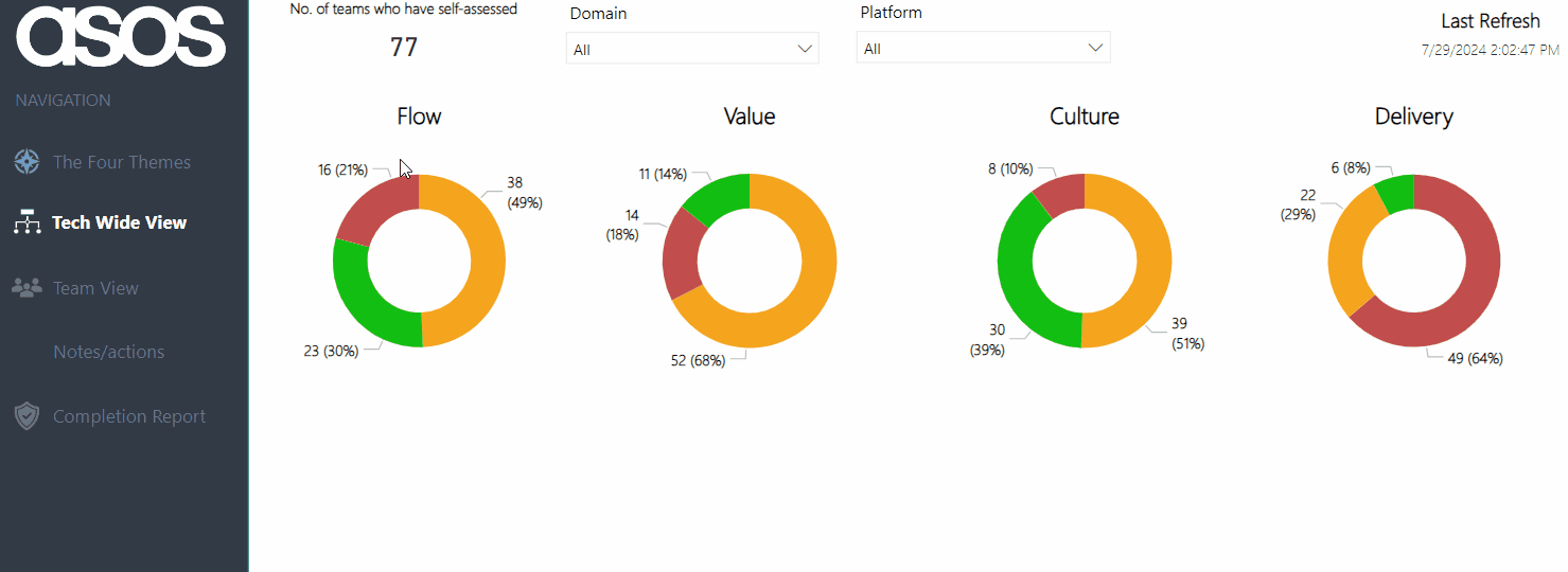
As coaches, this also helps inform us as to what practices/coaching areas we should be focusing on at scale, rather than trying to go after everything and/or focusing on just a specific team.
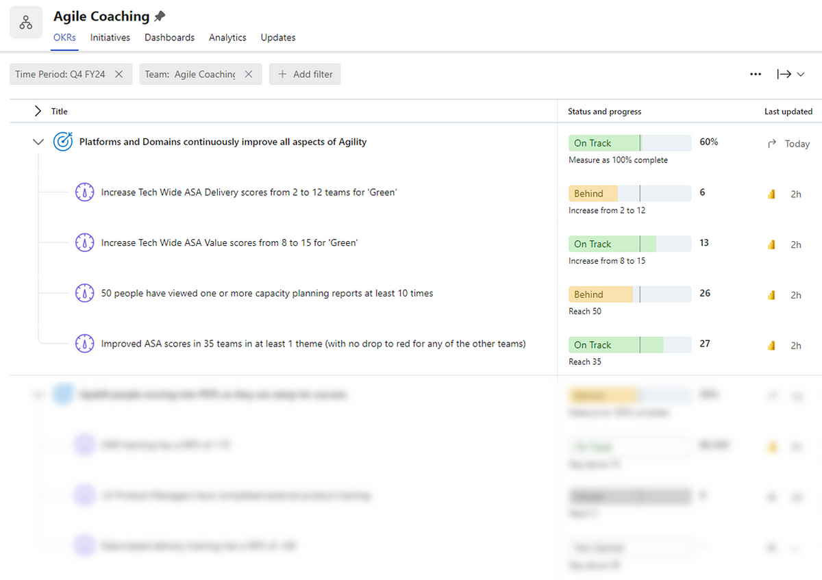
In turn we can use this data to help inform things like our own Objectives and Key Results (OKRs). We use this data to guide us on what we should be focusing on and, more importantly, if we are having impact:
Rollout, adoption and impact
In rolling this out, we were keen to stick to our principles and invite teams to complete this, rather than mandating (i.e. inflicting) it across all of our technology organisation. We used various channels (sharing directly with teams, presenting in Engineering All Hands, etc.) to advertise and market it, as well as having clear documentation around the assessment and the time commitment needed. After launching in Jan, this is the rate at which teams have submitted their first assessment:

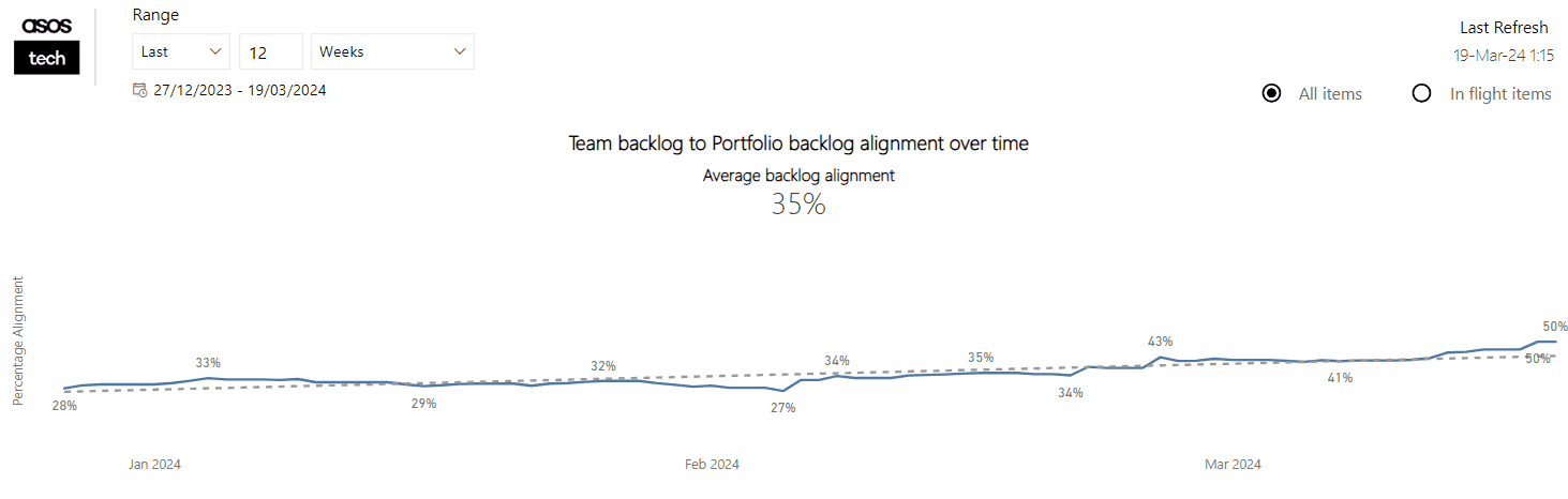
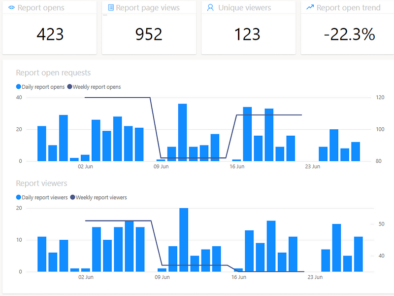
In addition to this, we use our internal Team Designer app (more on this here) to cross-reference our coverage across domains and platforms. This allows us to see in which areas adoption is good and in which areas we need to remind/encourage folks around trialling it:
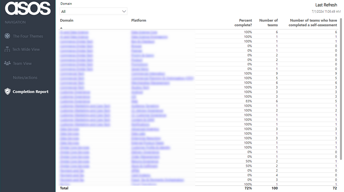
Note: numbers may not match due to date screenshots were taken!
With any ‘product’, it’s important to consider what are appropriate product metrics to consider, particularly as we know measurable changes in behaviour from users are typically what correlate with value. One of the ways to validate if the self-assessment is adding value for teams is if they continue to use it. One-off usage may give them some insight but if it doesn’t add value, particularly with something they are ‘invited’ to use, then it will gradually die and we won’t see teams continue to complete it. Thankfully, this wasn’t the case here, as we can see that 89% of teams (70 out of 79) have submitted more than one self-assessment:
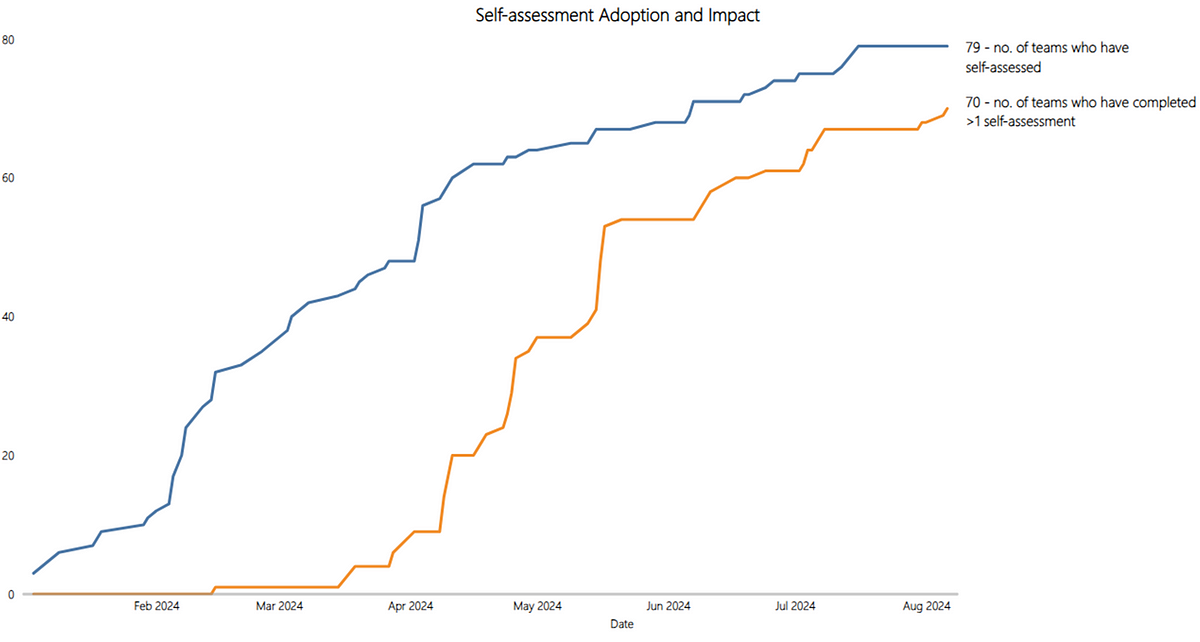
The main thing though that we are concerned with in demonstrating the impact/value of this approach is if teams are actually improving. You could still have plenty of teams adopt the self-assessment yet stay the same for every rating and never actually improve. Here we visualise each time a team has seen an improvement between assessments (note: teams are only counted the first time they improve, not counted again if they improve further):

Overall we can see the underlying story is that the vast majority of teams are improving, specifically that 83% of teams (58 out of 70) who have submitted >1 assessment have improved in one (or more) theme.
Learnings along the way
Invitation over infliction
In order to change anything around ways of working in an organisation, teams have to want to change or “opt-in”. Producing an approach without the acceptance going in that you may be completely wrong and being prepared to ditch it leads to sunk cost fallacy. It is therefore important with something like this that teams can “opt-out” at any time.
Keep it lightweight yet clear
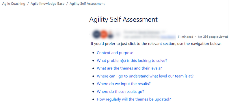
There are many agility assessments that we have seen in different organisations/the industry over the years and almost always these fall foul of not being lightweight. You do not need to ask a team 20 questions to “find out” about their agility. Having said this, lightweight is not an excuse for lack of clarity, therefore supporting documentation on how people can find out where they are or what the themes mean is a necessity. We used a Confluence page with some fast-click links to specific content to allow people to quickly get to what they needed to get to:
Shared sessions and cadence
Another way to increase adoption is to have teams review the results together, rather than just getting them to submit and then that’s it. In many areas we, as coaches, would facilitate a regular self-assessment review for a platform or domain. In this each team would talk through their rationale for a rating whilst the others can listen in and ask questions/give ideas on how to improve. There have been times for example when ratings have been upgraded due to teams feeling they were being too harsh (which surprisingly I also agreed with!) but the majority of time there are suggestions they can make to each other. In terms of continuous improvement and learning this is way more impactful than hearing it from just an Agile Coach.
Set a high bar
One of the observations we made when rolling this out was how little ‘green’ there was in particular themes. This does not automatically equate to teams being ‘bad’, more just they are where we think good is from an agility perspective, relevant to our experience and industry trends.
One of the hard parts with this is not compromising in your view of what good looks like, even though it may not be a message that people particular like. We leaned heavily on the experience of Scott Frampton and his work at ASOS to stay true to this, even if it at times it made for uncomfortable viewing.
Make improvements visible
Initially, the spreadsheet did not contain the column about what teams are going to do differently as a result of this, it was only after a brief chat with Scott and with his learnings we implemented this. Whilst it does rely on teams to add in the detail about what they are going to do differently, it helps see that teams are identifying clear action to take, based on the results of the assessment.
Culture trumps all when it comes to improvement
This is one of the most important things when it comes to this type of approach. One idea I discussed with Dan Dickinson from our team was around a ‘most improved’ team, where a team had improved the most from their initial assessment to what they are now. In doing this one team was a clear standout, yet they remained at a value of ‘red’ for culture. This isn’t the type of team we should be celebrating, even if all the other factors have improved. Speedy delivery of valuable work with good rigour around delivery practices is ultimately pointless if people hate being in that team. All factors to the assessment are important but ultimately, you should never neglect culture.
Measure it’s impact
Finally, focus on impact. You can have lots of teams regularly assessing but ultimately, if it isn’t improving the way they work it is wasted effort. Always consider how you will validate that something like an assessment can demonstrate tangible improvements to the organisation.
What does the future hold?
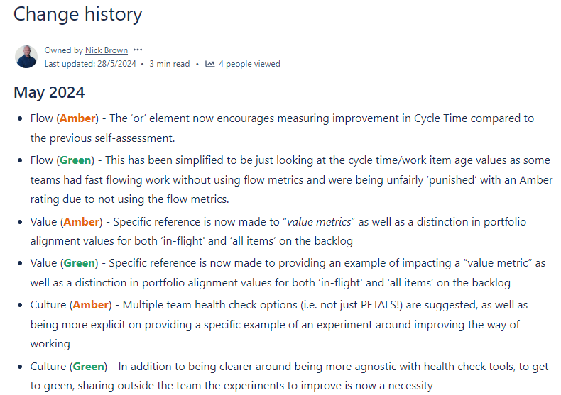
As a coaching team we have a quarterly cadence of reviewing and tweaking the themes and their levels, sharing this with teams when any changes are made:
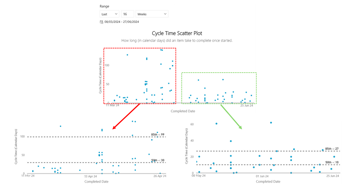
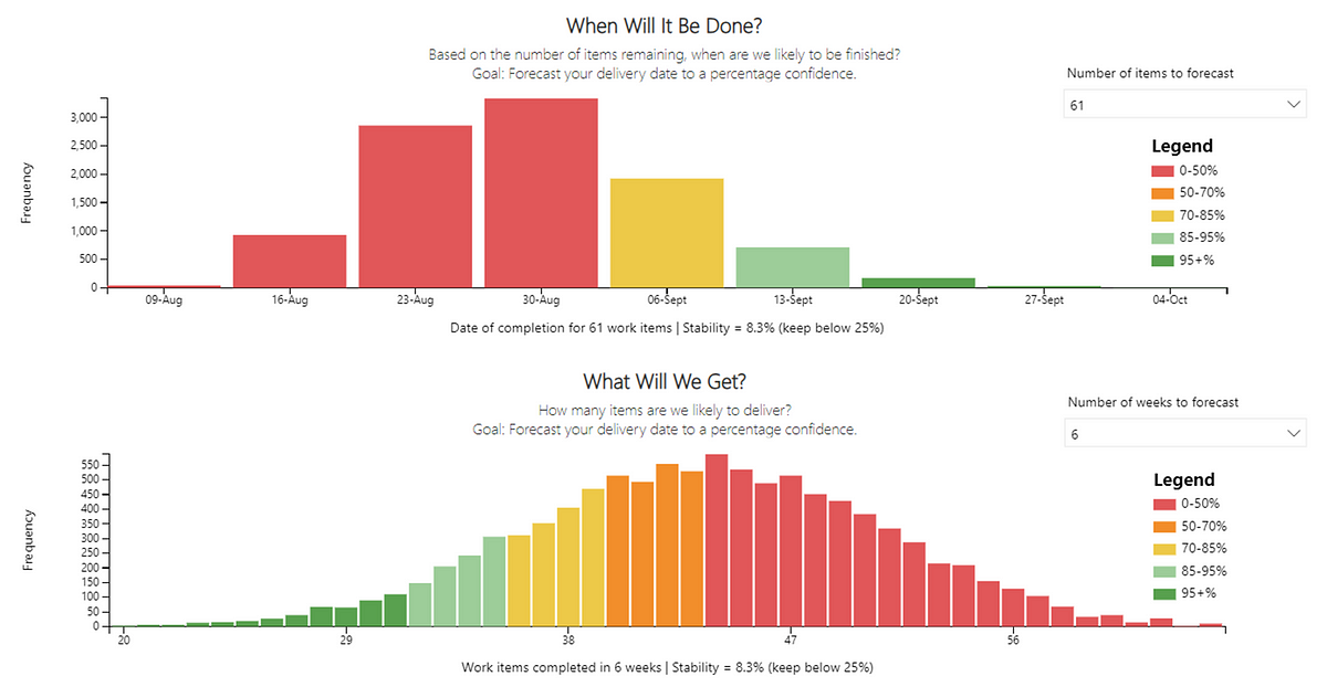
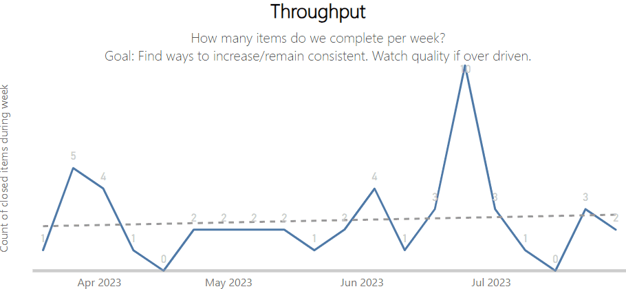
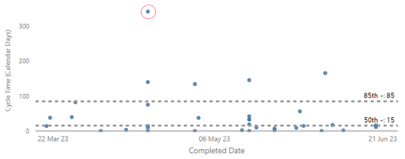
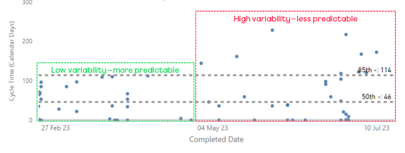
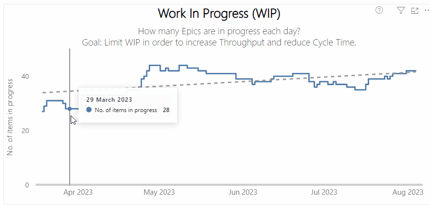
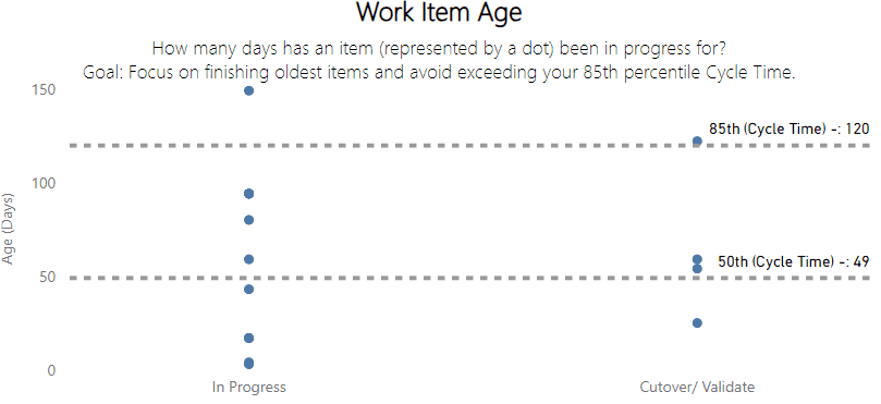
Currently, we feel that we have the right balance in the number of themes vs. the light-weightiness of the self-assessment. We have metrics/tools that could bring in other factors, such as predictability and/or quality:
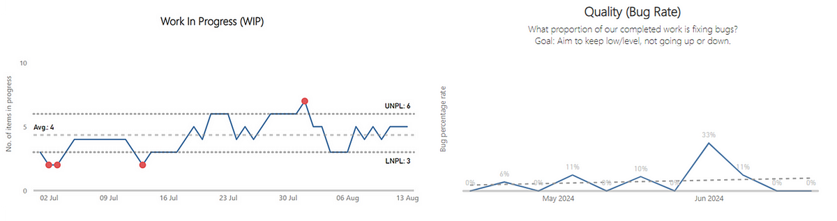
Left — a process behaviour chart highlighting where WIP has become unpredictable | Right — a chart showing the % of Throughput which are Bugs which could be a proxy for ‘quality’
Right now we’ll continue the small tweaks each quarter with an aim to improve as many teams, platforms and domains as we can over the next 12 months…watch this space!