Thoughtspot and the four flow metrics

Focusing on flow

As a Ways of Working Enablement Specialist, one of our primary focuses is on flow. Flow can be referred to as the movement of value throughout your product development system. Some of the most common methods teams will use in their day to day are Scrum, Kanban, or Scrum with Kanban.

Optimising flow in a Scrum context requires defining what flow means. Scrum is founded on empirical process control theory, or empiricism. Key to empirical process control is the frequency of the transparency, inspection, and adaptation cycle — which we can also describe as the Cycle Time through the feedback loop.

Kanban can be defined as a strategy for optimising the flow of value through a process that uses a visual, work-in-progress limited pull system. Combining these two in a Scrum with Kanban context means providing a focus on improving the flow through the feedback loop; optimising transparency and the frequency of inspection and adaptation for both the product and the process.

Quite often, product teams will think that the use of a Kanban board alone is a way to improve flow, after all that is one of its primary focuses as a method. Taking this further, many Scrum teams will also proclaim that “we do Scrum with Kanban” or “we like to use ScrumBan” without understanding what this means if you really do focus on flow in the context of Scrum. However, this often becomes akin to pouring dressing all over your freshly made salad, then claiming to eat healthily!

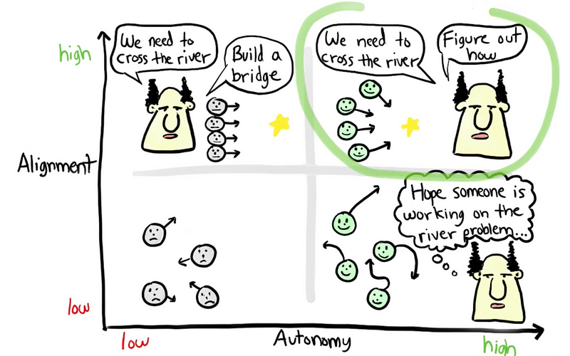
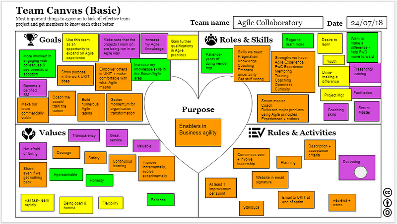
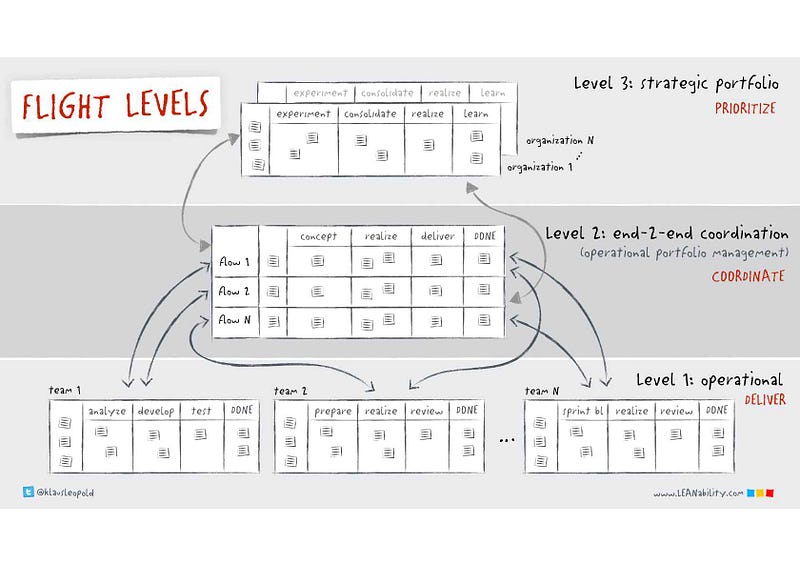
Images via

Idearoom / Adam Luck / Scrum Master Stances

If I was to be more direct, put simply, Scrum using a Kanban board ≠ Scrum with Kanban.

All these methods have a key focus on empiricism and flow — therefore visualisation and measurement of flow metrics is essential, particularly when incorporating these into the relevant events in a Scrum context.

The four flow metrics

There are four basic metrics of flow that teams need to track:

  • Throughput — the number of work items finished per unit of time.

  • Work in Progress (WIP) — the number of work items started but not finished. The team can use the WIP metric to provide transparency about their progress towards reducing their WIP and improving their flow.

  • Cycle Time — the amount of elapsed time between when a work item starts and when a work item finishes.

  • Work Item Age — the amount of time between when a work item started and the current time. This applies only to items that are still in progress.

Generating these in ThoughtSpot

ThoughtSpot is what we use for generating insights on different aspects of work in Nationwide, one of the key products offered to the rest of the organisation by Marc Price and Zsolt Berend from our Measurement & Insight Accelerator. This can be as low level as individual product teams, or as high-level as aggregated into our different Member Missions. We produce ‘answers’ from our data which are then pinned to ‘pinboards’ for others to view.

Our four flow metrics are there as a pinboard for teams to consume, filtering to their details/context and viewing the charts. If they want to, they can then pin these to their own pinboards for sharing with others.

For visualizing the data, we use the following:

  • Throughput — a line chart for the number of items finished per unit of time.

  • WIP — a line chart with the number of items in progress on a given date.

  • Cycle Time — a scatter plot where each dot is an item plotted against how long it took (in days) and the completed date. Supported by an 85th percentile below showing how long in days items took to complete.

  • Work Item Age — a scatter plot where each dot is an item plotted against its current column on the board and how long it has been there. Supported by the average age of WIP in the system.

Using these in Scrum Events

Throughput (Sprint Planning, Review & Retrospective) — Teams can use this as part of Sprint Planning in forecasting the number of items for the Sprint Backlog.

It can also surface in Sprint Reviews when it comes to discussing release forecasts or product roadmaps (although I would encourage the use of Monte Carlo simulations in this context — more in a later blog on this). As well as being reviewed in the Sprint Retrospective, where teams inspect and adapting their processes to find ways to improve (or validating if previous experiments have improved) throughput.

Work In Progress (Daily Scrum & Sprint Retrospective) — as the Daily Scrum focuses on what’s currently happening in the sprint/with the work, WIP chart is good to look at here (potentially seeing if it’s too high).

The chart also is a great input into the Sprint Retrospective, particularly seeing where WIP is trending towards — if teams are optimising their WIP then you would expect this to be relatively stable/low — if high/highly volatile then you need to “stop starting and start finishing” or find ways you can improve your workflow.

Cycle Time (Sprint Planning, Review & Retrospective) — Looking at 85th/95th percentiles of Cycle Time can be a useful input into deciding what items to take into the Sprint Backlog. Can we deliver this within our 85th percentile time? If not, can we break it down? If we can, then let’s add it to the backlog. It also works as an estimation technique, so stakeholders know that when work is started on an item, there is an 85% likelihood it will take n days — want it in n days? Ok well that’s only got a 50% likelihood, can we collaborate to break it down into something smaller? Then let’s add that to a backlog refinement discussion.

In the Sprint Review it can be used by looking at trends, such as if your cycle times are highly varied then are there larger constraints in the “system” that we need stakeholders to help with? Finally, it provides a great discussion point for Retrospectives — we can use it to deep dive into outliers to find out what happened and how to improve, see if there is a big difference in our 50th/85th percentiles (and how to reduce this gap), and/or see if the improvements we have implemented as outcomes of previous discussions are having a positive impact on cycle time.

Work Item Age (Sprint Planning & Daily Scrum) — this is a significantly underutilised chart that so many teams could get benefit from. If you incorporate this into your Daily Scrums, it will likely lead to much more conversations on getting work done (due to item age) rather than generic updates. Compare work item age to your 85th percentile on your cycle time — is it likely to exceed this time? 

 Is that ok? Should we/can slice it down further to get some value out there and faster feedback sooner? All very good, flow-based insights this chart can provide.

It may also play a part in Sprint Planning — do you have items left over from the previous sprint? What should we do with those? All good inputs into the planning conversation.

Summary

To summarise, focusing on flow involves more than just using a Kanban board to visualize your work. To really take a flow-based approach and incorporate the foundations of optimising WIP and empiricism, teams should utilise the four key flow metrics of Throughput, WIP, Cycle Time and Work Item Age. If you’re using these in the context of Scrum, look to accommodate these appropriately into the different Scrum events.

For those wanting to experiment with these concepts in a safe space, I recommend checking out TWiG — the work in progress game, (which now has a handy facilitator and participant guide) and for any Nationwide folks reading this curious about flow in their context, be sure to check out the Four Key Flow Metrics pinboard on our ThoughtSpot platform.

Further/recommended reading:

Kanban Guide (Dec 2020 Edition) — KanbanGuides.org

Kanban Guide for Scrum Teams (Jan 2021 Edition) — Scrum.org

Basic Metrics of Flow — Dan Vacanti & Prateek Singh

Four Key Flow Metrics and how to use them in Scrum events — Yuval Yeret
TWiG — The Work In Progress Game

Product Metrics for Internal Teams

Disclaimer: this Post describes one way not the only way to
approach product metrics for internal teams

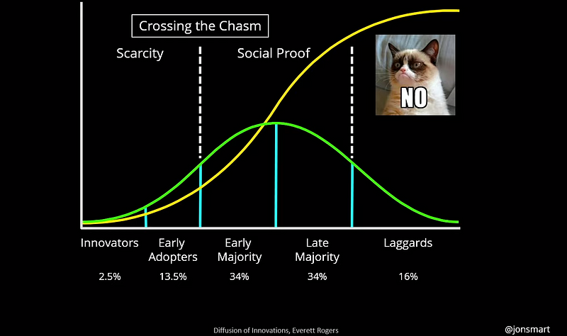
As our move from Project to Product gathers pace, it’s important that not only are we introducing a mindset shift and promoting different ways of working, but by doing so we also need to ensure that we are measuring things accordingly, as well as showcasing examples for others to help them on their journey. As Jon Smart points out, there is a tipping point in any approach to change where you start to cross the chasm, with people who are early/late majority wanting to see social proof of the new methods being implemented.

Screenshot 2020-06-05 at 09.38.17.png

I’ve noticed this becoming increasingly prevalent in training sessions and general coaching conversations, with the shift away from “what does this mean?” or “so who does that role?” to questions such as “so where are we in PwC doing this?” and “do you have a PwC example?”
These are trigger points that things are probably going well, as momentum is gathering and curiosity is growing, but it’s important that you have to hand specific examples in your context to gain buy-in. If you can’t provide ready-made examples from your own organisation then it’s likely your approach to new ways of working will only go so far.

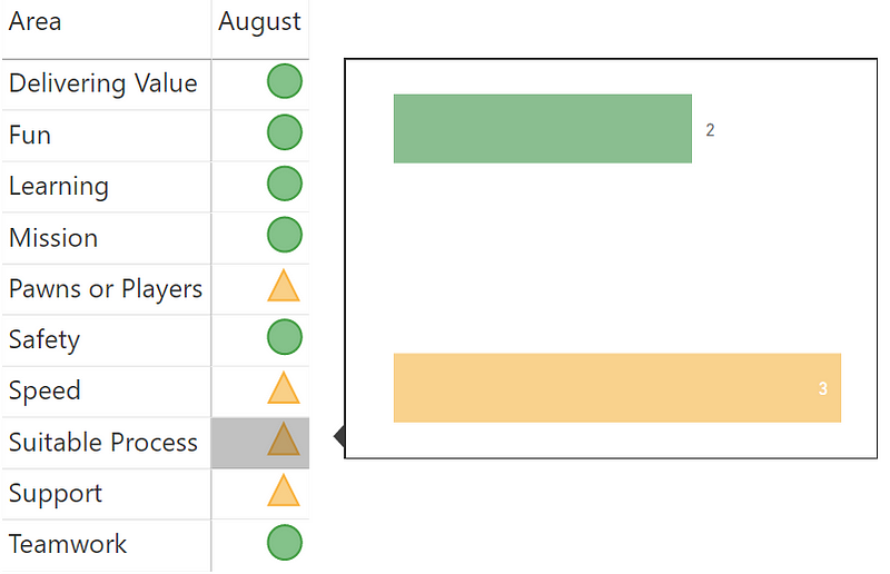
This week I’ve been experimenting around with how we measure the impact and outcomes of one of the Products I’ve taken a Product Manager role on (#EatYourOwnDogFood). Team Health Check is a web app that allows teams to conduct anonymous health checks with regards to their ways of working, using it to identify experiments they want to run to improve areas, or identify trends around things that may or may not be working for them. Our first release of the app took place in December, with some teams adopting it.

Screenshot 2020-06-05 at 08.52.47.png

In a project model, that would be it and we’d be done, however we know that software being done is like lawn being mowed. If it’s a product, then it should be long-lived, in use and leading to better outcomes. So, with this in mind, we have to incorporate this when it comes to our product metrics we want to track.

Adoption & Usage

One of the first things to measure is adoption. I settled on three main metrics to track for this, the number of teams who have completed a team health check, adoption across different PwC territories and repeat usage by teams. 

Untitled.png

This way I can see what the adoption has been like in the UK, which is where I’m based and where it’s predominantly marketed, compared to other territories where I make people aware of it but don’t exactly exert myself in promoting it. The hypothesis being you’d expect to see mostly UK teams using it. I also then can get a sense as to the number of teams who have used it (to promote the continued investment in it) and see which teams are repeat users, which I would associate with them seeing the value in it.

Untitled2.png

Software Delivery Performance

We also want to look at technical metrics, as we want to see how we’re doing from a software delivery performance perspective. In my view, the best source for this are Software Delivery Performance metrics presented each year as part of the State of DevOps/DORA report.

I’m particularly biased towards these as they have been formulated through years of years with thousands of organisations and software professionals, with them proven directly correlate with different levels of software delivery performance. These are actually really hard to track! So I had to get a bit creative with them. For our app we have a specific task in our pipeline associated with a production deployment which thankfully has a timestamp in the Azure DevOps database, as well as a success/failure data point.
Using this we can determine two of those four metrics - Deployment Frequency (for your application how often do you deploy code to production or release it to end users) and Change Failure Rate (what percentage of changes to production or released to users result in degraded service and subsequently require remediation).

So looks like currently we’re a Medium-ish performer for Deployment Frequency / Elite performer in Change Failure Rate, which is ok for what the app is, its size and its purpose. It also prompts some questions around our changes, is our batch (deployment) size too big? Should we in fact be doing even smaller changes more frequently? If we did could that negatively impact change failure rate? How much would it impact it? All good, healthy questions informed by the data.

Feedback

Another important aspect to measure is feedback. The bottom section of the app has a simple Net Promoter Score style question for people completing the form, as well as an optional free text field to offer comments.

Screenshot 2020-06-05 at 09.19.31.png

Whilst the majority of people leave this blank, it has been useful in identifying themes for features people would like to see, which I do track in a separate page:

Screenshot (244).png

Looking at this actually informed our most recent May 20th release, as we revamped the UI, changing the banner image and radio button scale from three buttons to four, as well making the site mobile compatible.

Screenshot (246).png

I also visualise the NPS results, which proved for some interesting responses! I’d love to know what typical scores are for measuring NPS of software, but it’s fair to say it was a humbling experience once I gathered the results!

The point of course is that rather than viewing this as your failure, use it to inform what you do next and/or as a counter metric. For me, I’m pleased the adoption numbers are high, but clearly the NPS score shows we have work to do in making it a more enjoyable experience for people completing the form. Are there some hidden themes in the feedback? Are we missing something? Maybe we should do some user interviews? All good questions that the data has informed.

Screenshot (242).png

Cost

Finally we look at cost, which is of course extremely important. There are two elements to this, the cost of the people who build and support the software, and any associated cloud costs. At the moment we have an interim solution of an extract of peoples timesheets to give us the people costs per week, which I’ve tweaked for the purpose of this post with some dummy numbers. A gap we still have are the cloud costs, as I’m struggling to pull through the Azure costs into Power BI, but hopefully it’s just user error.

We can then use this to compare the cost vs all other aspects, justifying whether or not the software is worth the continued investment and/or meeting the needs of the organisation.

Overall the end result looks like this:

Screenshot (248).png

Like I said, this isn’t intended to be something prescriptive - more that it provides an example of how it can be done and how we are doing it in a particular context for a particular product.

Keen to hear the thoughts of others - what is missing? What would you like to see given the software and its purpose? Anything we should get rid of?
Leave your comments/feedback below.

Test Traceability Reporting for Azure DevOps

Recently I’ve been trying to see what testing data you can get out of Azure DevOps. Whilst there tends to be sufficient reporting available out the box, I do feel the ability to do aggregated reporting is somewhat lacking. Specifically, I was interested in looking at how to get an overview of all Test Plans (and a breakdown of test cases within it) as well as looking at how you can get some form of testing ‘traceability’ when it comes to Product Backlog Items (PBIs). This in particular harks back to the ‘old days’ when you used to have to deliver a Requirements Traceability Matrix (RTM) to ‘prove’ you had completed testing, showing coverage and where any tests had passed/failed/not run/blocked etc. It wouldn’t be my preferred choice when it comes to test reporting but there was an ask from a client to do so, plus if you can provide something people are used to seeing to get their buy in with new ways of working then why not? So I took this up as a challenge to see what could be done.

Microsoft’s documentation has some pretty useful guidance when it comes to Requirements Tracking and how to easily obtain this using OData queries. One major thing that’s missing in the documentation, which I found out through this process and raising in the developer community, is that this ONLY works when you have test cases that you’ve added/linked to a PBI/User Story via the Kanban board. Any test cases that have been manually linked to work items simply will not appear in the query, potentially presenting a false view that there is a “gap” in your testing 😟

Thankfully, I went through the frustration of figuring that out the hard way and changed the original OData query to pull in more data, template it as a .PBIT file so others don’t have to worry about it. What I have now is a Power BI report consisting of two pages.
The first consolidates the status of all my Test Plans into a single page (within Azure DevOps you have to go through each individual one to get this data) with a table visual. This will show the status of test cases within the test plan, whether it be run / not run / passed / failed / blocked / N/A - in both count and percentage. The conditional formatting will highlight any test cases blocked or failed, with the title column being clickable to take you to that specific test plan. 

Picture1.png

The second page in the report was the key focus, which shows traceability of tests cases to PBI’s /User Stories and their respective status. I could have added the number of bugs related to the PBI’s/User Stories however I find teams are not consistent with how they handle bugs, so this might be a misleading data point. Like I said, this ONLY work for test cases added via the Kanban board (I added a note at the top of the report to explain this as well). Again, the conditional formatting will highlight any test cases blocked or failed, with the title column being clickable to take you to that specific test plan. 

Picture3.png

Finally, both pages contain the ‘Text Filter’ visual from App Source, meaning if you have a large dataset you can search for either a particular test plan or PBI/User Story.

Picture2.png
Picture4.png

The types of questions to ask when using this report are:

  • How much testing is complete?

  • What is the current status of tests passing, failing, or being blocked?

  • How many tests are defined for each PBI/User Story?

  • How many of these tests are passing?

  • Which PBIs/User Stories are at risk?

  • Which PBIs/User Stories aren't sufficiently stable for release?

  • Which PBIs/User Stories can we ship today?

Anyway, I hope it adds some value and can help your teams/organisation.
Templated in my GitHub repo, leave a like if this is would be useful or comment below if you have any thoughts or feedback.

I’m considering creating a few of these, so would be great to here from people what else would help with their day to day.

Weeknotes #40 - Product Management & 2019 Reflections

Product Management Training

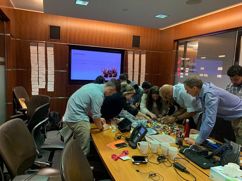
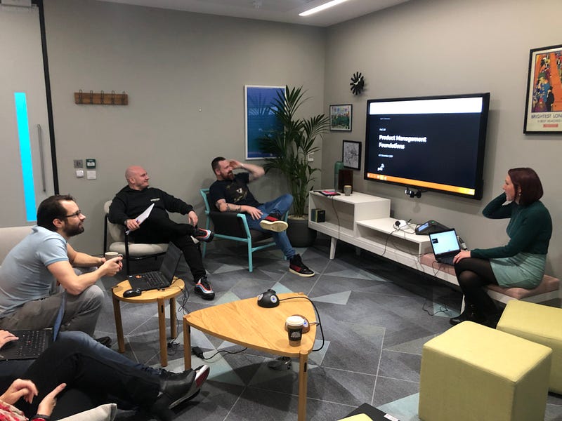
This week we had a run through from Rachel of our new Product Management training course that she has put together for our budding Product Managers. I really enjoyed going through it as a team (especially using our co-working space in More London) and viewing the actual content itself.

Credits: Jon Greatbatch for photo “This can be for your weeknotes”

What I really liked about the course was the fact the attendees are going to be very ‘hands-on’ during the training, and will get to go apply various techniques that PdM’s use with a case study of Delete My Data (DMD) throughout. It’s something that I’ve struggled with when putting together material in the past of having an ‘incremental’ case study that builds through the day, so glad that Rachel has put something like this together. We’ve earmarked the 28th Jan to be the first session we run, with it being a combination of our own team and those moving into Product Management being the ‘guinea pigs’ for the first session.

2019 Reflections

This week has been a particularly challenging week, with lots of roadblocks in the way of moving forward. A lack of alignment in new teams with future direction, and lack of communication to the wider function around our move to new ways of working means that it feels like we aren’t seeing the progress we should be, or creating a sense of urgency. Whilst it’s certainly true around achieving big through small, it does feel that with change initiatives it can feel like you are moving too slow, which is the current lull we’re in. After a few days feeling quite down I took some time out to reflect on 2019, and what we have achieved, such as:

  • Delivering a combined 49 training courses on Agile, Lean and Azure DevOps

  • Trained a total of 789 PwC staff across three continents

  • Becoming authorised trainers to offer an industry recognised course

  • Actually building our first, proper CI/CD web apps as PoC’s

  • Introducing automated security tools and (nearly) setting up ServiceNow change management integration to #TakeAwayTheExcuses for not adopting Agile

  • Hiring our first ever Product Manager (Shout out Rachel)

  • Getting our first ever Agile Delivery Manager seconded over from Consulting (Shout out Stefano)

  • Our team winning a UK IT Award for Making A Difference

  • Agreement from leadership on moving from Project to Product, as part of our adoption of new ways of working

All in all, it’s fair to say we’ve made big strides forward this year, I just hope the momentum continues into 2020. A big thank you from me goes to Jon, Marie, James, Dan, Andy, Rachel and Stefano for not just their hard work, but for being constant sources of inspiration throughout the year.

Xmas Break

Finally, I’ll be taking a break from writing these #Weeknotes till the new year. Even though I’ll be working over the Christmas period, I don’t think there’ll be too much activity to write about! For anyone still reading this far in(!), have a great Christmas and New Year.

Weeknotes #39 - Agile not WAgile

Agile not WAgile

This week we’ve been reviewing a number of our projects that are tagged as being delivered using Agile ways of working within our main delivery portfolio. Whilst we ultimately do want to shift from project to product, we recognise that right now we’re still doing a lot of ‘project-y’ style of delivery, and that this will never completely go away. So we’re trying to in parallel at least get people familiar with what Agile delivery is all about, even if delivering from a project perspective.

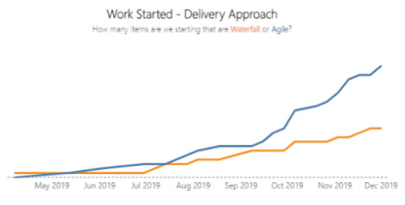
The catalyst really for this was one of our charts where we look at the work being started and the split between which of that is Agile (blue line) Vs. Waterfall (orange line).

The aspiration being of course that with a strategic goal to be ‘agile by default’ the chart should indeed look something like it does here, with the orange line only slightly creeping up when needed but generally people looking to adopt Agile as much as they can.

When I saw the chart looking like the above last week I must admit, I got suspicious! I felt that we definitely were not noticing the changes in behaviours, mindset and outcomes that the chart would suggest, which prompted a more thorough review.

The review was not intended to act as the Agile police(!), as we very much want to help people in moving to new ways of working, but to really make sure people had understood correctly around what Agile at its core really is about, and if they are indeed doing that as part of their projects.

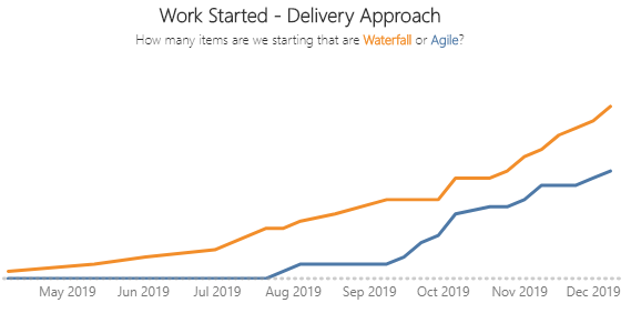
The review is still ongoing, but currently it looks like so (changing the waterfall/agile field retrospectively updates the chart):

The main problems observed being things such as lack of frequent delivery, with project teams still doing one big deployment to production at the end before going ‘live’ (but lots of deployments to test environments). Projects are maybe using tools such as Azure DevOps and some form of Agile events (maybe daily scrums), but work is still being delivered in phases (Dev / Test / UAT / Live). As well as this, a common theme was not getting early feedback and changing direction/priorities based on that (hardly a surprise if you are infrequently getting stuff into production!).

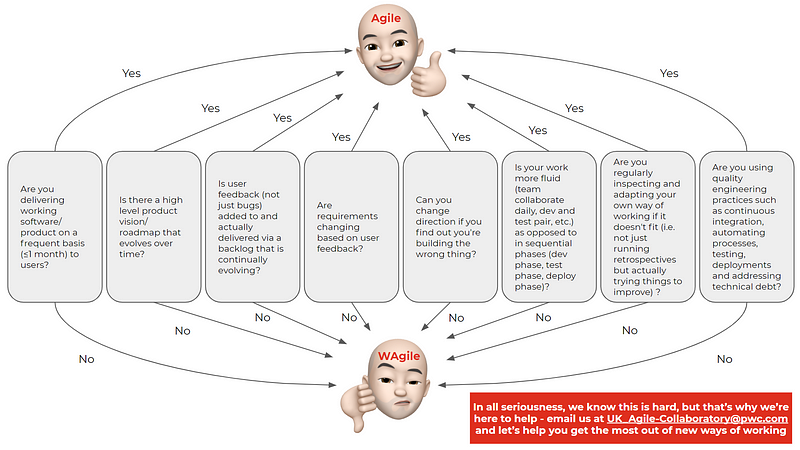
Inspired by the Agile BS detector from the US Department of Defense, I prepared a one-pager to help people quickly understand if their application of Agile to their projects is right, or if they need to rethink their approach:

Here’s hoping the blue line goes up, but against some of that criteria above, or at least we get more people approaching us for help in how to get there.

Team Health Check

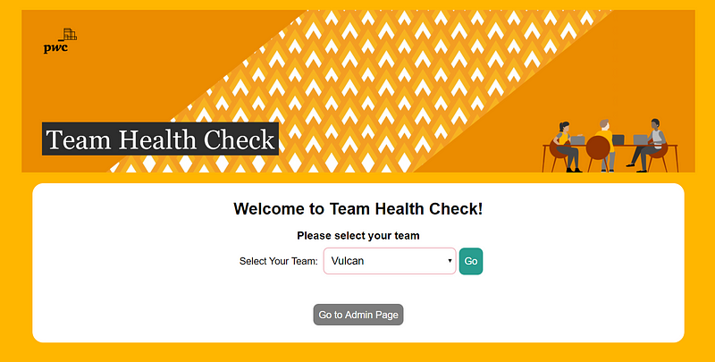
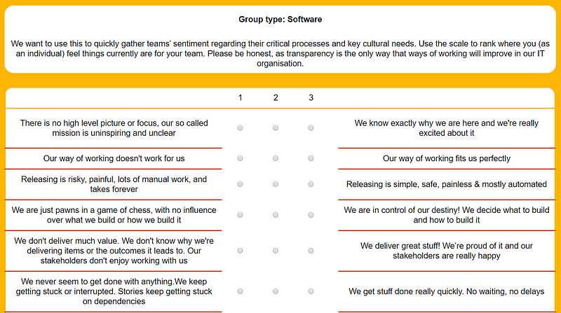
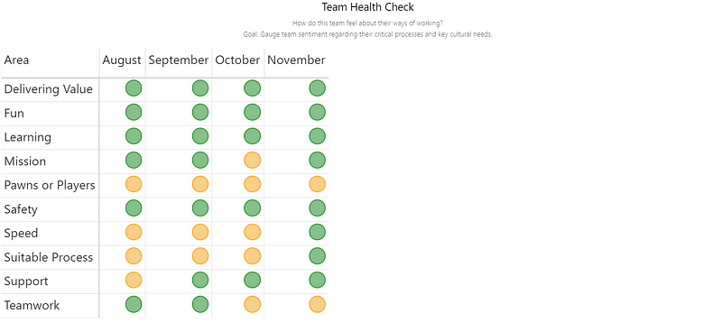
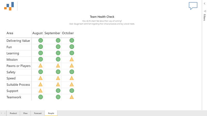
This week we had our sprint review for the project our grads are working on, helping develop a team health check web app for teams to conduct monthly self assessments as to different areas of team needs and ways of working.

Again, I was blown away by what the team had managed to achieve this sprint. Not only had they managed to go from a very basic, black and white version of the app to a fully PwC branded version.

They’ve also successfully worked with Dave (aka DevOps Dave) to configure a full CI/CD pipeline for any future changes made. As the PO for the project I’ll now be in control of any future releases via the release gate in Azure DevOps, very impressive stuff! Hopefully now we can share more widely and get teams using it.

Next Week

Next week will be the last weeknotes for a few weeks, whilst we all recharge and eat lots over Christmas. Looking at finalising training for the new year and getting a run through from Rachel in our team of our new Product Management course!