Data Visualization

How is the sprint going?

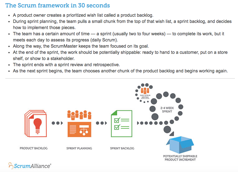
Currently, the vast majority of agile teams are working using the Scrum framework as part of their agile delivery mechanism.

For those new to Scrum, the Scrum Alliance summarises this framework very nicely:

Tracking Sprint Progress

Typically, a team would then make use of a burn down to track progress against hours in the sprint, like so:

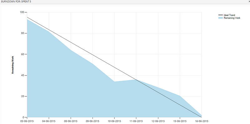
However one of the problems with using a burn down in this way is that it is not giving a ‘true’ picture as to how the sprint is going.

Sure, the team’s hours may be burning down but most importantly, if working software is our primary measure of progress, this visual representation does not tell us what working software has been delivered and how frequently the team are delivering it.

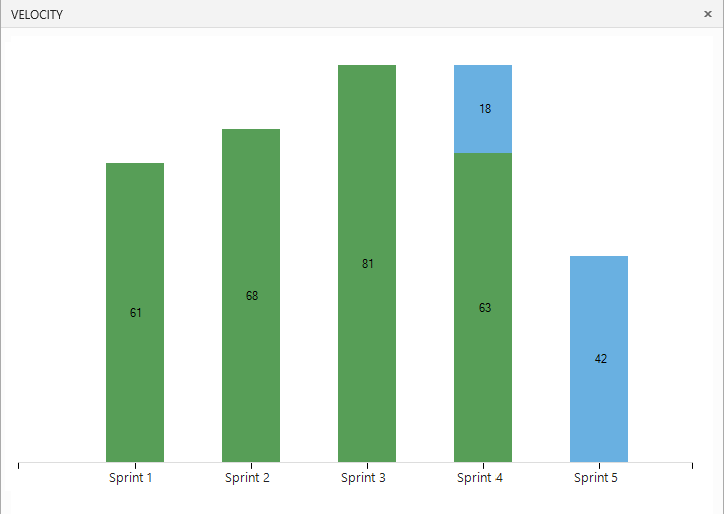
Some teams may revert to a velocity chart, but unfortunately this is only giving a measure of pace at which the team is operating at sprint by sprint. They are known to fluctuate quite easily and they are not an indicator mid-sprint as to where a team is at and how the sprint is actually going.

A burn-up can help elaborate on which stories have been completed in a sprint. However, what it cannot do visually is show the relationship between hours and points. Which would allow for both the team and PO/stakeholders to appropriately address throughout the sprint if they can see things are not working.

Teams should want to sense where they are, and then adapt within the sprint so that they can deliver…

The ‘New’ Burn Down

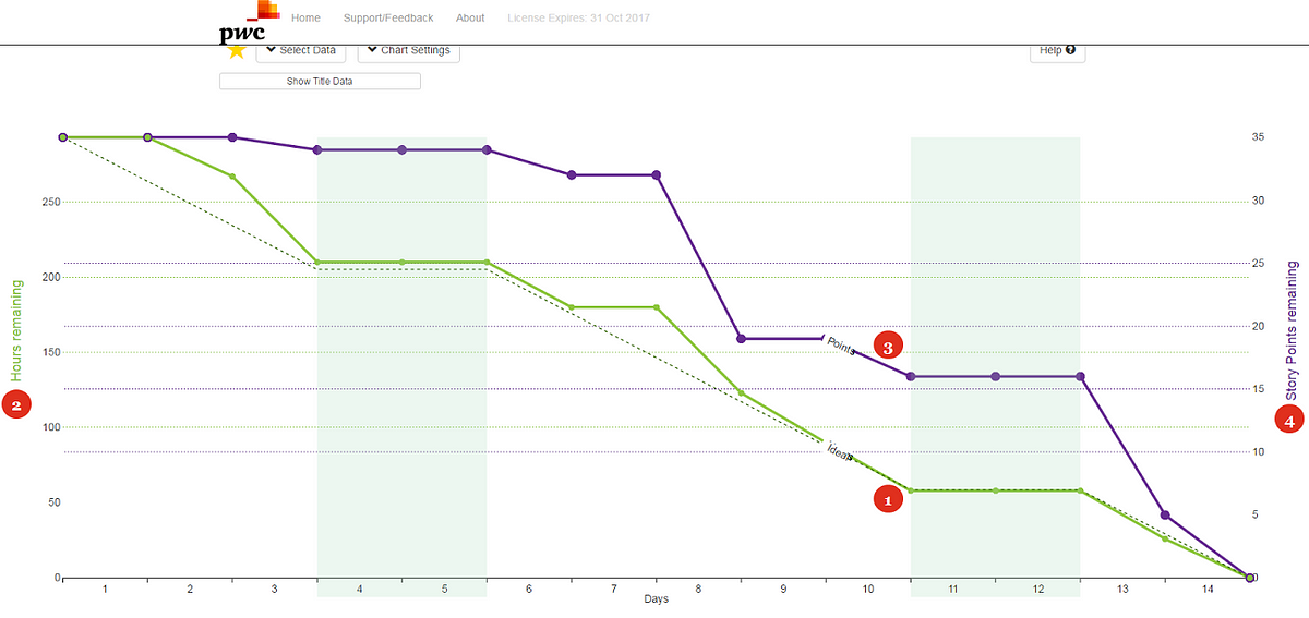
This burn down is different. This is a more effective version of the commonly used sprint burndown chart.

This shows the Task Burndown (1), on the left had scale (2) and the Story burndown (3), on the right hand scale (4).

By showing both the task burndown and the story burndown we help the team see the two key aspects of their sprint work:

  • Are they on track from a task point of view?

  • Are they completing stories early enough in the sprint?

Are we mini-waterfall?

Delay in completing stories, as shown in this example below, indicates that the team should be looking for ways to finish stories earlier in the sprint.

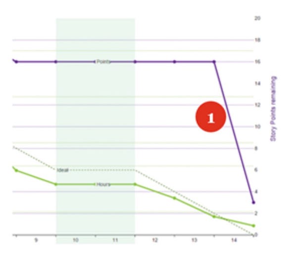
This kind of sprint pattern is often referred to as ‘mini-waterfall’, as the testing (and validation) is left to the end of the sprint (1) rather than throughout it.

Gain further insight

The burndown shows the state of work on each day of the sprint. So, if the team commits to a new story or adds tasks during the sprint then this will be shown on the day that it was actually done.

You can then start to dive into the data and identify where the changes have occurred:

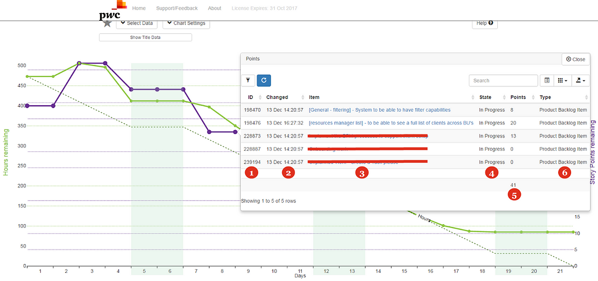
Through the information pane you can see you the unique ID of the backlog item in your respective tool (1), the timestamp of the change to the backlog item (2), the title of the backlog item and a hyperlink to open it in your respective tool (3), the current state (4), the effort in points of each backlog item as well as the total of these (5) and the type of backlog item (6).

This unique way to visualise the sprint will help everyone answer that all important question, “how is the sprint going?”

Using data visualisation to aid deadline driven Agile projects…

Quite often in the agile world, you will come across pieces of work that are deadline driven.

Whilst it can be negotiated in some instances, other times it’s just something we have to deal with as this is the world we live in.

Some people (myself included) are focused on delivering value continuously, whereas others still have a deadline orientated mind-set because, it may be the only way they’re familiar with working, it may be imposed upon them (legislative/regulatory for example) or quite simply this may be the only way they motivate themselves to actually do the work.

For these scenarios we need to know how best to handle this when working on agile projects as one of our biggest challenges is how to manage the delivery when working to a deadline.

You will have stakeholders/PO’s/management pressuring you to ‘meet a deadline’ yet unwilling to compromise on scope.

“You have to deliver it all” is a typical response for those that have not had the benefit of coaching on what agile truly means, and it can create an unnecessary pressure on the team.

So how do you tackle this?

Well for one, we know that delivering “everything” directly contradicts agile principles.

Remember, Agile is about working smarter, rather than harder.

It’s not about doing more work in less time; it’s about generating more value with less work.

You will need strong customer negotiation/stakeholder management (as well as a lot of patience!) skills to get this message across, relying on management where needed to help support you.

What I find the most helpful in these scenarios is showing stakeholders that if they want ‘everything’, just how long it will take.

For those curious on how best to get this message across visually, a follow on post will show you how you to do this using data/probabilistic forecasting.

However, our question today is deadline driven. 

So how can we do this visually?

Potentially Deliverable Scope (PDS) Chart

This chart uses Monte Carlo simulation and the actual movement of cards across a team's board to predict how far down the backlog a team will get for a specified budget or timeline for a selected project or release.

The model predicts the ‘Probable’ and ‘Possible’ deliverable scope, which helps the business focus on the marginal scope.

Take this example chart (generated 14th Feb) with a finish date of 3rd March for a project/release:

The chart represents the current backlog order, as well as the sizes of each backlog item being relative to the points estimate per PBI (user story).

Pink items are currently In Progress, Grey items are To Do. 

The title, person assigned to (removed for the purposes of this data) and unique ID for a backlog item is also visible, with the ability to click on an item taking you to the actual backlog item in your respective tool (Jira, TFS, etc.).

There are 3 areas to look at:

1) Anything above the ‘Probable’ Line

These items will almost certainly be delivered. 

As you’ll see for this team that is currently everything that is In Progress.

2) Anything below the ‘Possible’ Line

These items will almost certainly not be delivered, however if a stakeholder sees something we are definitely not going to get to, this allows them to visually see the priority of an item and if this needs to be moved up/down the backlog priority.

3) The scope that *could* still be delivered

This should be the area that everyone focuses on.

This is where the team *could* get to by the deadline if the team and business work through the priorities to improve throughput. This could be through story slicing, closer collaboration, etc.

This chart can be run every few days, with the ability to change date/data range used, scope change, throughput increase or an increase in any rework needed.

This is hugely beneficial when wanting to visualise using data (rather than speculation) how far down the backlog you will get by a given date, which will in turn significantly help in managing those tough questions from stakeholders.

For those interested in exploring this further, please reply below or get in touch directly.