Wroclaw (Vrohts-wahf)

As I mentioned in closing last week, I headed out to Wroclaw (pronounced Vrohts-wahf) to visit one of our suppliers this week.
Accompanied by Jon, Andy and Stuart we had 3 days of good discussion on Agile, DevOps, Product Management, UX, Data Science, Security and, what is fast becoming my favourite topic, anti-patterns.
Whilst there was some really impressive stuff that we saw, mainly from a technical practices perspective, there were a number of anti-patterns identified in our *current* Agile ways of working, largely being imposed from within our own organisation. Sprint zero, gantt charts, change advisory boards (CABs) approving all deployments (even to low level environments), RAG status, the iron triangle as the measure of project success, changes in scope needing a change request to be raised — all got a mention.
It’s clear that we still have a large amount of cultural debt to overcome.
For anyone new to the concept of cultural debt, Chris Matts describes it well in that it commonly comes in two forms:
As a team we are very strict in our interactions with individuals that training and/or coaching must be via pull rather than push (i.e. opt-in).
However the second point is, I feel, much tougher. Plenty of teams are wanting to plough on ahead and get a kanban board setup, do daily stand-ups and retrospectives, etc. and, whilst this enthusiasm is great, the mindset and reason why we’re choosing to work in this way is often lost.
An outcome of our discussion was creating a supplier working group to work with our team, so we can share some of the approaches we’re taking to encouraging Agile ways of working, and how we can collaborate and support, sharing data/examples to drive continuous improvement rather than taking on the organisational challenges individually.
Less is more?
We also had the last couple days of our Sprint this week as a team.
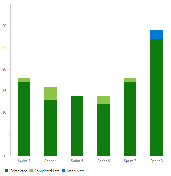
We like to work in 4-week sprints, as we find this is the right balance in cadence and as a feedback loop with stakeholders. From the end of Jan we went down to one less team member, so with five in our team I was interested see how our throughput was compared to previous sprints.

Our team throughput per sprint over the last 6 sprints
As you can see, this sprint we managed to complete more work items than in any sprint prior.
Upon review as a team, the general consensus was that we put this down to having run more training in this sprint compared to previous sprints (a training session is 1 PBI on our backlog) and that as we trained more people it spawned off more opportunities from a coaching standpoint. We’re going to stick with current team size going forward, mainly due to a good dynamic as a team and having a good variety of skillset.

Done column = 😍😍😍 (shoutout
for the stickies)
One thing we did try this sprint as an ‘experiment’ over this sprint was working with both physical and digital boards. It’s rare for us as a team to have a day where everyone is in the same office, so primary for us is a digital board. However we wanted people to also have the view of a physical board in our London office, mainly so they could see what we were working on and how a kanban board works in practice. Whilst we’ve not had loads of questions, general feedback seems to be positive and people like seeing it in action — we’re hoping it encourages others to experiment with physical and/or digital versions of their workflow.
TIL Python
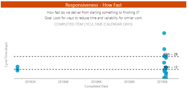
One learning I have made this week is I’ve picked up a little bit of Python knowledge. One of my biggest frustrations with FlowViz has been how the Scatter Chart within Power BI cannot handle date values and can only use whole numbers in the X-axis, therefore needing a date string (i.e. 20190301) which of course, is then treated as a number rather than a date (so 20,190,301) leading to a rather bizarre looking scatter plot.

And the award for most useless Scatter Chart goes to…
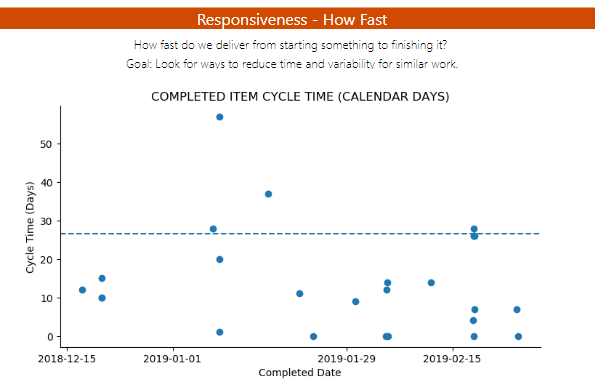
However this week Microsoft announced that python visuals are now available in the web service and hence, I could ‘code’ my own python chart to display the scatter chart how I really wanted it to be.
After some browsing of the web (read: Stack Overflow) I managed to get a scatter chart working with my dataset. However I needed the brilliance of Tim in our Data Science team to help get the dates working how they should be (checkout his Tableau public profile btw), as well as clean up the axis and add my percentile line. It’s not *done done* yet as it needs a label for the percentile line but I’m pretty pleased with how it is now looking.

Much better (thanks Tim!)
Next Week
Next week I’m running what I hope will be the polished version of our Hands on with Azure DevOps course for a group of 20 in Consulting.
I’ll also be learning about Google Analytics, as we launch our Partner Up initiative where senior staff pair up with someone junior who then demos and coaches the more senior person about a new tool/technology, all in the spirit of creating a learning organisation — looking forward to sharing my own learnings with you all next week.
